Slinkachu, a German Photographer who's 'little people' project began in 2006.
His work involves using miniature figures and creating a scene.
His art has been placed in many places such as London and Norway.
He has another project 'Inner City Snail' project,which is where he uses non toxic spray paint to graffiti on real snails.
He likes the idea that hardly no-one notices his work because we never notice everything that goes on in the world,even if we don't intend to.
I like Slinkachu's work because its different and I think you would need a wide imagination to appreciate the beauty of it.


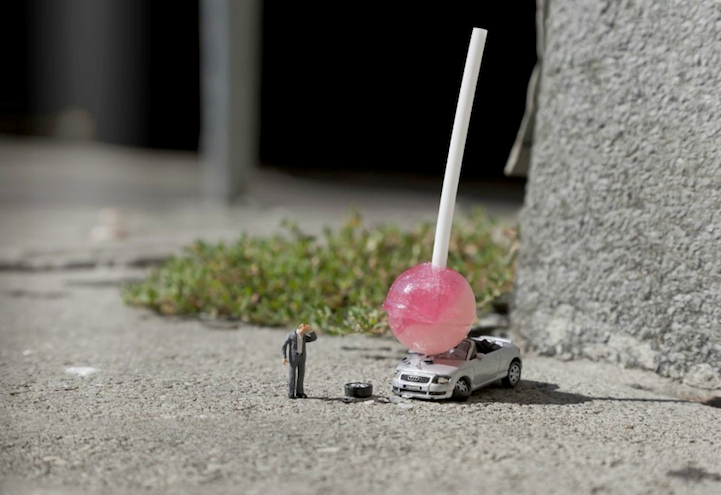
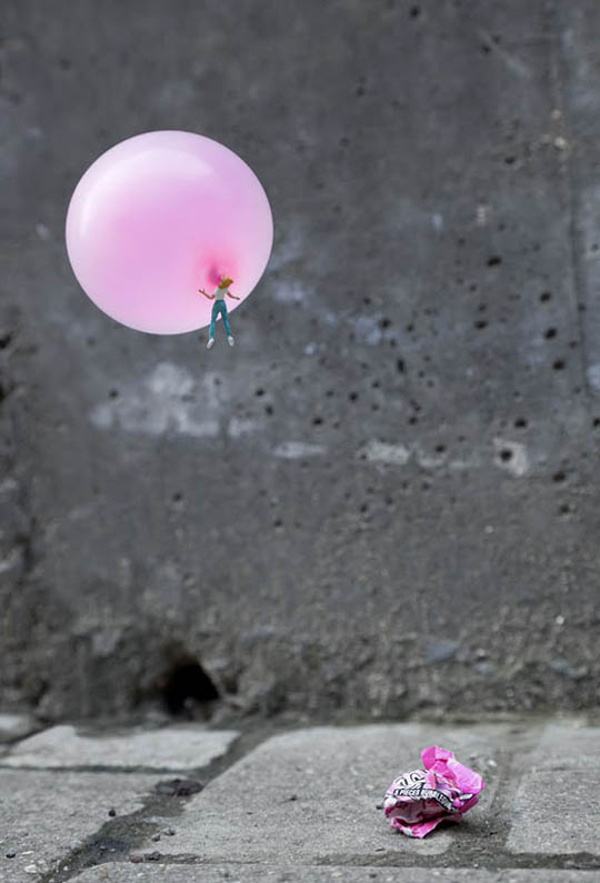
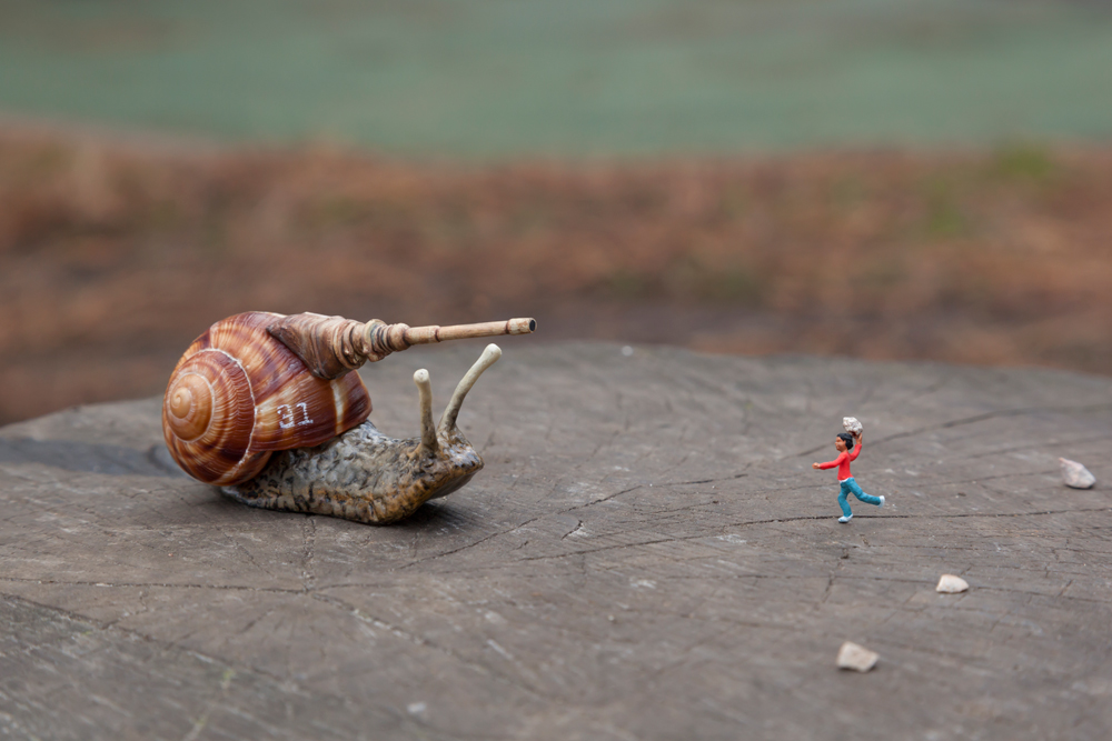
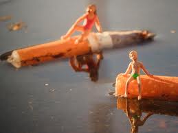
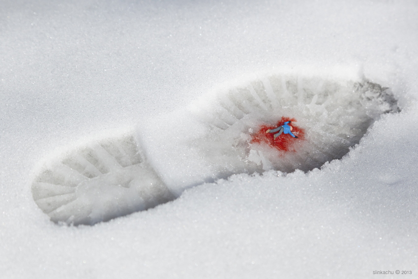
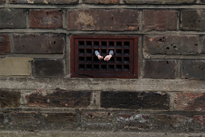
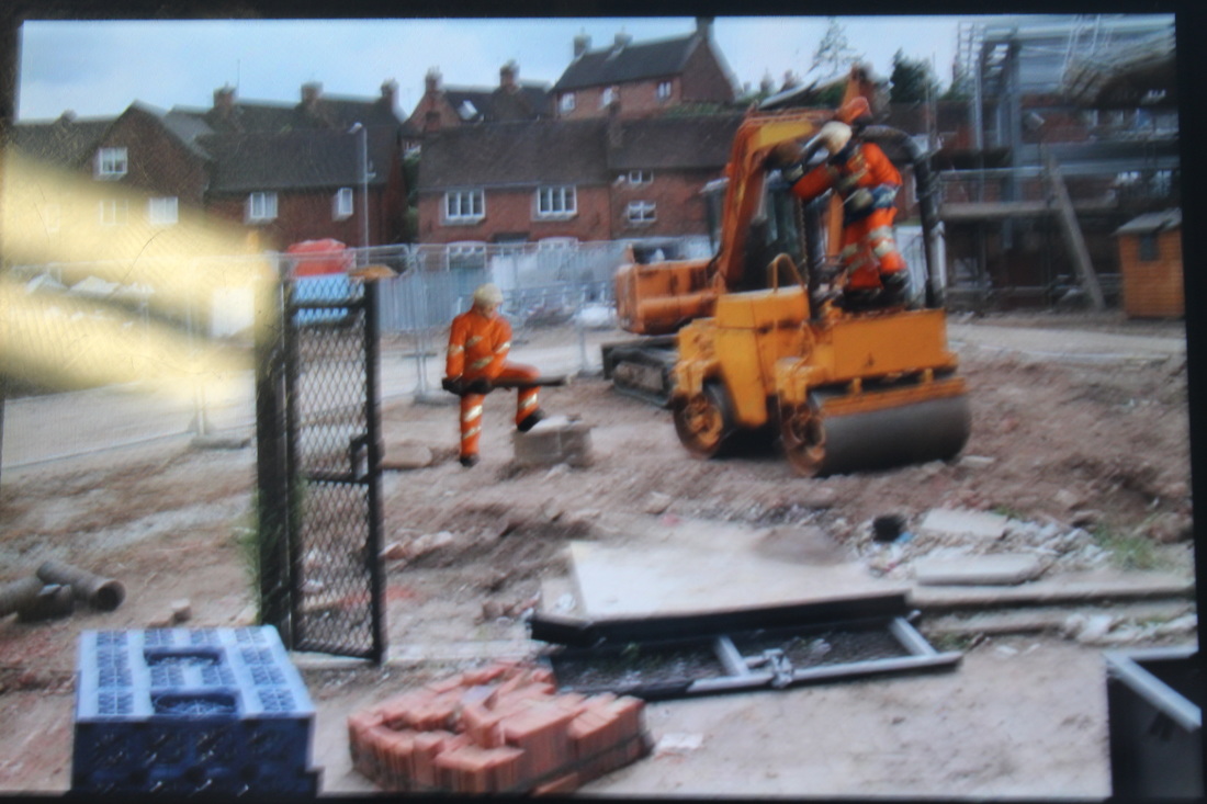
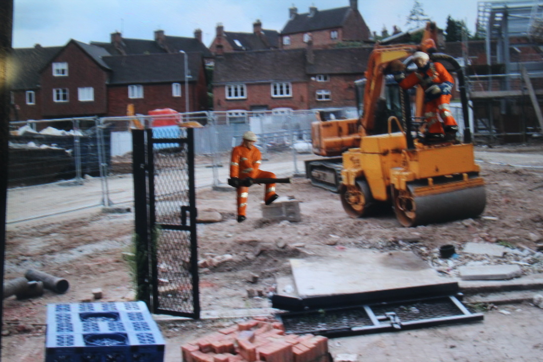
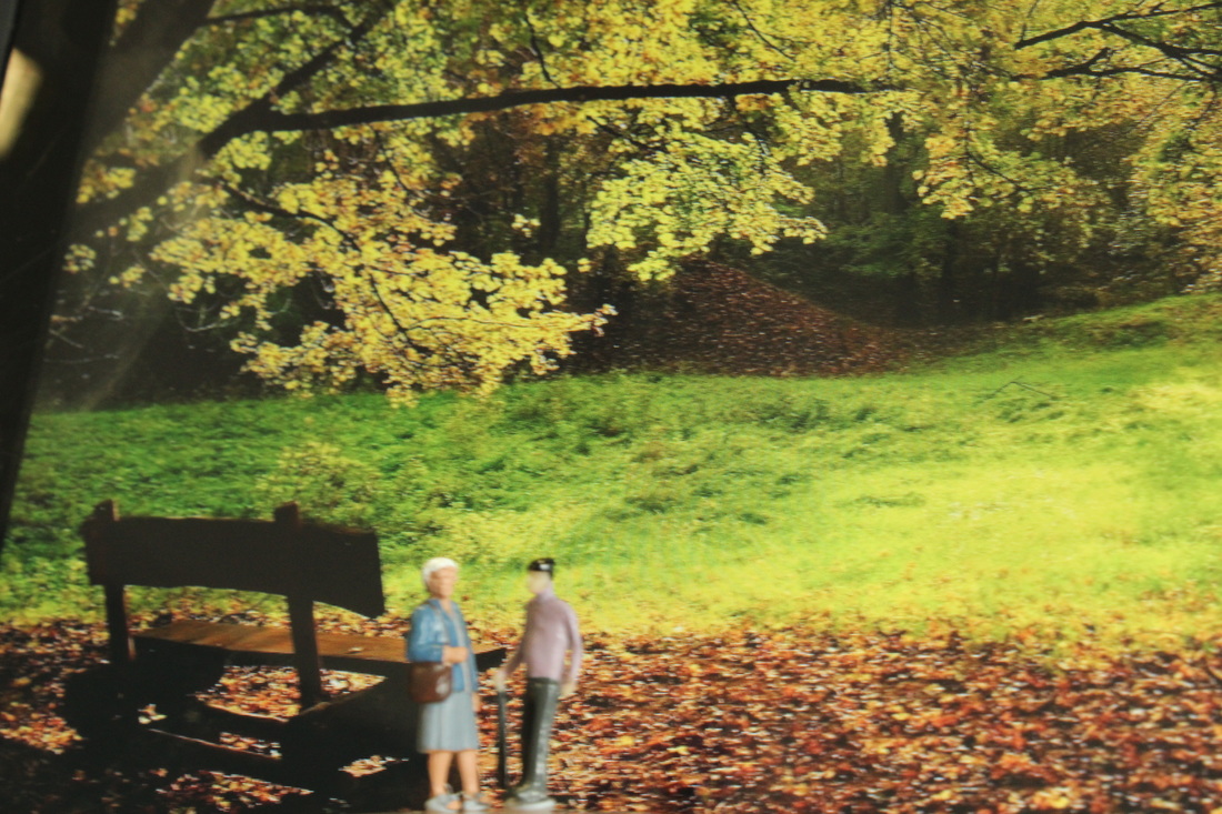
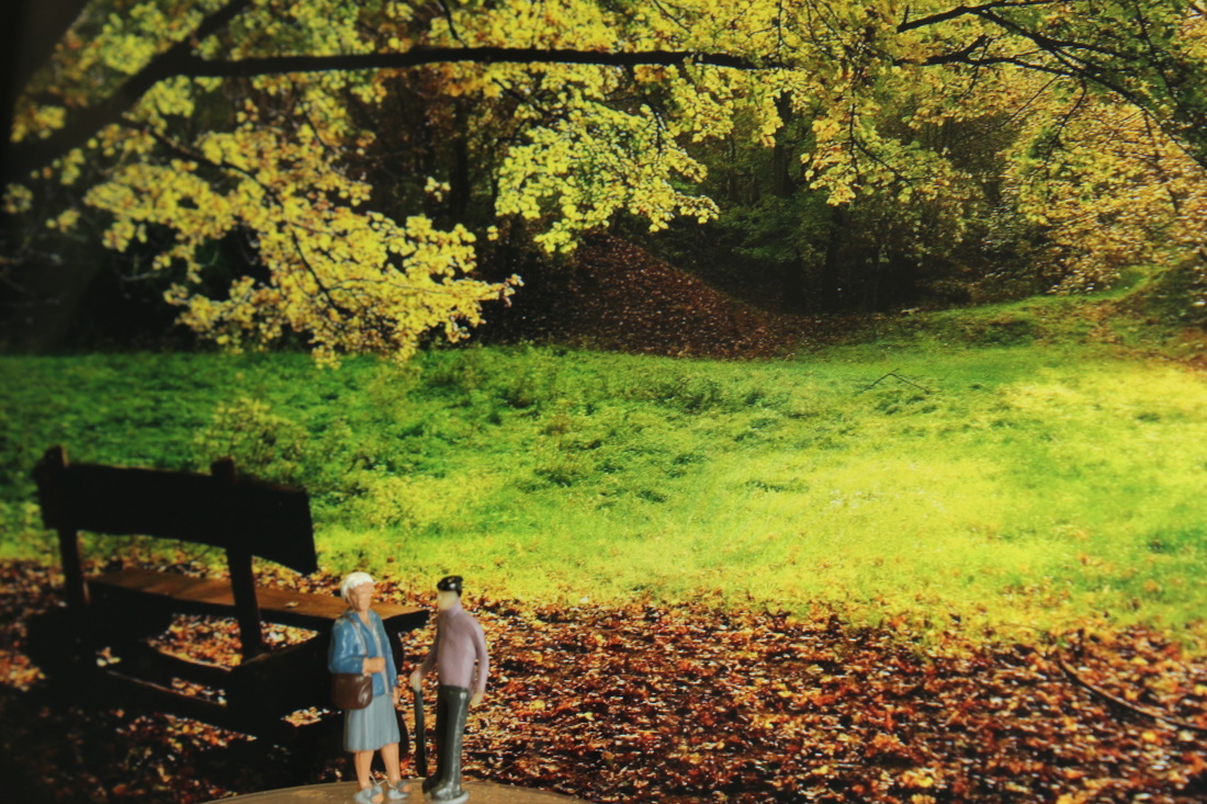
My favourite slinkachu images are listed below, in my opinion they're his best ones because of the angle and the props which he used during the shoot.
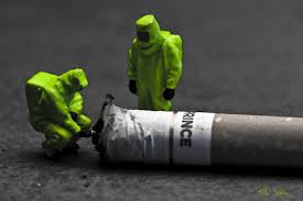

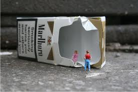
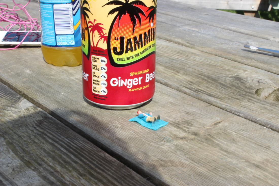
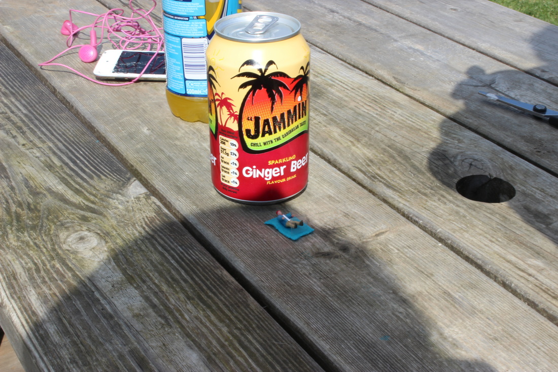
The one with the cigarette is my favourite because the story that its telling is that cigarettes are harmful. Due to the safety suits and one of the figures 'dissecting' the cigarette its showing the fact that smoking is harmful and can cause damage. Also the angle is taking the image from is good because you can see what the figures are doing rather then having it at a birds eye view and only see it from a far,not actually seeing the point of the image.
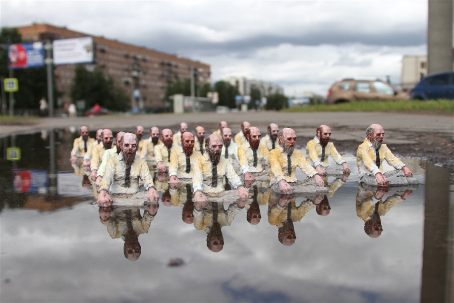
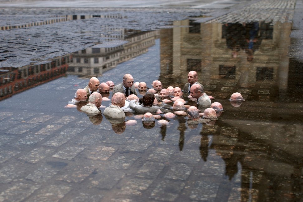
There are other photographers that also do work like slinkachu such as
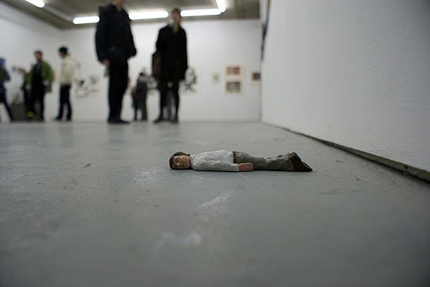
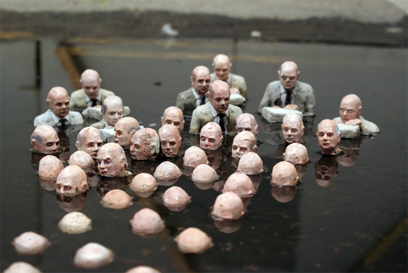
Isaac Cordal, however his images are more sinister and gruesome. Personally I prefer Cordal's work because it's more dark.
Isaac Cordal, however his images are more sinister and gruesome. Personally I prefer Cordal's work because it's more dark.
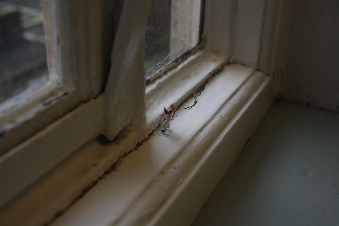
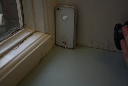
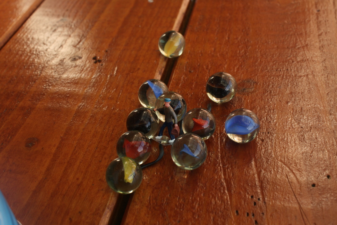
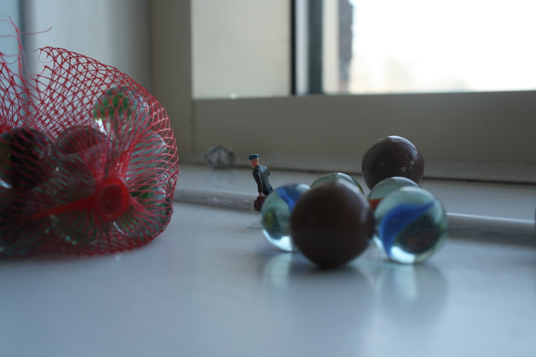
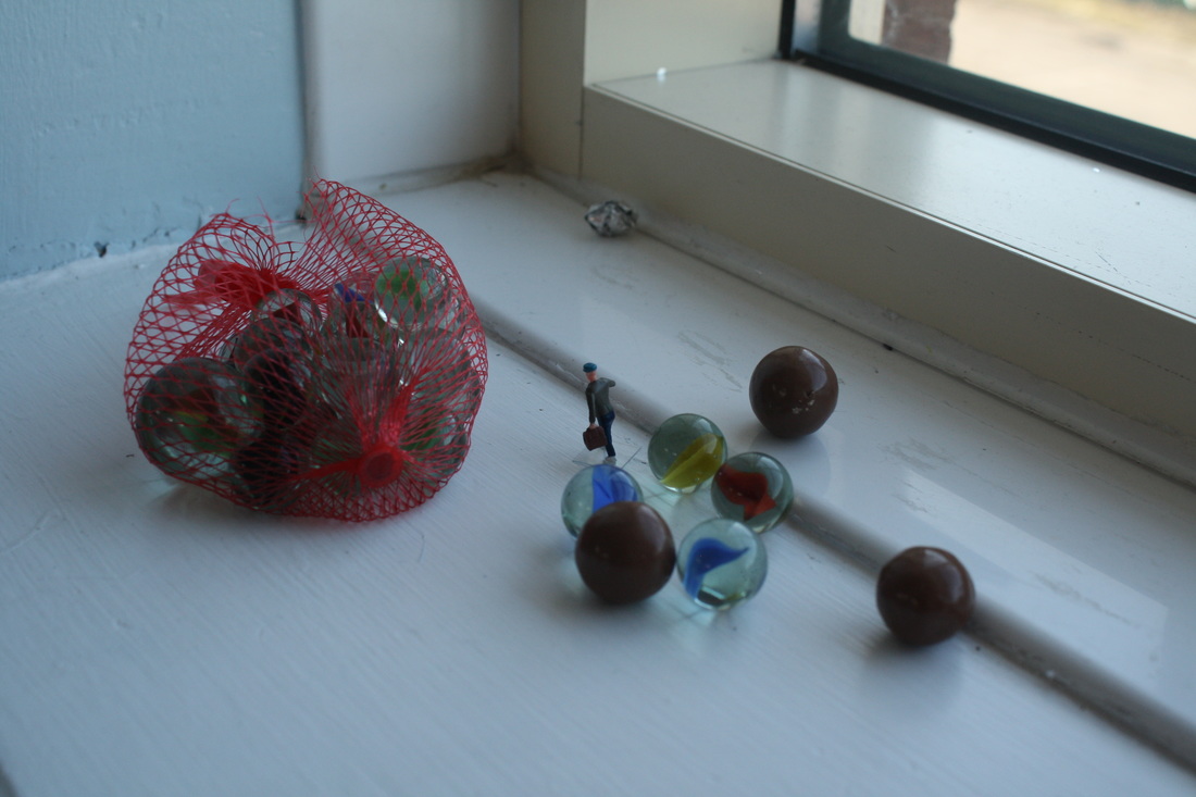
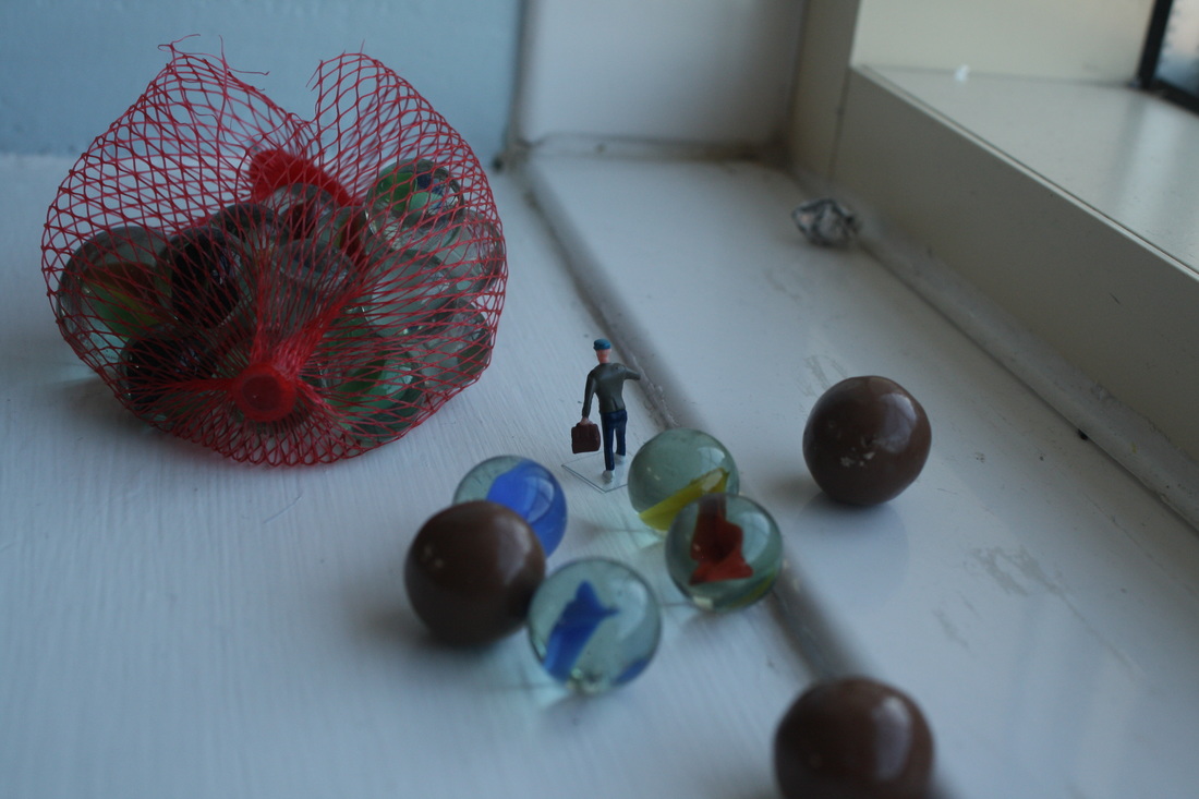
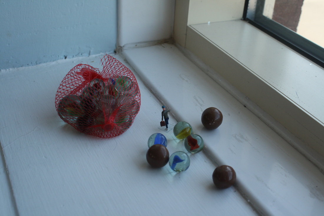
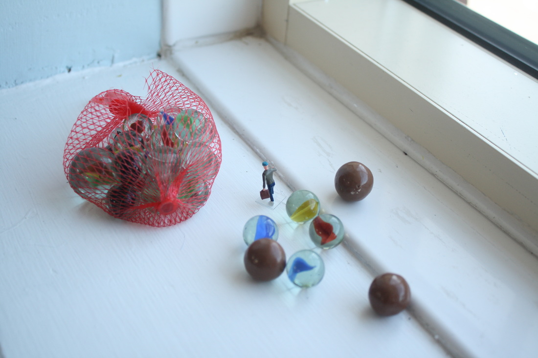
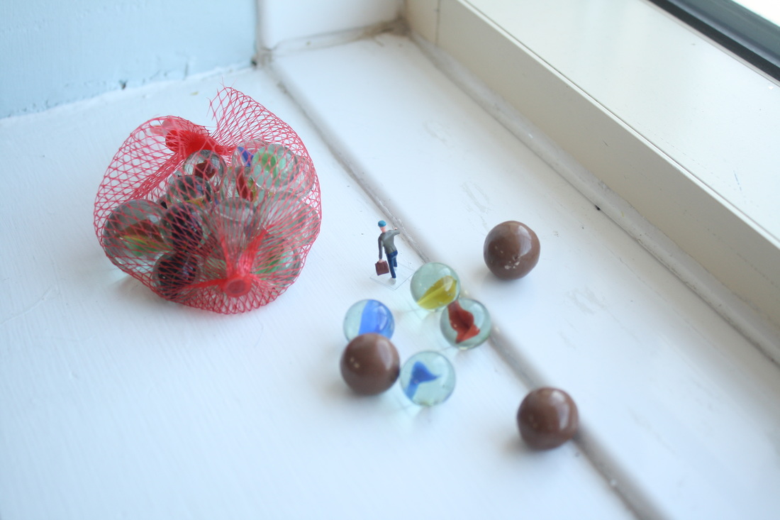
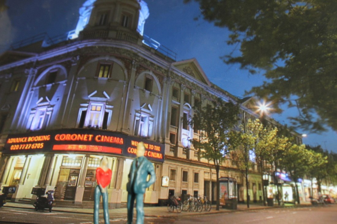
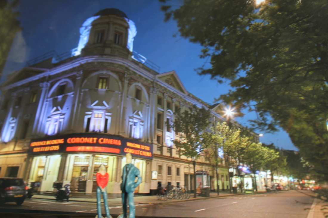
During the slinkachu shoot I tried to make them as similar to his as possible but at the same time adding my own ideas to it.
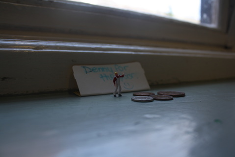
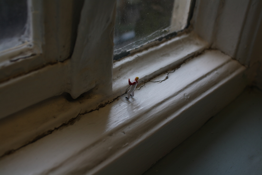
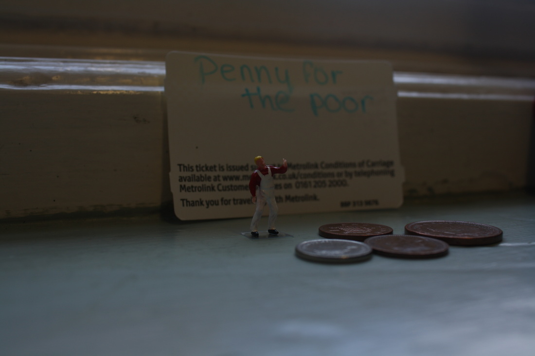
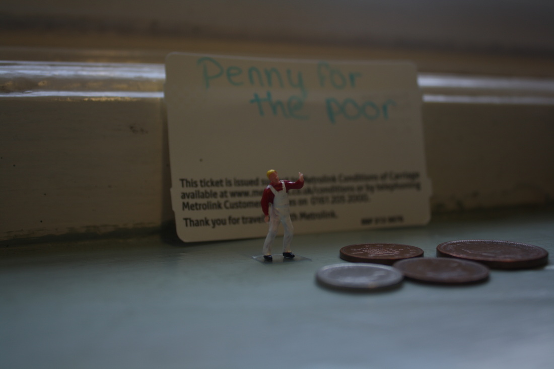
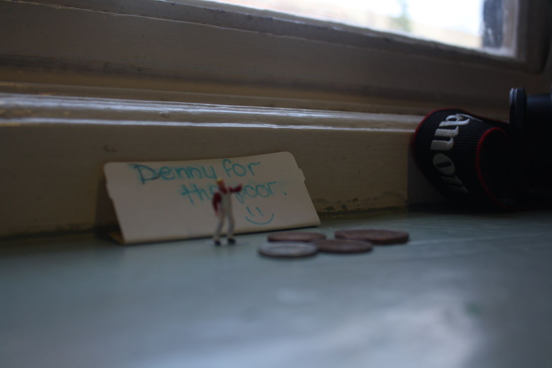
This image was taken in the same way as one of slinkachus pictures, similarities are the beggar and the change on the window sill,however the signs read a different message and the background is different.
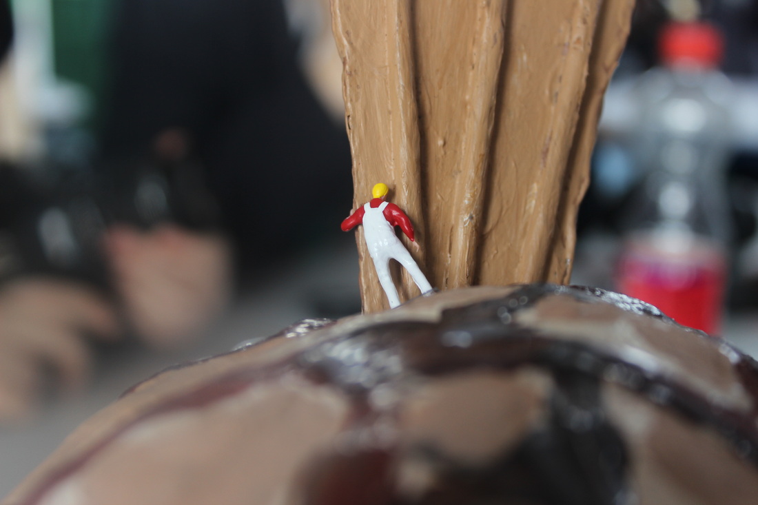
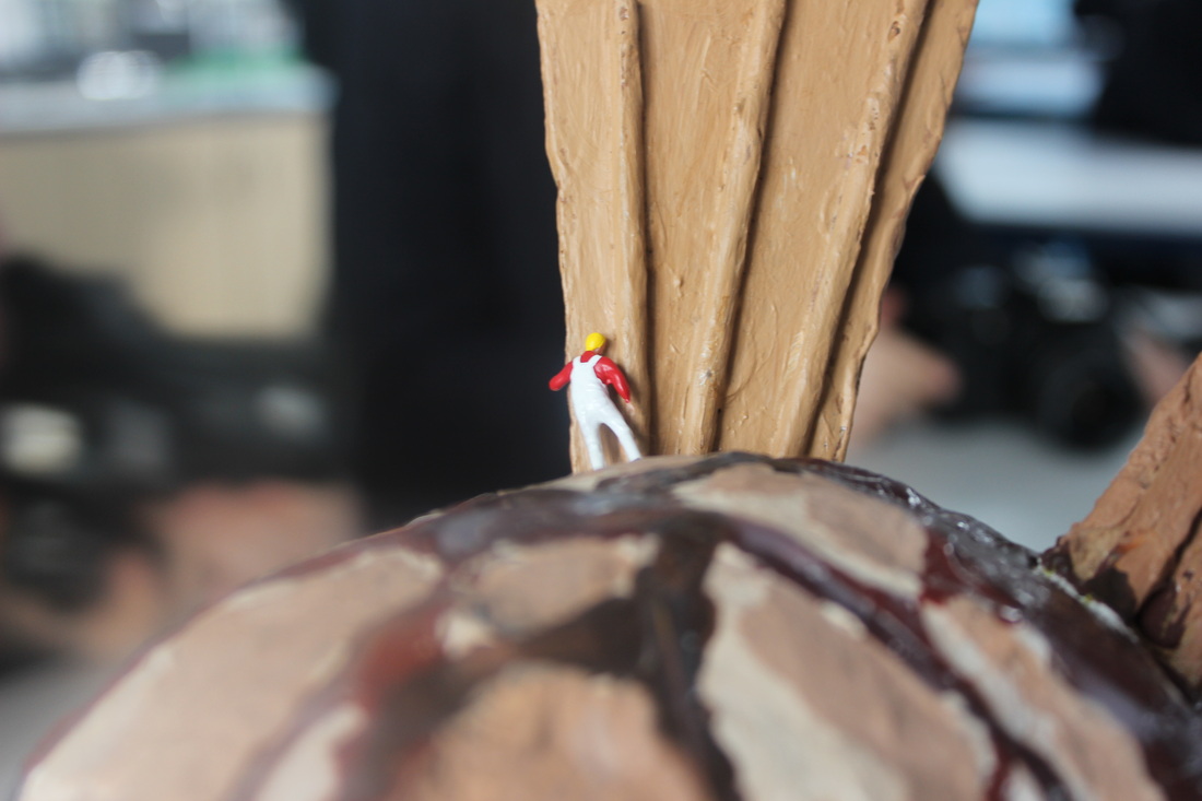
First shoot
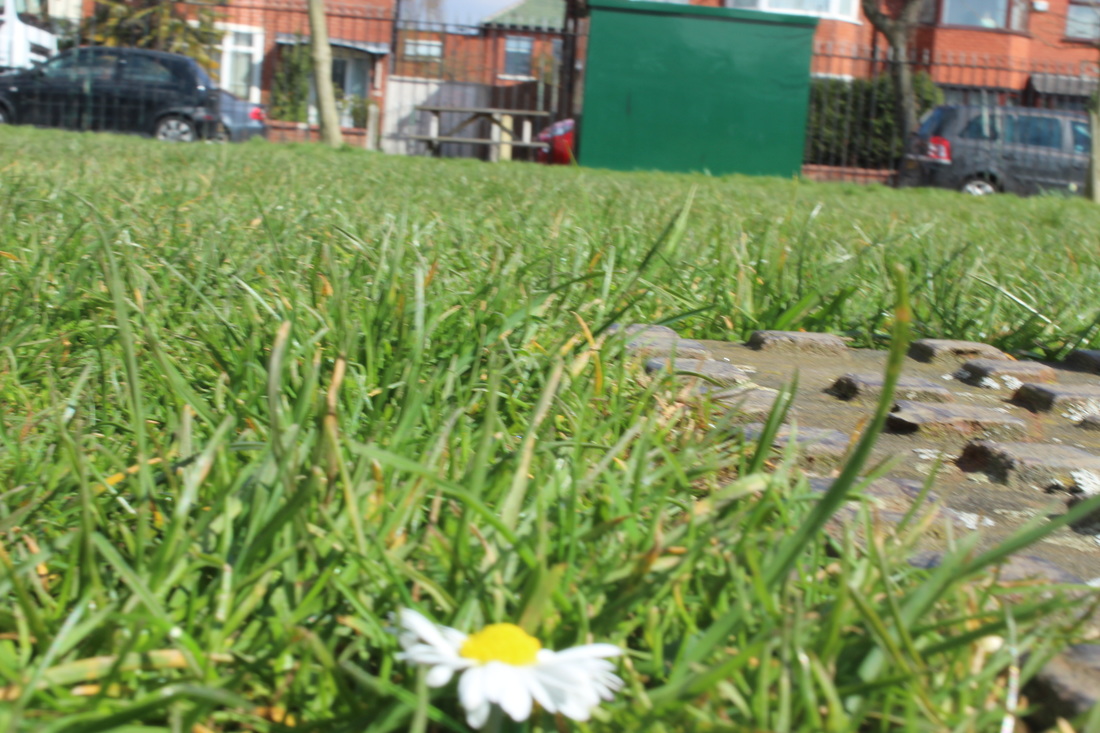
The first shoot was my worst shoot because I kept on capturing the figures stand in the images. Plus most I feel like in most of them the shot was to far away.
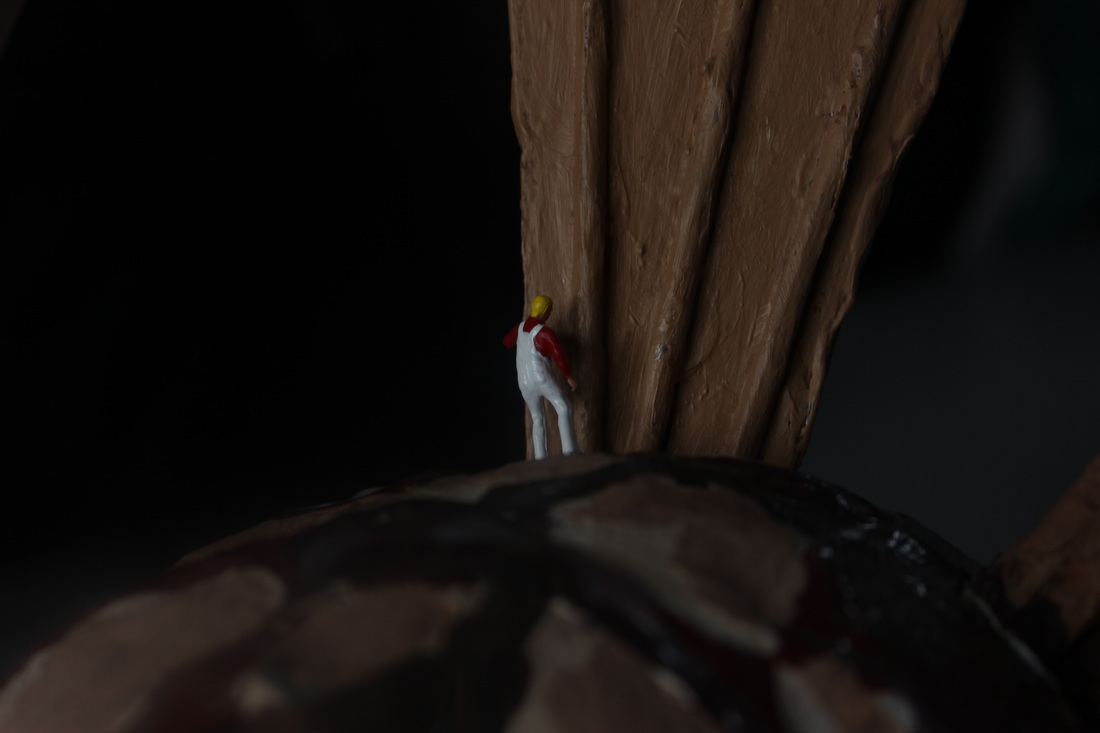
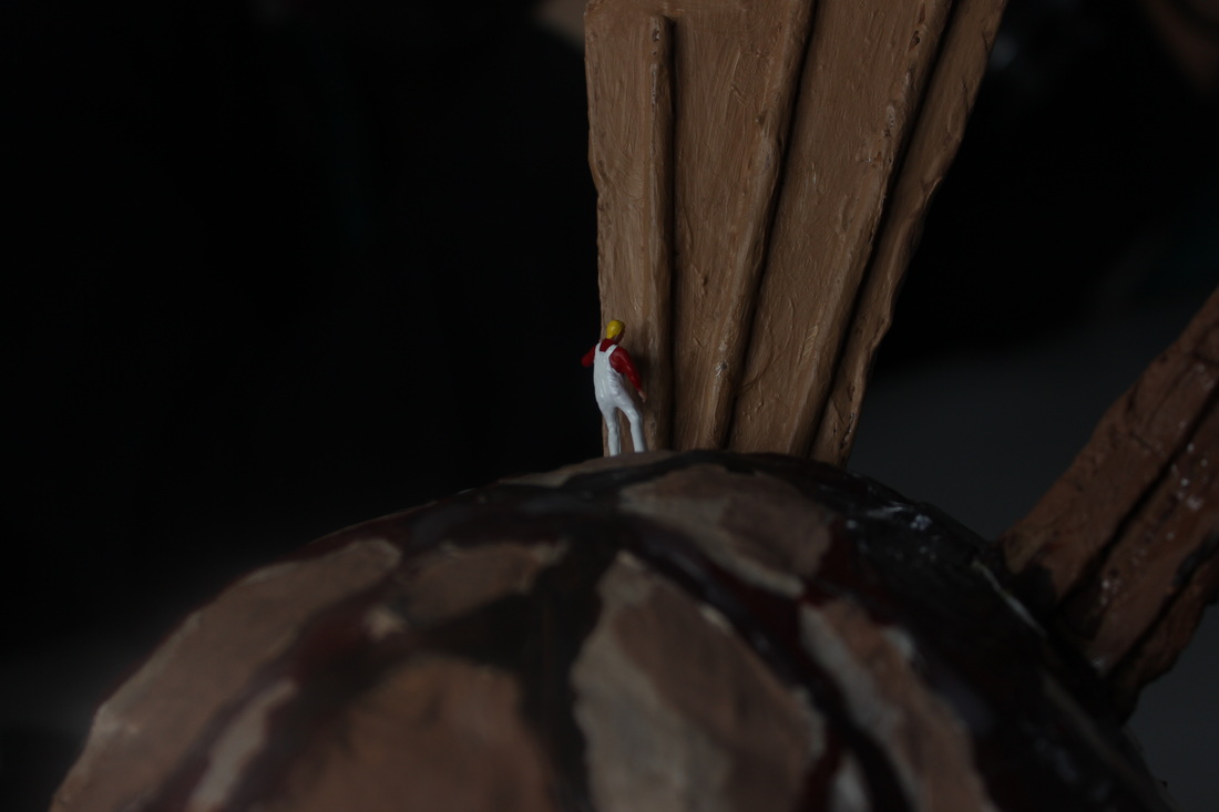

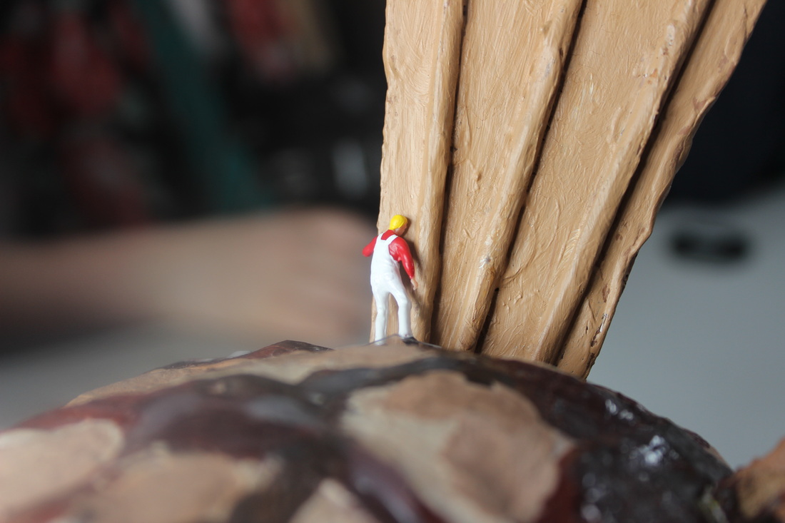
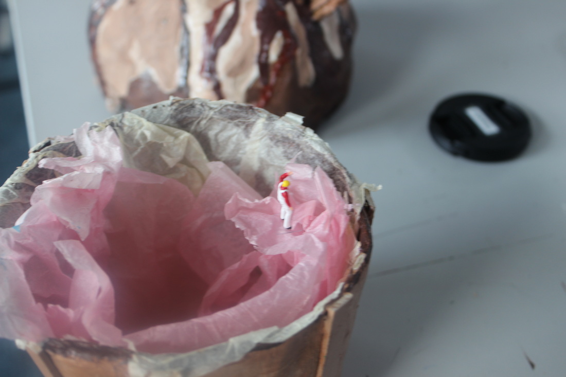

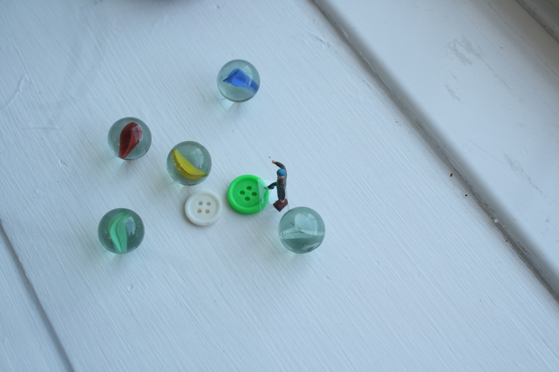
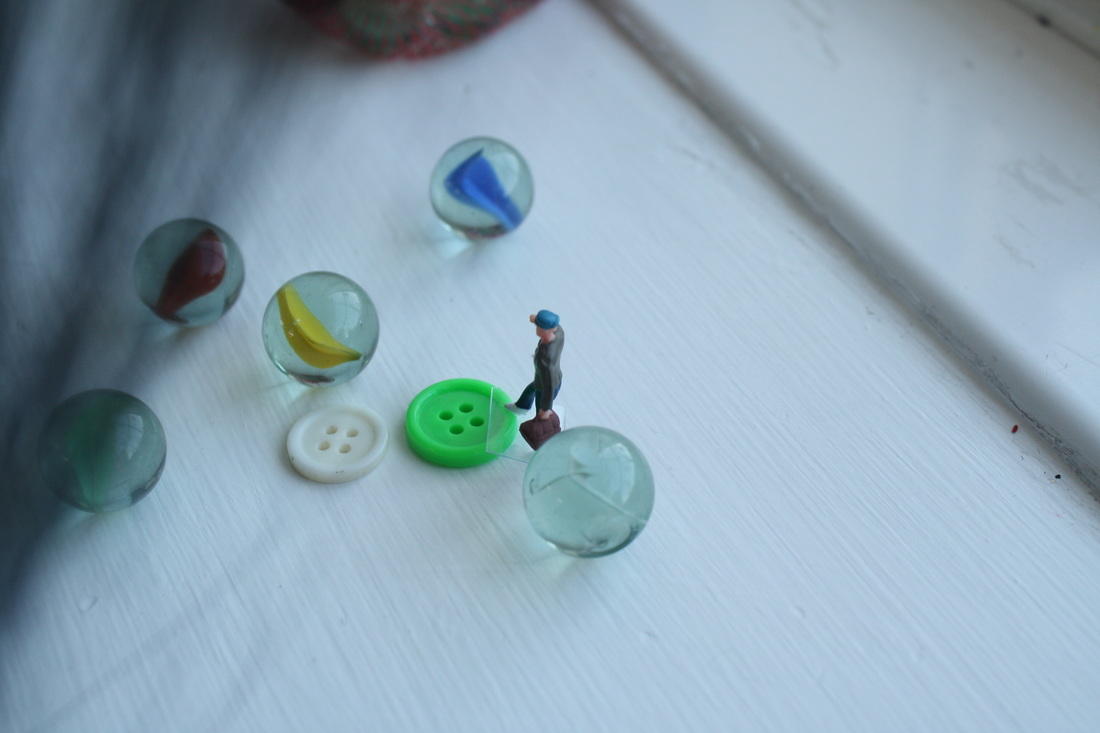
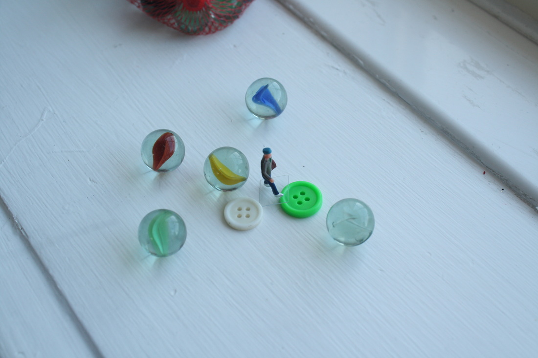
Best shot
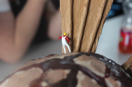
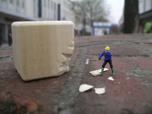
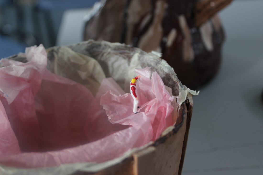
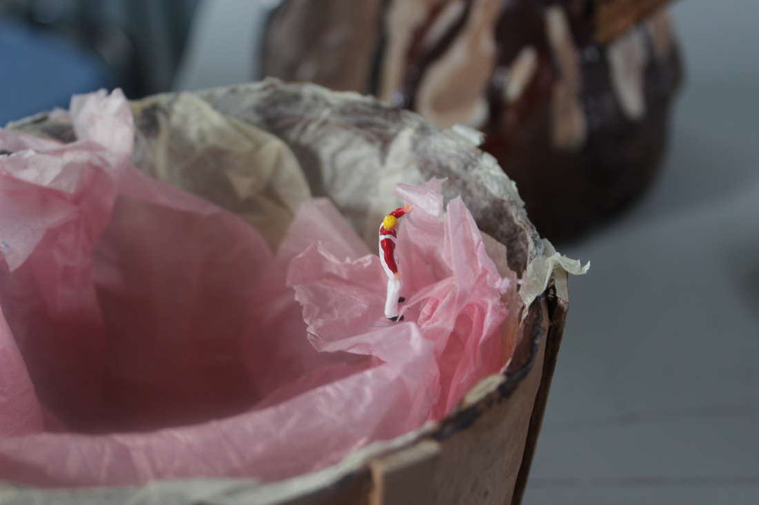
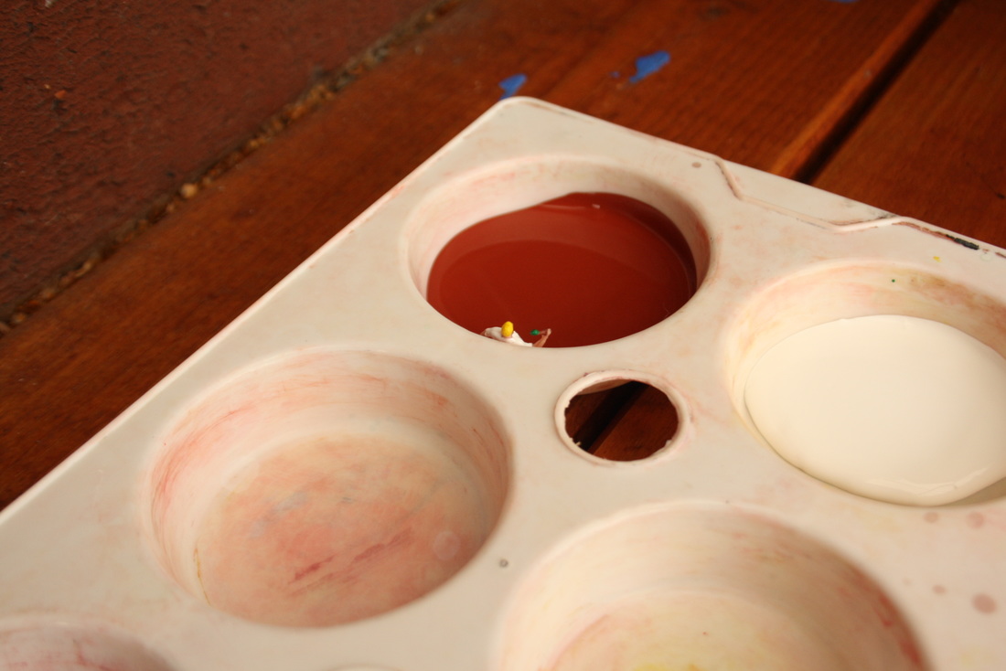
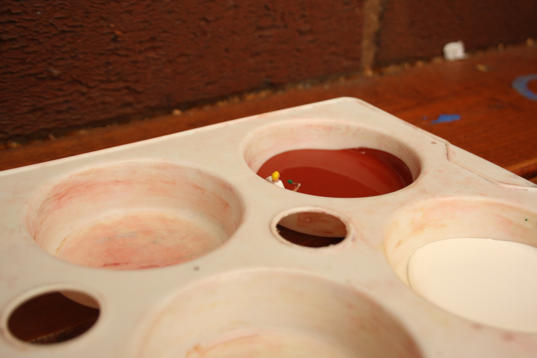
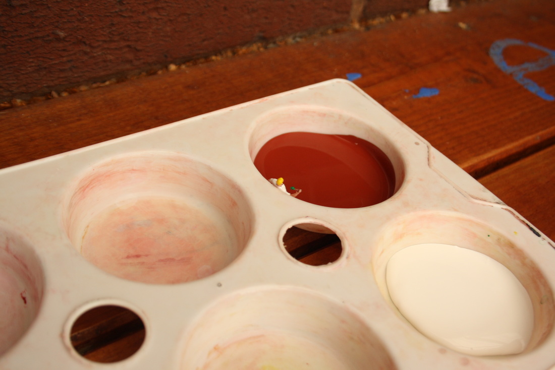
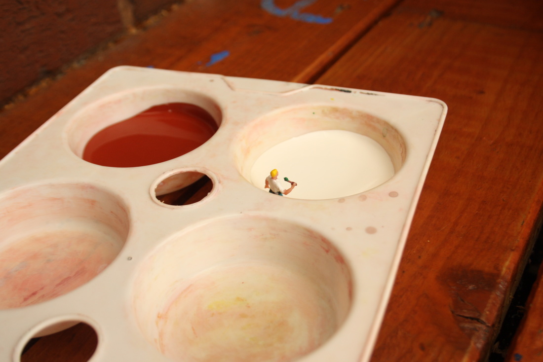
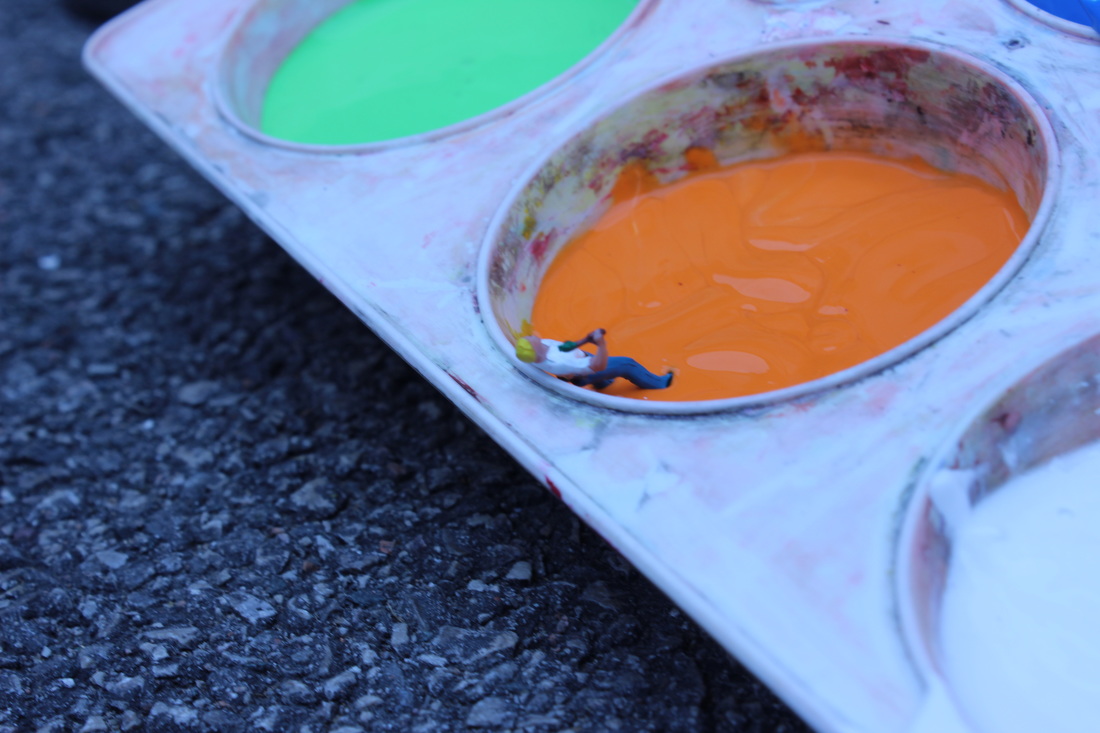
This image has a small depth of field causing the focus point to be on the miniature
figure causing the background to be out of focus,like every other slinkachu picture.The figure looks as if he is painting the cardboard wafer which is what he was meant to look like.This picture would look better if I took it from a higher viewpoint making the figure look smaller and the wafer look bigger.
figure causing the background to be out of focus,like every other slinkachu picture.The figure looks as if he is painting the cardboard wafer which is what he was meant to look like.This picture would look better if I took it from a higher viewpoint making the figure look smaller and the wafer look bigger.
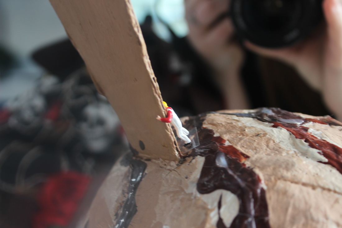
Worst shot
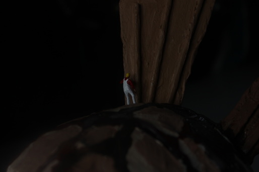
The photo is slightly out of focus which means my focus point is not in the correct place. The exposure is too dark which means I need to enlarge the aperture to allow more light in.
There is no story behind this picture I didn't think the shoot through. The lighting is too dark, needed to change the exposure. The image is not in focus , indicates camera shake or focus point is not in the correct place. Someone's hand is also in the shot, I took the picture at the wrong time.
second shoot
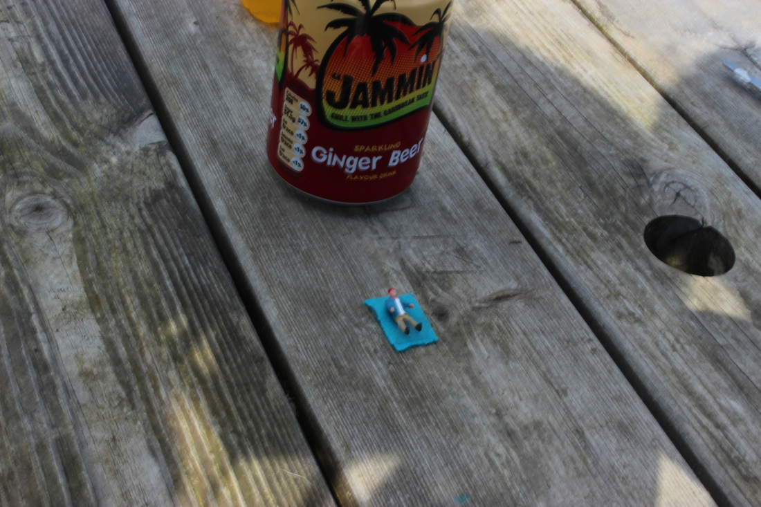
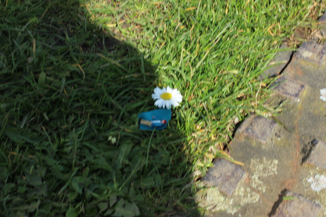
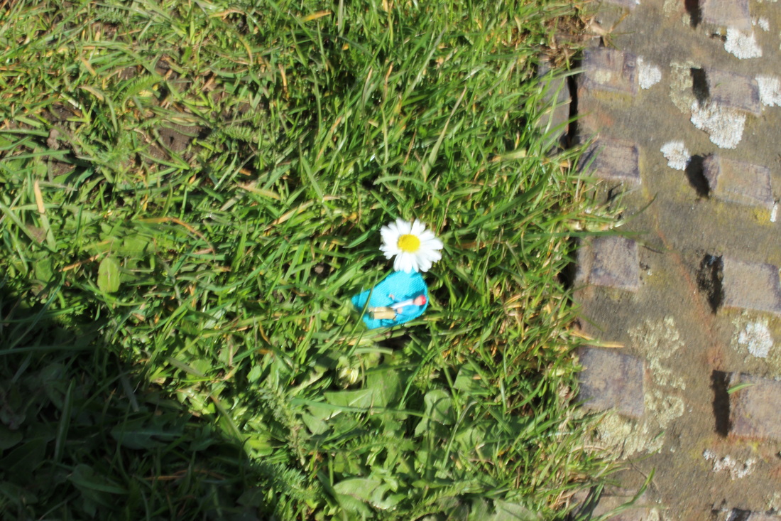

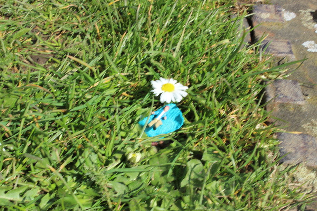
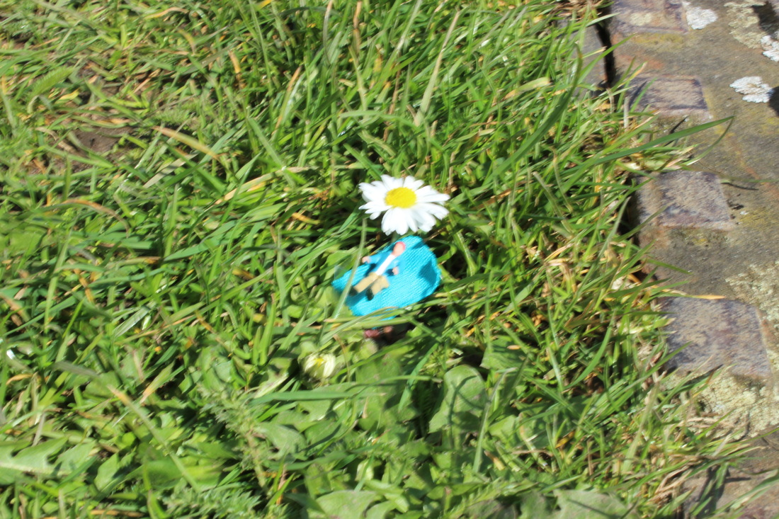
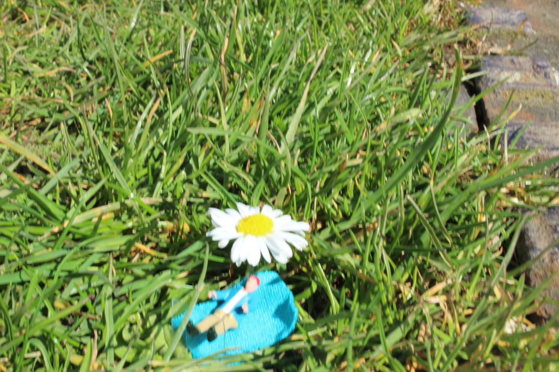
bEST SHOT
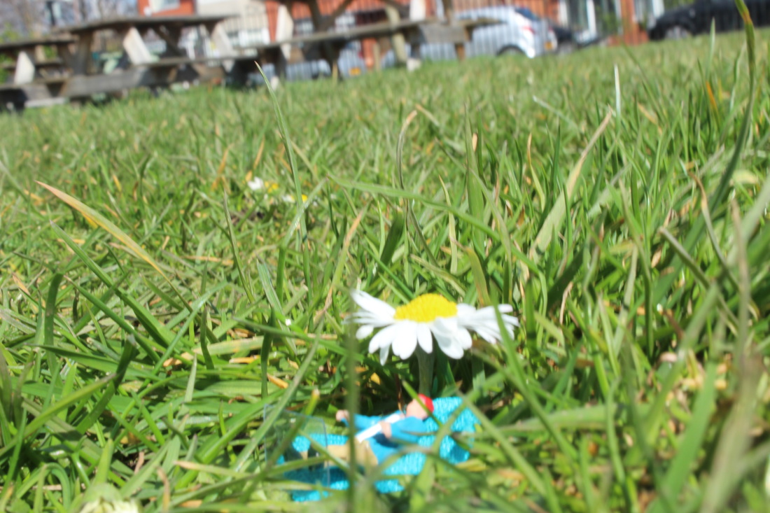
Although the exposure is quite bright, personally I
think this is my best shot from my second shoot.
Based on how well the photo works with the background,the daisy as an umbrella and the
miniature figure sunbathing. I think this is more in
the style of slinkachu. The way the grass grows over
the top of the figure and looks tall captures the size of
the figure.
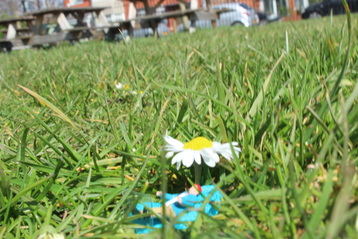
worst SHOT

It is over exposed therefore causing it to be
too bright and ruin the picture. The exposure
needs to be smaller so it allows less light in. I also
need a smaller depth of field because there is no
focus point, the depth of field is too large causing everything to be in focus.
too bright and ruin the picture. The exposure
needs to be smaller so it allows less light in. I also
need a smaller depth of field because there is no
focus point, the depth of field is too large causing everything to be in focus.
Completely out of focus, indicates that I had really
bad camera shake also the exposure's bright
therefore the aperture needs to be smaller to allow
less light, large depth of field needs to be a lot
smaller to actually have a focus point.
bad camera shake also the exposure's bright
therefore the aperture needs to be smaller to allow
less light, large depth of field needs to be a lot
smaller to actually have a focus point.
third shoot


|
|

|
|
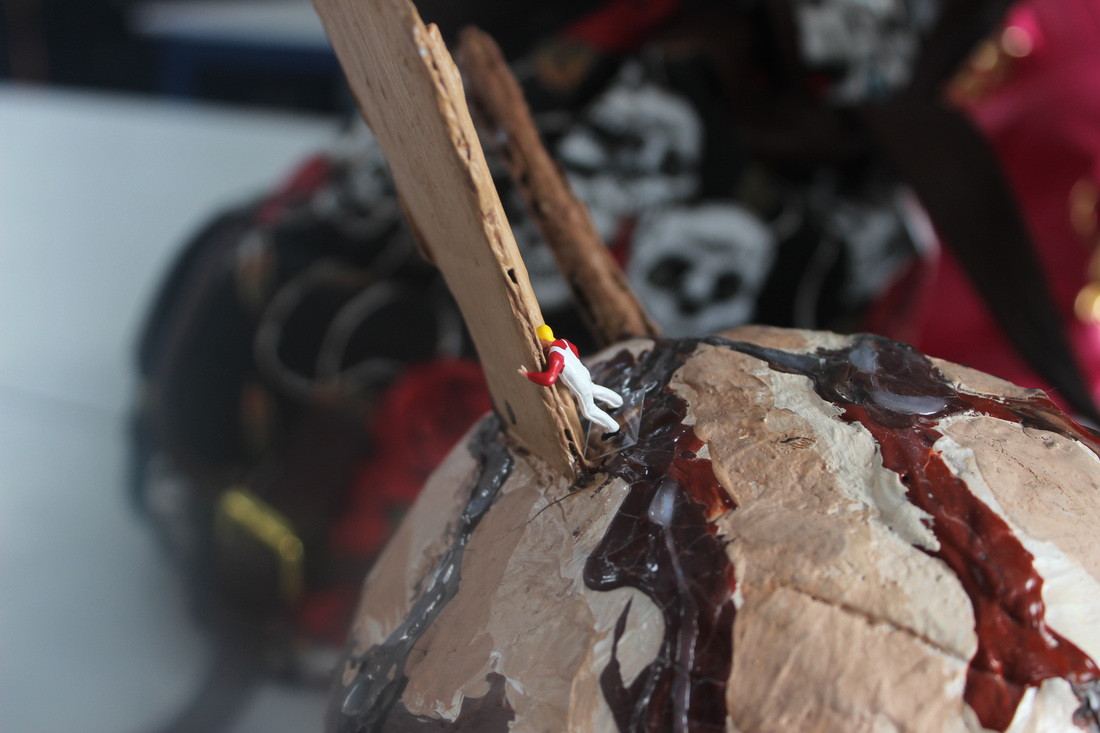
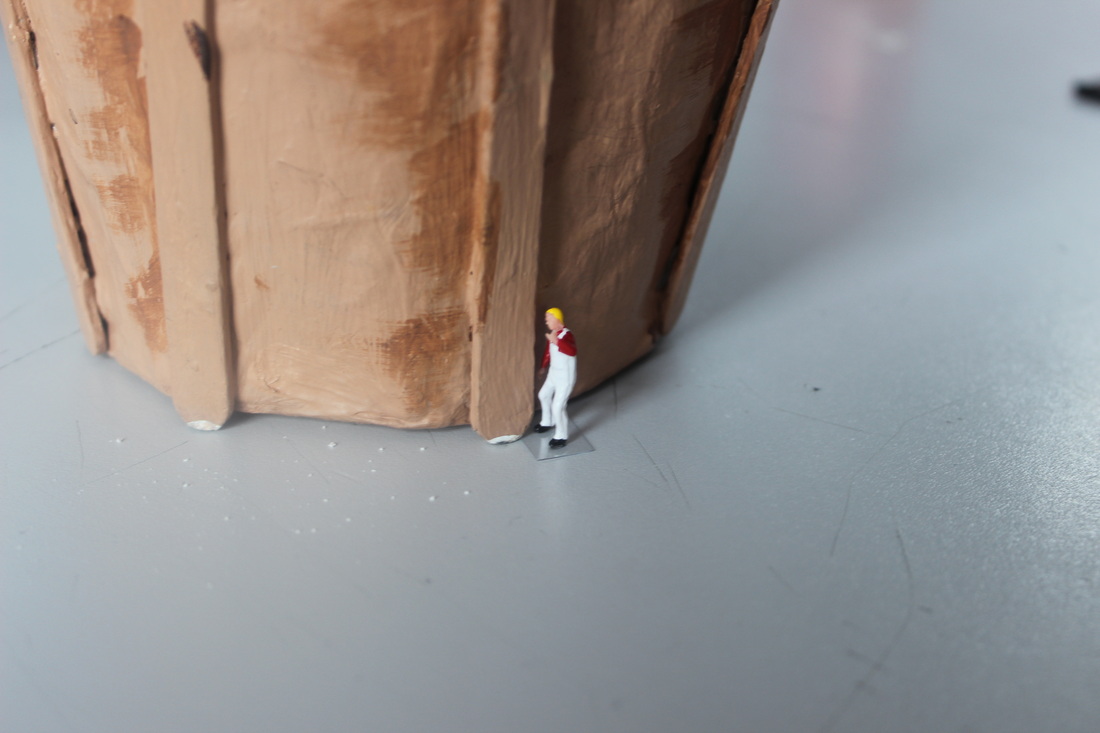
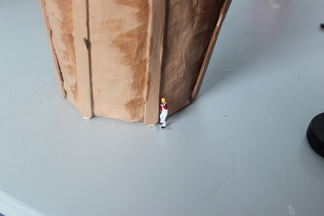
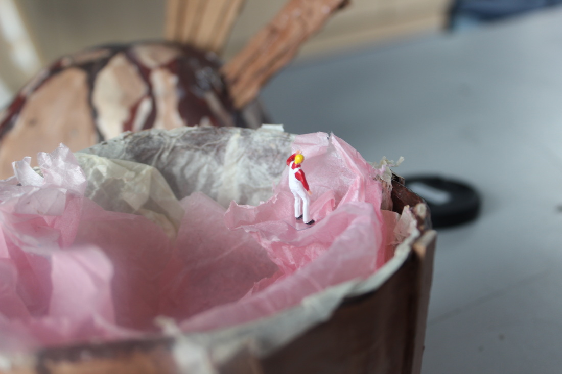
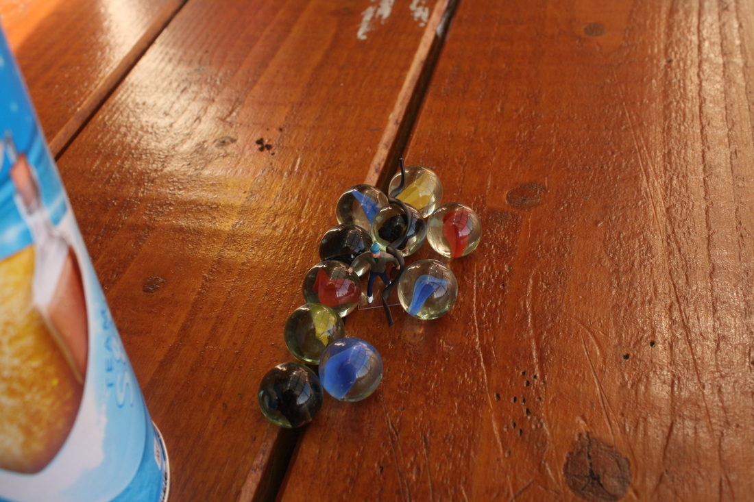
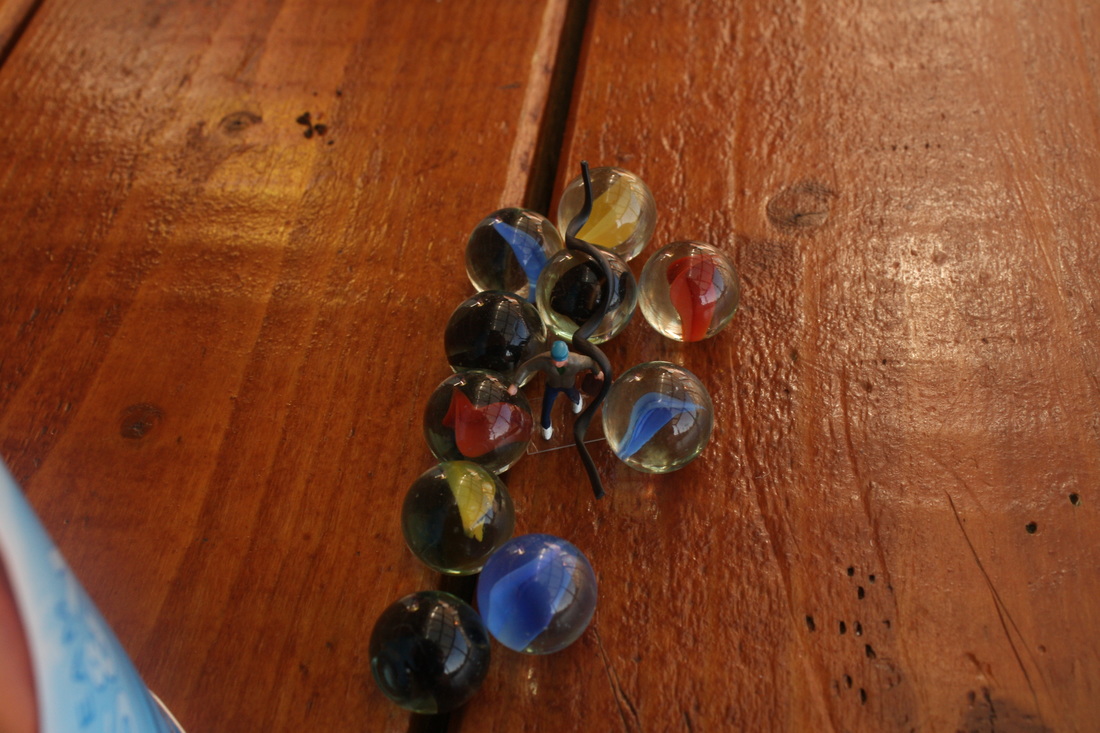
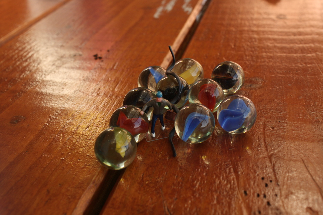
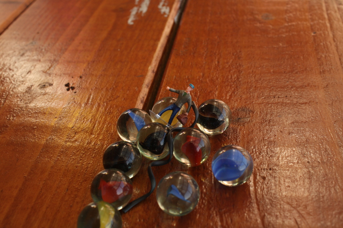
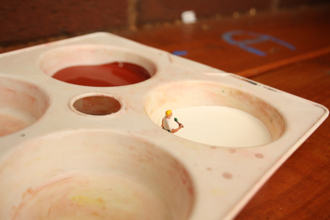
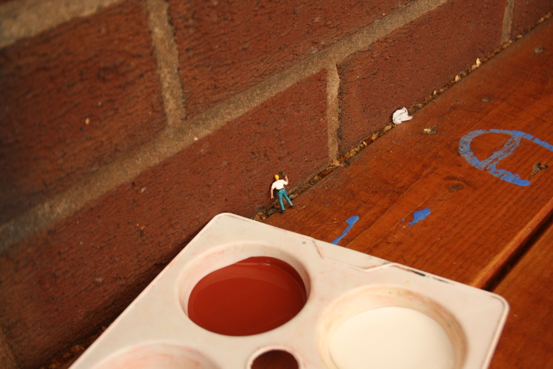
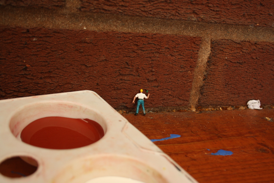
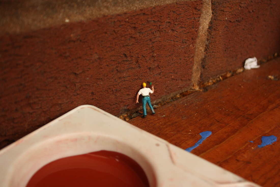
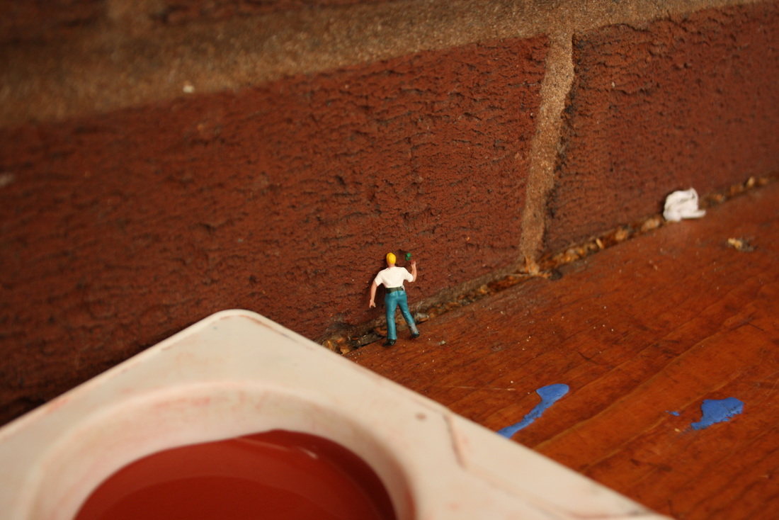
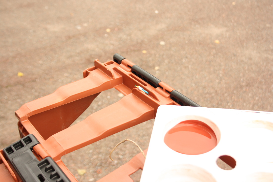
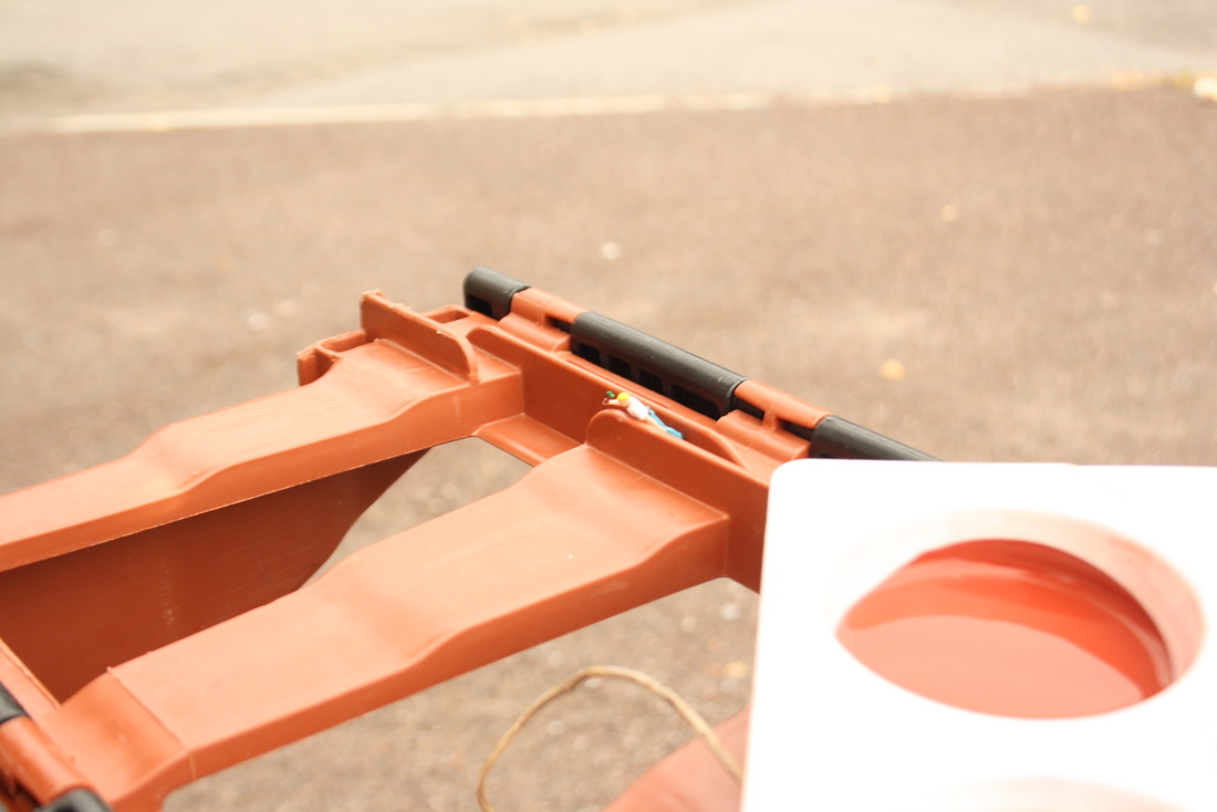
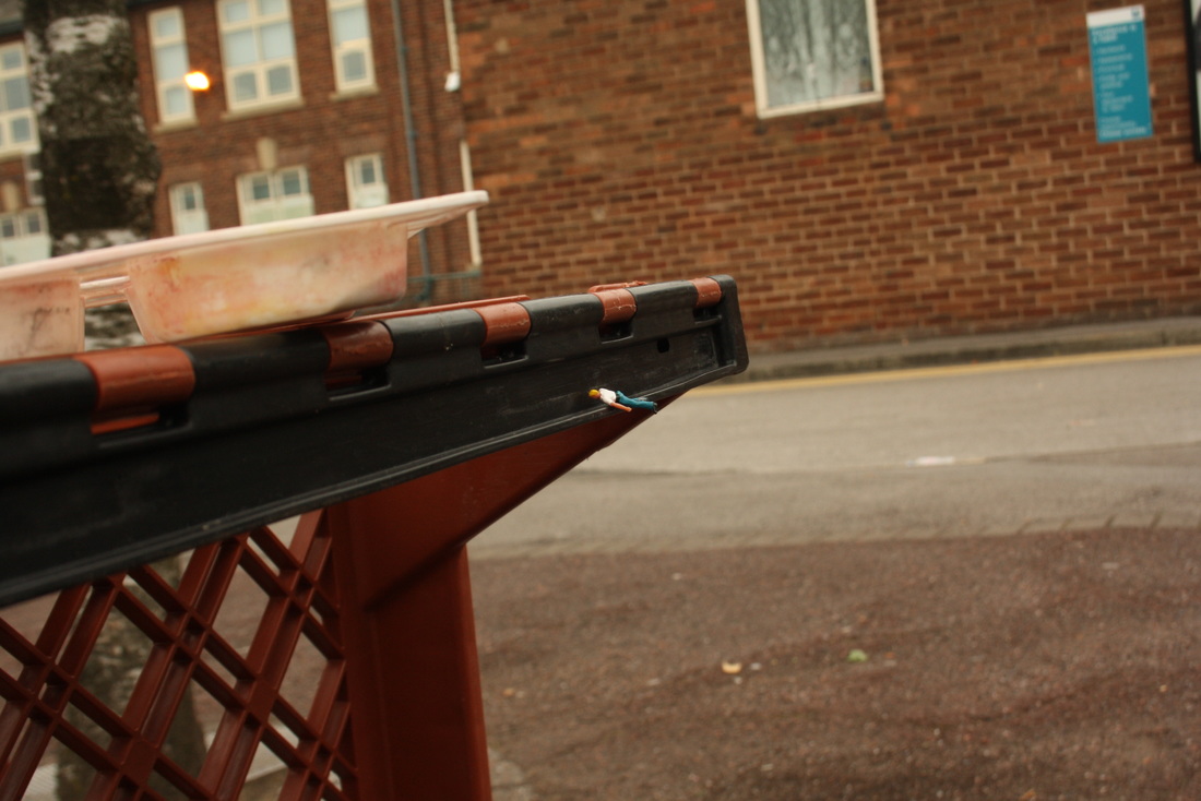
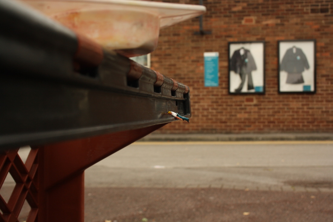
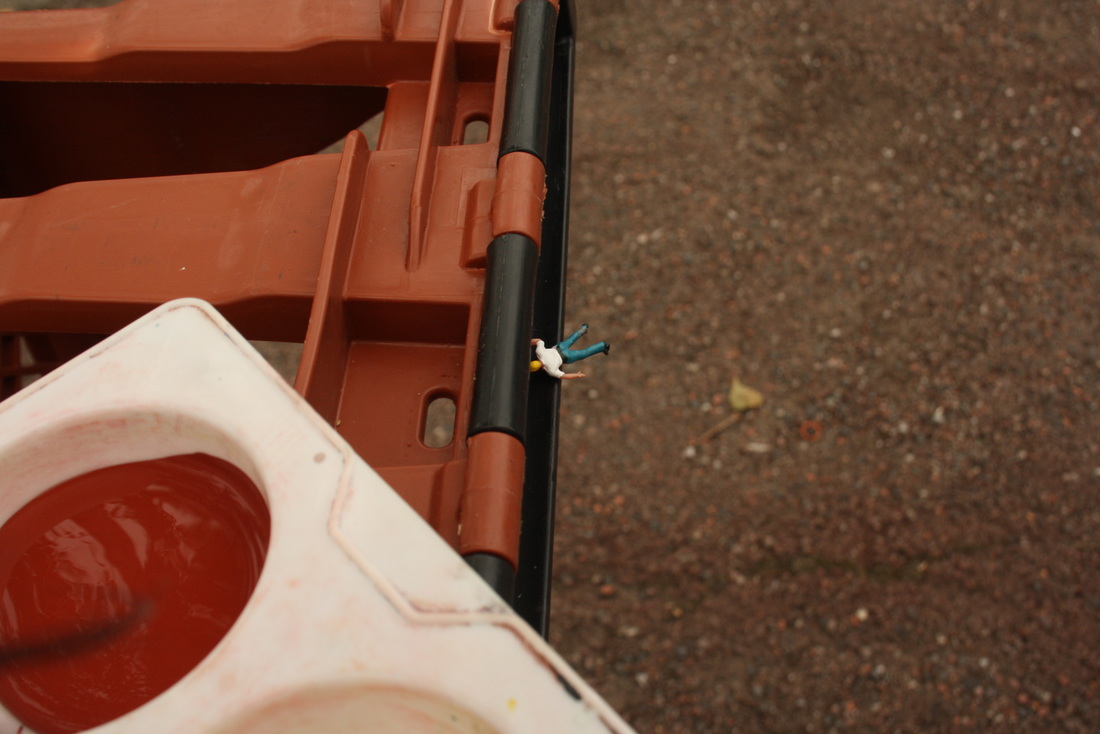
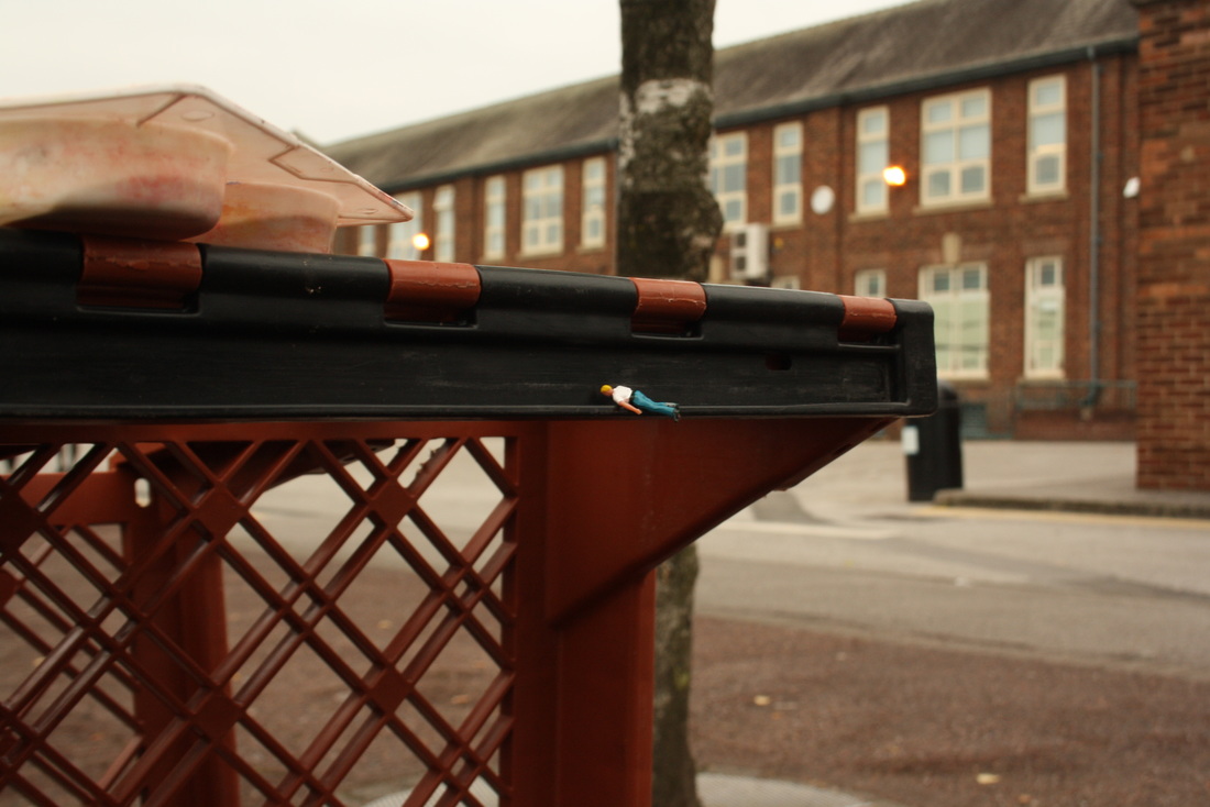
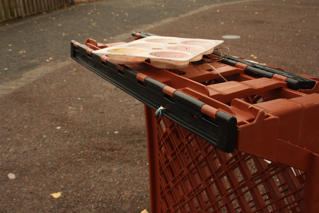
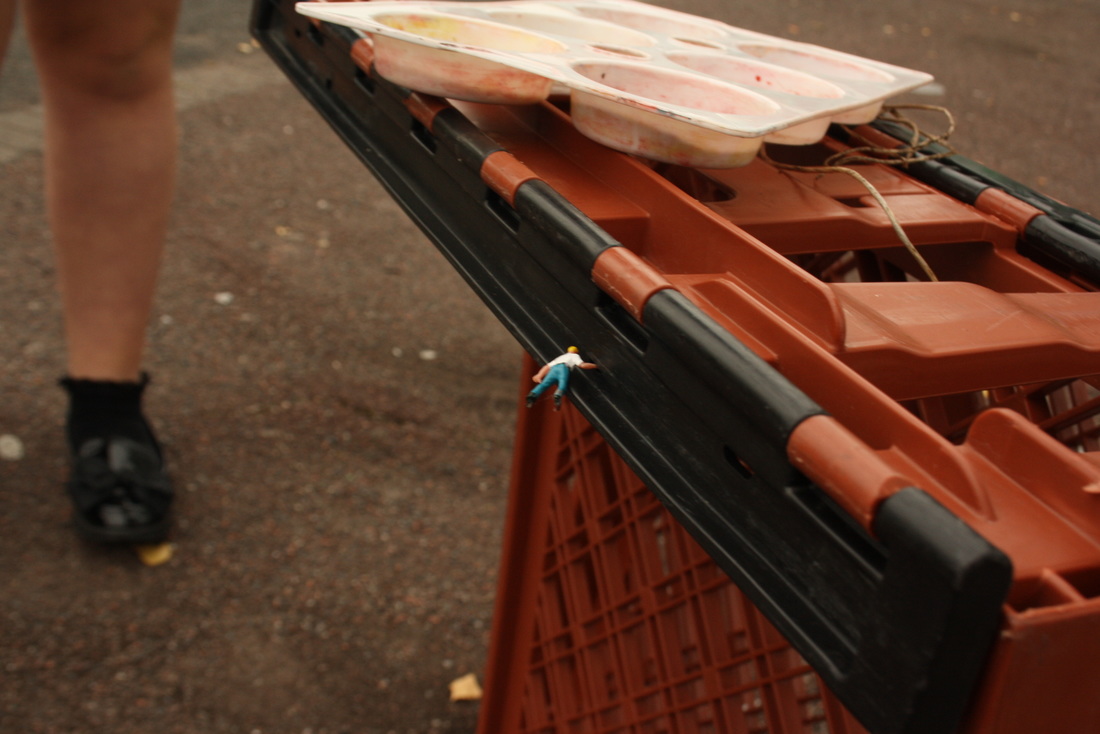
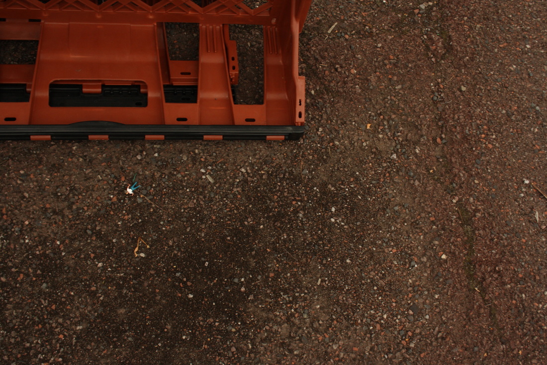
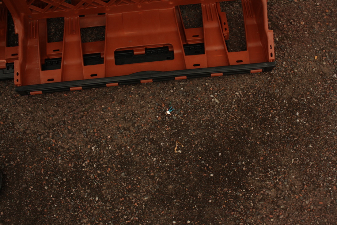
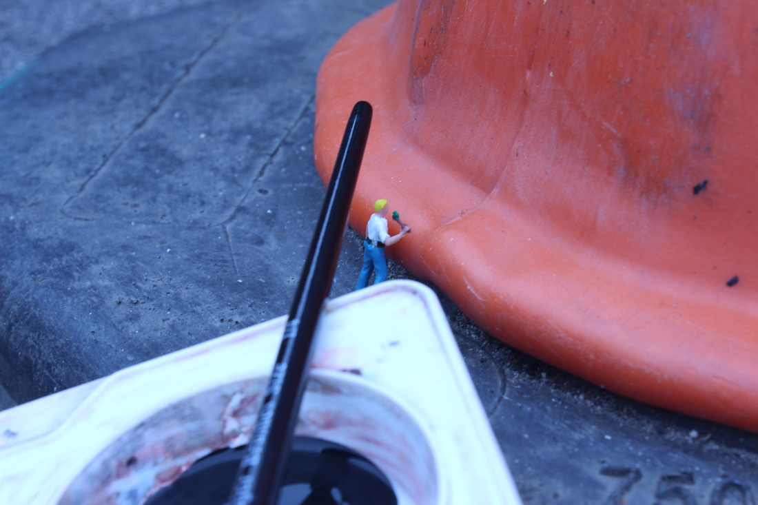
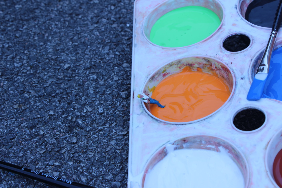
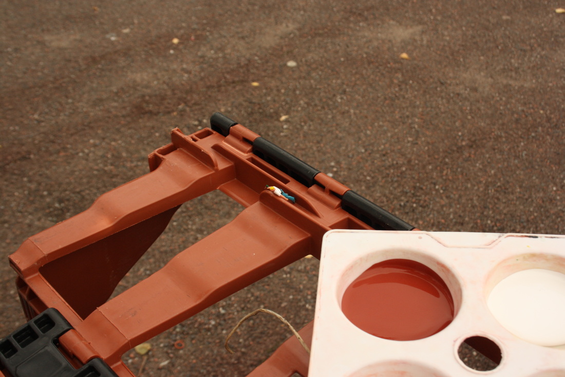
I attempted to make a story with the miniature figure and the crate.
The figure I chose was a painter, on the first image he is painting the crate,
accidentally falls and eventually ends up dying. With this shoot it lead to documentary photography as well as slinkachu because of the story it tells.
The figure I chose was a painter, on the first image he is painting the crate,
accidentally falls and eventually ends up dying. With this shoot it lead to documentary photography as well as slinkachu because of the story it tells.


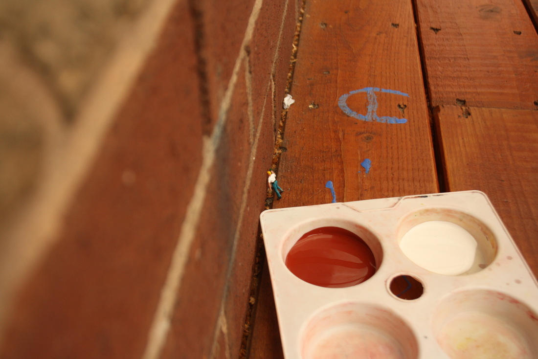
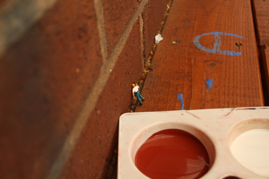
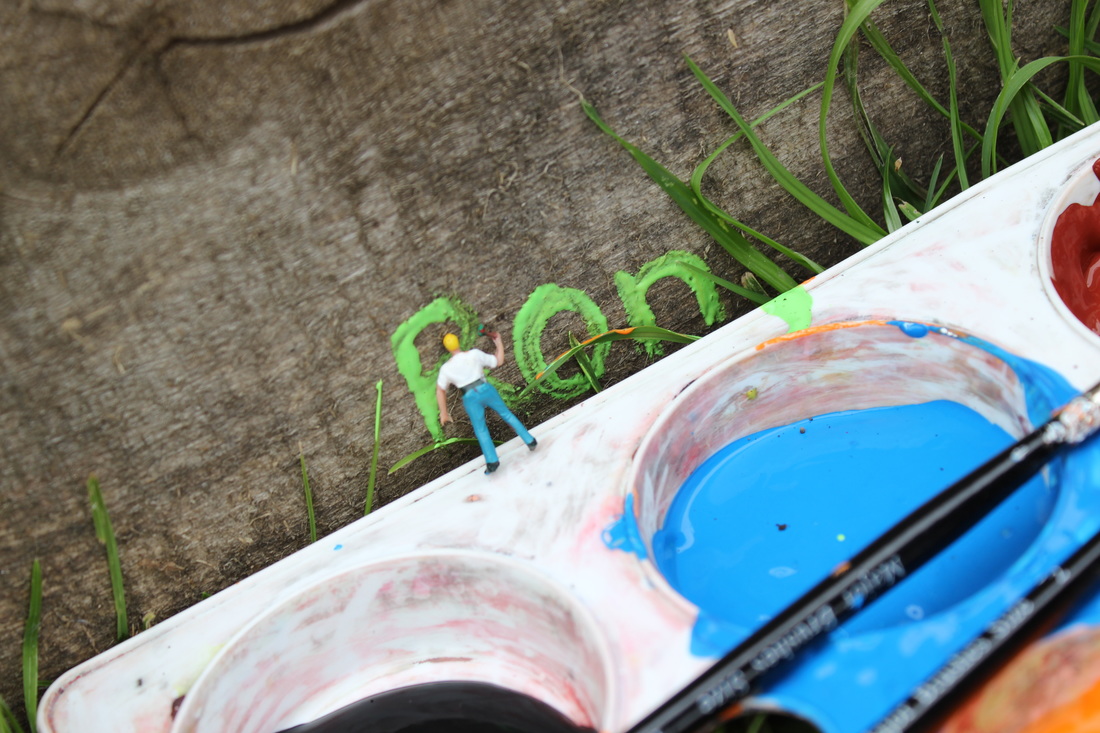
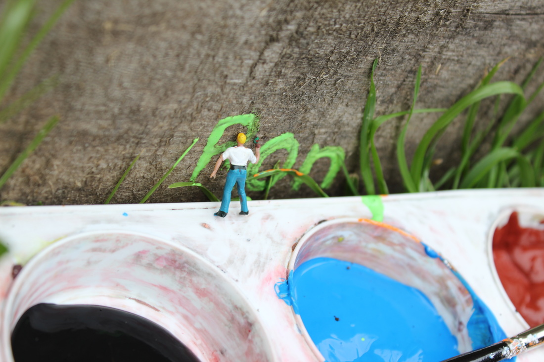
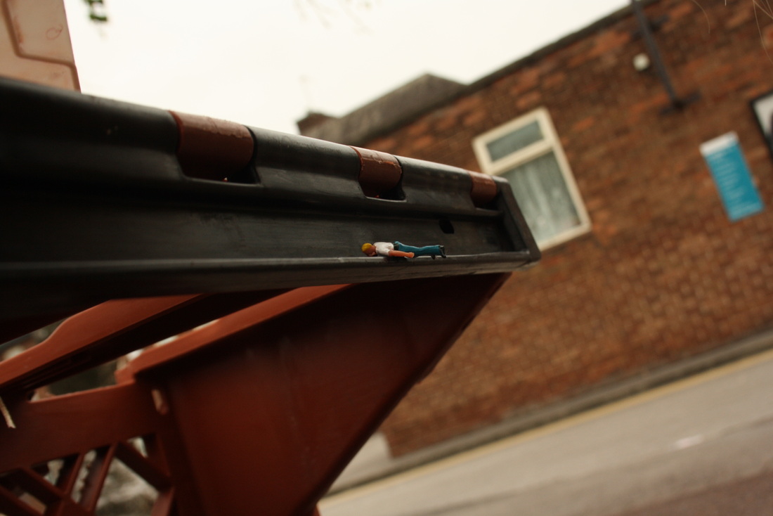
Personally with these images, it is really capturing the style of slinkachu, the figure
coming across as if it is doing graffiti. The contrast of the blue paint with the wood and the
grass makes the image good because it shows that the exposure is just right, not too bright and not too dark.
coming across as if it is doing graffiti. The contrast of the blue paint with the wood and the
grass makes the image good because it shows that the exposure is just right, not too bright and not too dark.
Final shoot
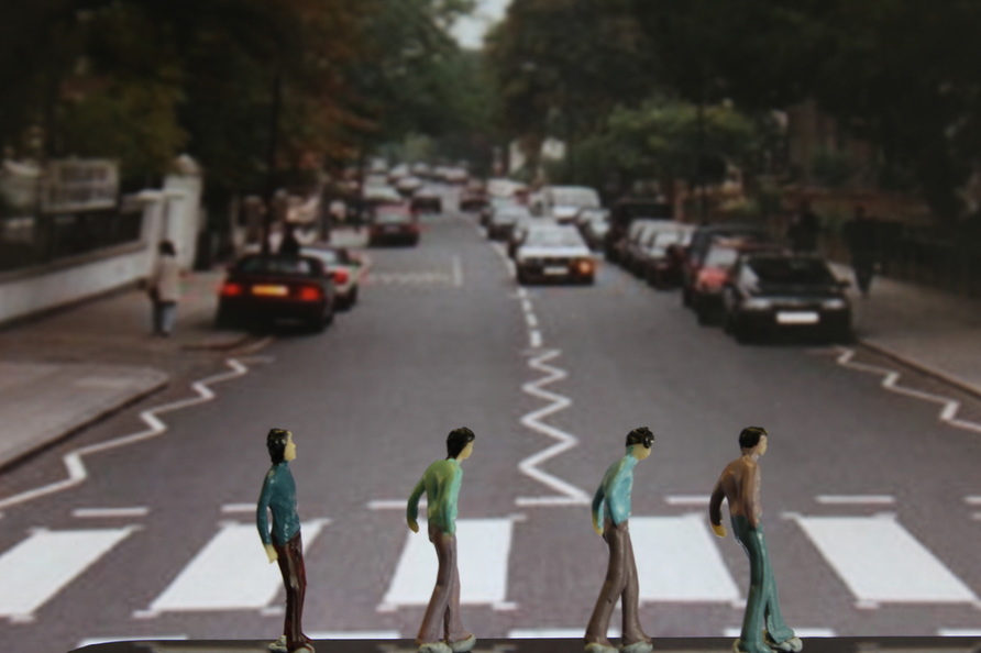
After looking back on my past shoots I realised that I was struggling to work to the best of my ability, therefore I thought about doing something other people might not have done. I decided to use my ipad as background and then find figures that would match which backgrounds I had chosen. After trying it and looking at the outcomes I knew what I wanted to do for my final piece.
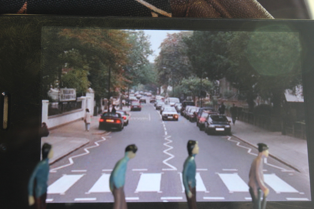
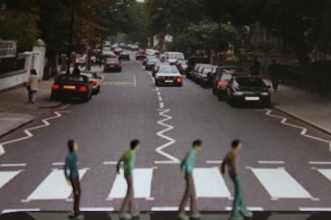
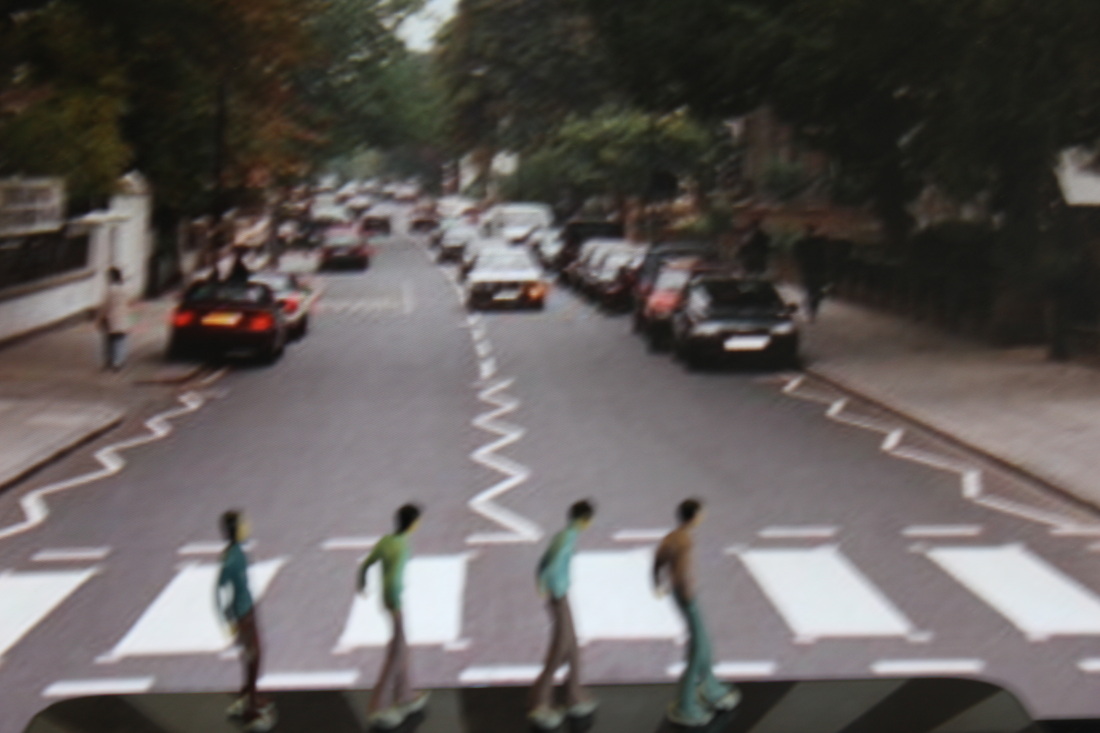
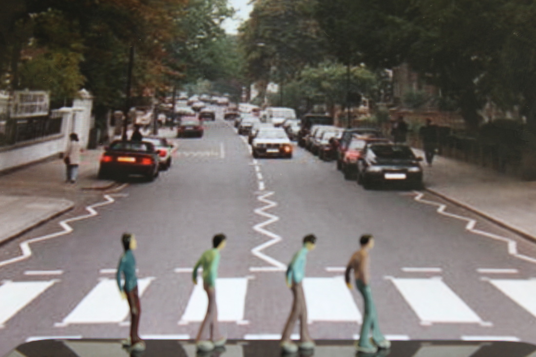
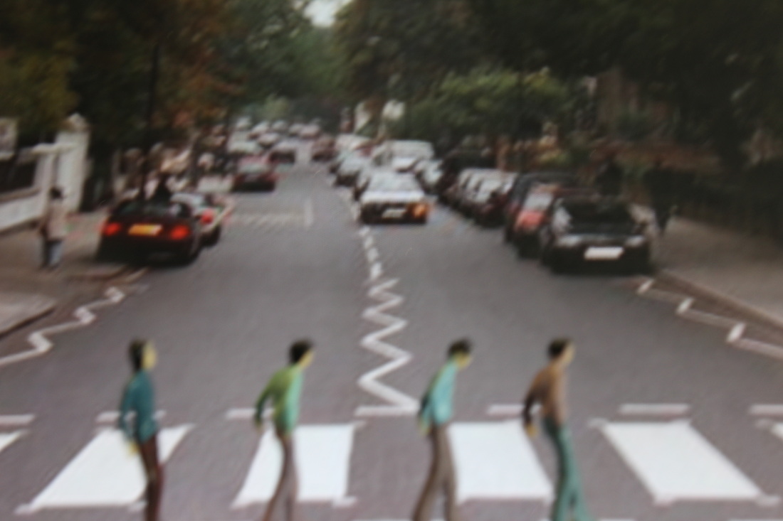

final piece
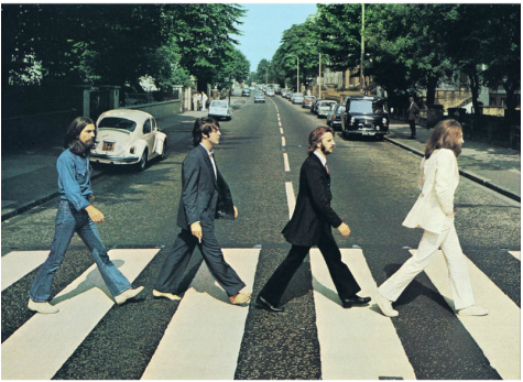
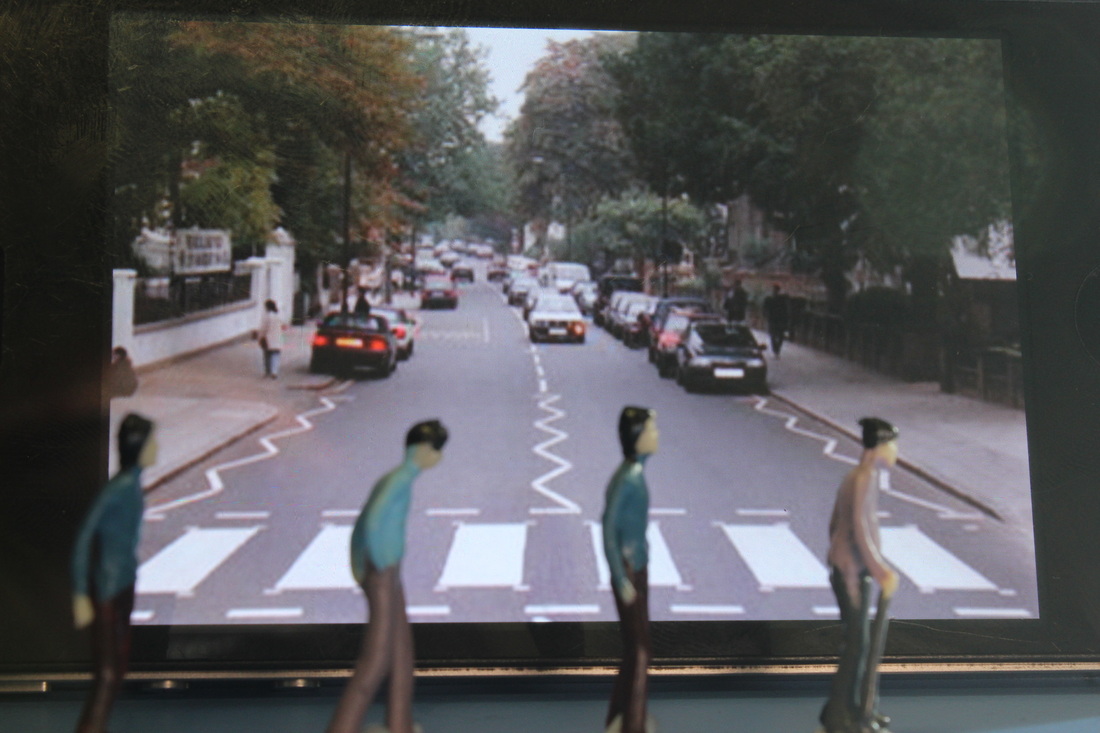
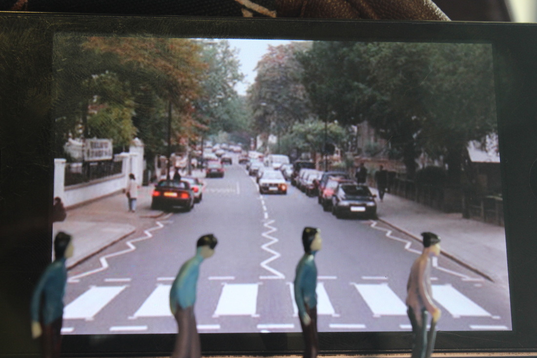
My idea was to re-create abbey road,The Beatles,it took me a good couple of tries to get it perfect. I needed the figures to be in focus and the background slightly out of focus so I needed to get the right depth of field at first I had really bad camera shake which developed terrible pictures and then I couldn't get the figures in the right place or the background to fit in the shot. On the left is my inspiration and above are the pictures I took which led up to my final piece.