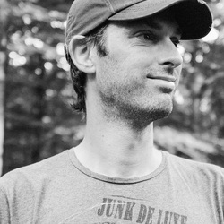
Robert-Paul Jansen
Robert-Paul Jansen is a mobile photographer based
in the Netherlands,the majority of his photographs are based on natural form.
He discovered the IPhone as a camera in 2010,then his love for photography
expanded into a huge ball of creativity.
However the IPhone camera was quite limited therefore leading
him to explore more.
Currently he uses the Fujifilm X-Pro1 and his iPhone 5 to capture his wonderful photographs.
His goal is to make people more aware of the tiny,special
details around them.
Robert-Paul believes that beauty can be found anywhere you just have to have an open mind to notice it.
His work has been exhibited all over the world including gallery's in New York,London,San Francisco,Orlando,Rotterdam and Reno(Italy).
“You think I live in a beautiful place? I think you do too.
Open your eyes, look at it thoroughly and see the things I see ”
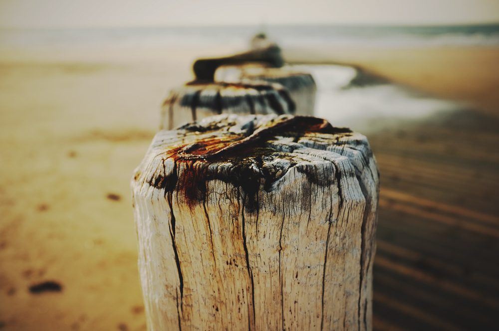
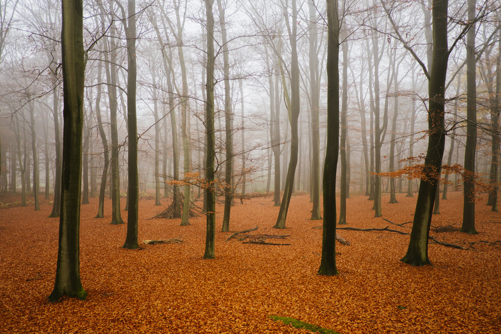
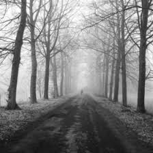
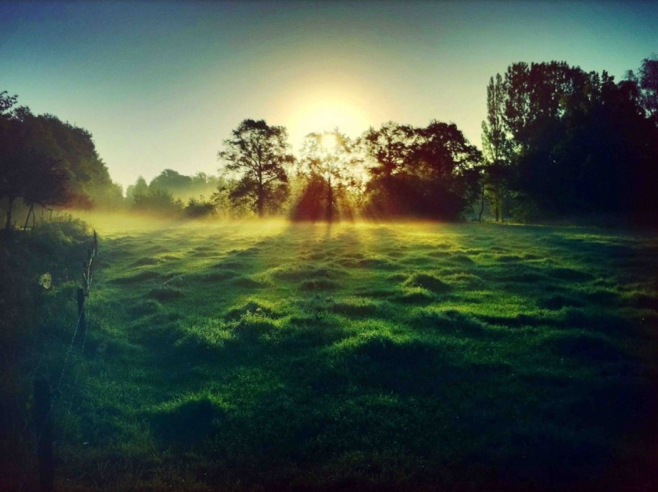
I really like Jansens point of view on his images the close ups,the contrast of colours,the landscapes.
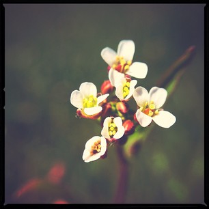
The first image within the slideshow is an image of a flower, due to the close up you can see the flower in a lot of detail and the real nature of it, you can see how beautiful the flower actually is rather than it being just on a tree that you don't even notice.
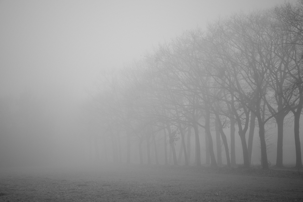
Not only does he capture the real beauty of nature but the angles and effects he uses make you feel an emotion when looking at an image, 5th image along makes you feel sad almost depressed, he captured the fog rolling through the trees as if something is lurking within it.
The way he captures his images are as if hes in an alternate universe.
The first image within the slideshow is an image of a flower, due to the close up you can see the flower in a lot of detail and the real nature of it, you can see how beautiful the flower actually is rather than it being just on a tree that you don't even notice.
Not only does he capture the real beauty of nature but the angles and effects he uses make you feel an emotion when looking at an image, 5th image along makes you feel sad almost depressed, he captured the fog rolling through the trees as if something is lurking within it.
The way he captures his images are as if hes in an alternate universe.
Mobile Photography
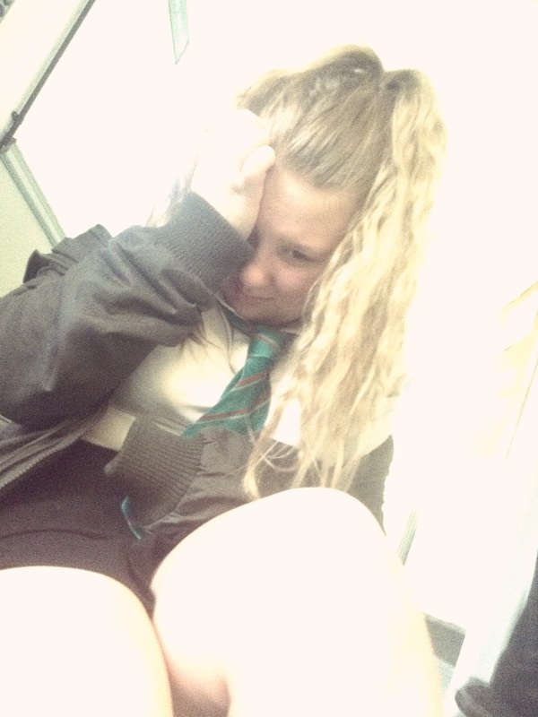
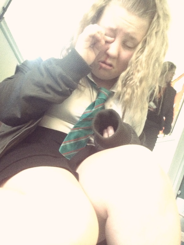
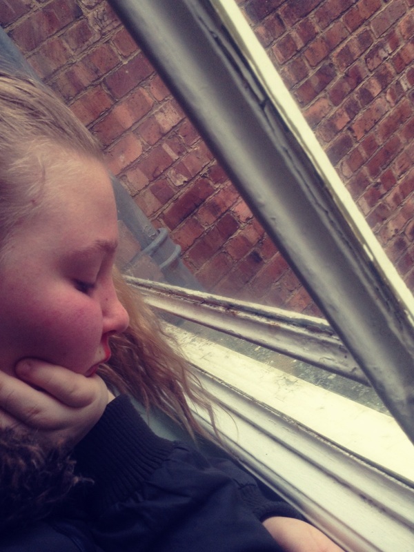
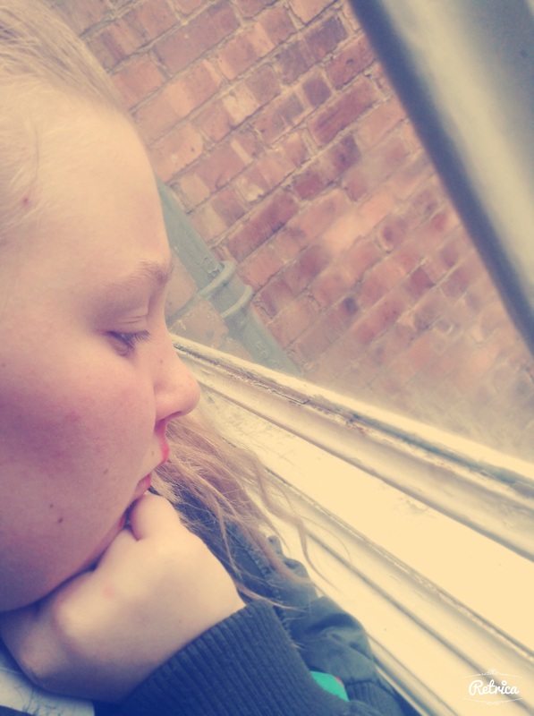
During this part of our mobile photography unit,we were based on capturing emotion.
In my opinion it was quite hard because we had to capture emotion within a building using different
effects and themes like horror etc.
In my opinion it was quite hard because we had to capture emotion within a building using different
effects and themes like horror etc.
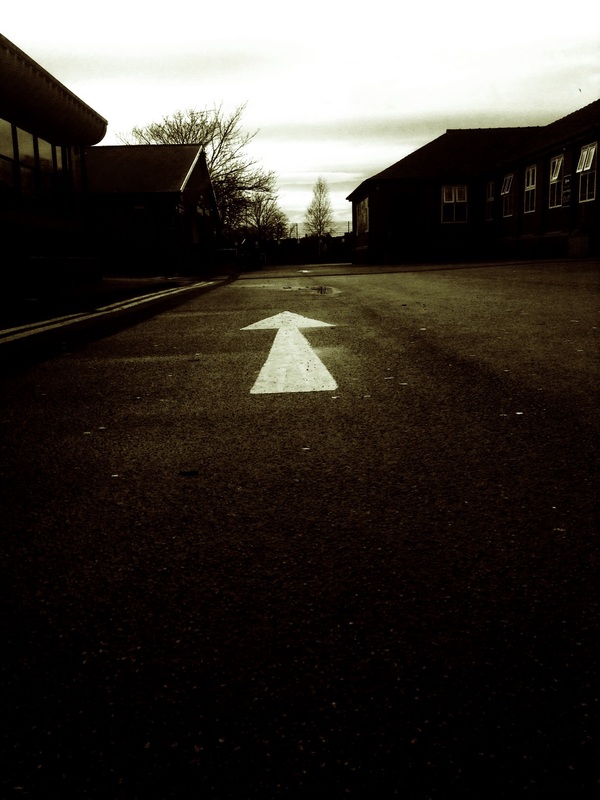
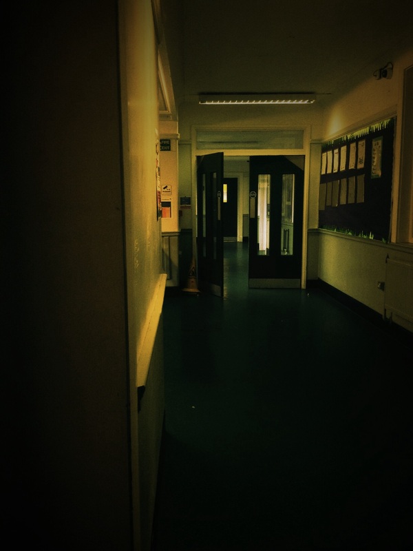

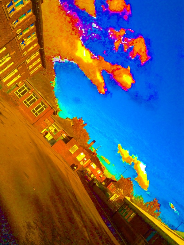
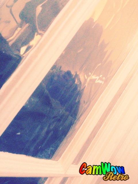
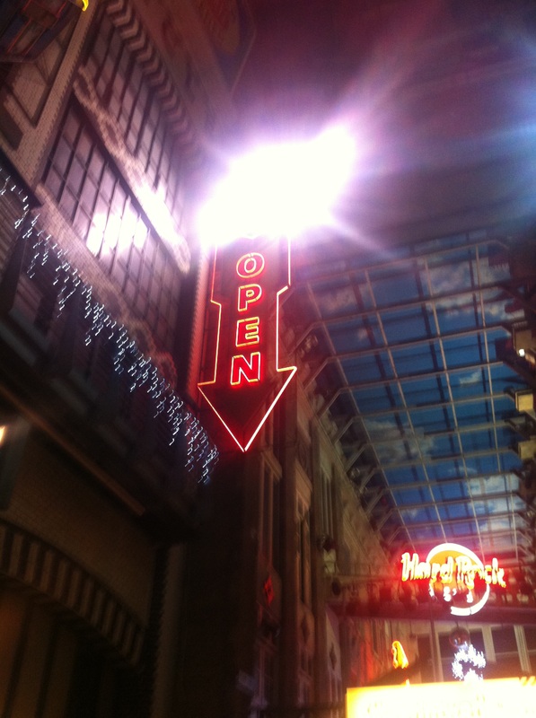
I really like this photo because it is a chiaroscuro image,the background is dull and plain and the arrow is bright and it stands out causing it to catch your eye. The arrow is the focus point,even though it has a large depth of field you only focus on the arrow. The contrast of the image is good because the effect is black and white. In my opinion this image is like a message in a way, due to the effect the image its as if the emotion is 'lost' or 'lonely' and the arrow is like a way out,an escape.

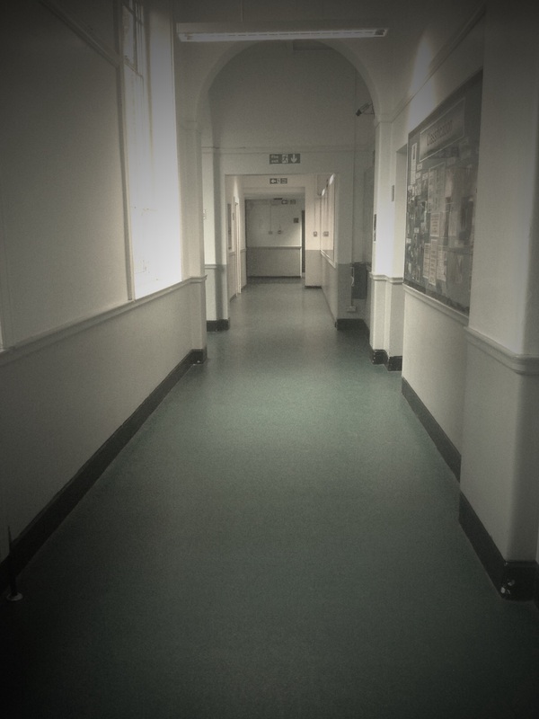
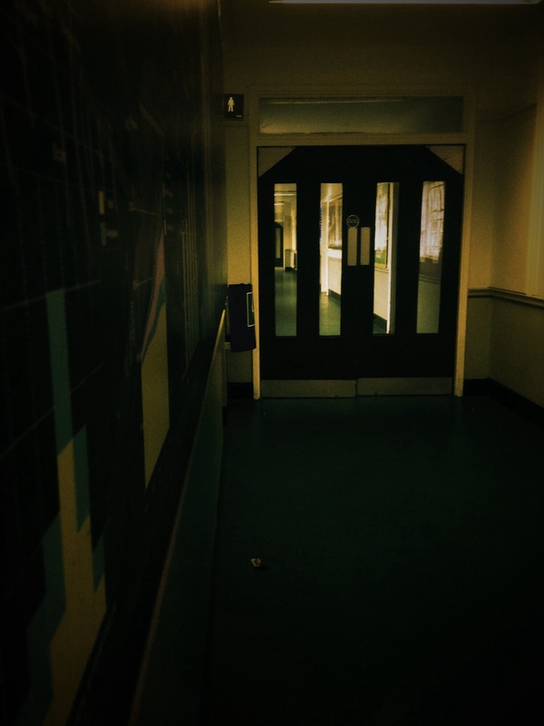
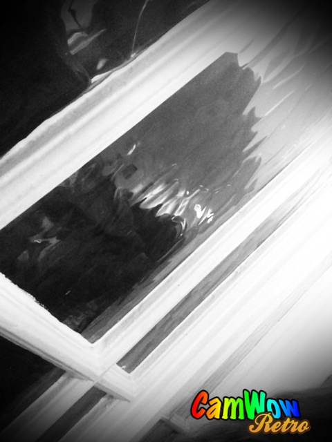
This image is showing 'isolation' or 'trapped'.
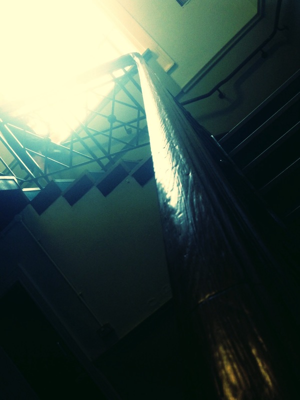
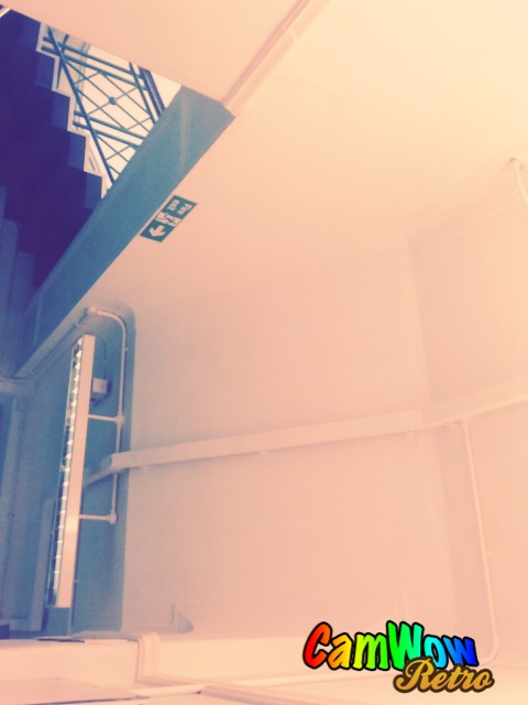
The angle the image is taken is as if someone is creeping
up the stairs slowly, as if they were unsure of where
they were and where they were going on.
The angle the image is taken is as if someone is creeping
up the stairs slowly, as if they were unsure of where
they were and where they were going on.
Documentary Photography
Documentary Photography is where you 'capture the moment', take pictures of reality;for instance historical events like 9/11.
A journalist is a documentary photographer also paparazzi.
This unit was quite difficult,due to the fact you had to capture a series of imaging which expresses a story.
A journalist is a documentary photographer also paparazzi.
This unit was quite difficult,due to the fact you had to capture a series of imaging which expresses a story.
App Reviews
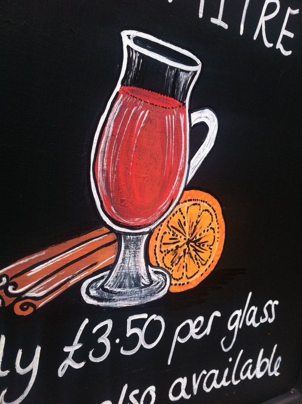
'Color Effects'
Pros
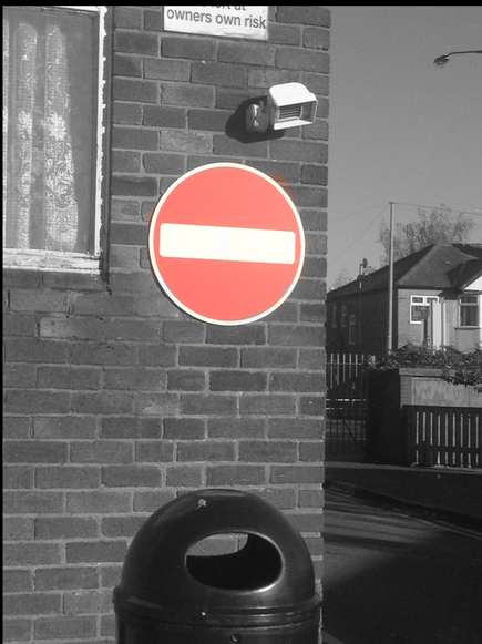
In my opinion this app is very effective
because you can choose which objects
stand out,the way it works is you take
a picture or you can use an existing
picture then your iPad transfers it into
black&white then you colour in which
object you want in colour,therefore you
can choose which object stands out. For
instance in this photo I chose to make the
stop sign stand out,because it is red it makes the picture more effective&causes you to focus on the stop sign.
Cons
One of the problems is that it takes quite a while
to get it right or in fact perfect mainly because
you have to go over the object to get the colour
back,you can go over the edges or go add
colour to objects you do not want to stand out,
it's much quicker than Photoshop however with
Photoshop it would be more precise, apart from
the fact that i would suggest the app.
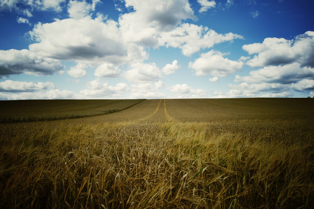
'MegaPhoto'

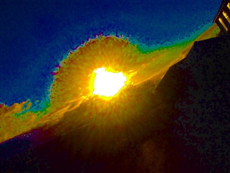
This is one of my favourites.
Due to the contrast of colours and how bright the sun is;this fills the majority of the image causing it to stand out and catch your eye.
The view point is on an angle which is more effective because it isn't the most common view.
Although it is taken with effects it is still a good picture.
Due to the contrast of colours and how bright the sun is;this fills the majority of the image causing it to stand out and catch your eye.
The view point is on an angle which is more effective because it isn't the most common view.
Although it is taken with effects it is still a good picture.
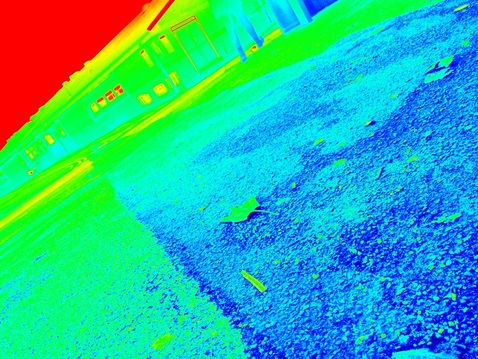
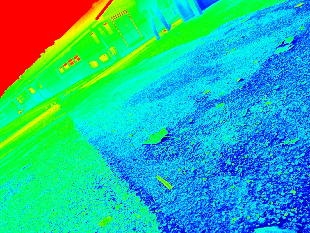
In my opinion this picture is not good.
mainly because there is no focus, however there is a small focus but it is not a good focus,the leaf.
The effect is not very good,there is no use of depth of field,rule of thirds etc.
However the view point is quite good due to the fact it is slanted diagonally but that is the only thing which is sort of good about the picture.
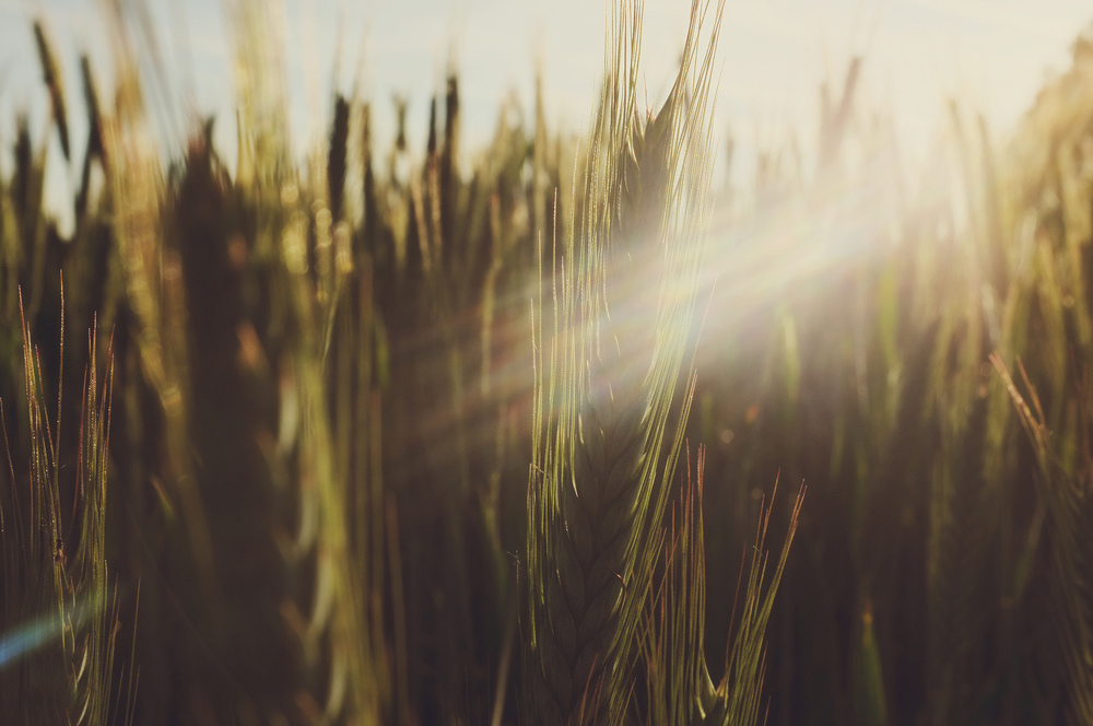
Pros
there is many different effects varied from different
colours to different distortions, on the photos above
I chose to change the colours. Changing the colours
made the photos more effective in a different way,
for instance the contrast was more attracting to the
eye.
Cons
The effects move whilst you are viewing it causing it
hard to take the picture,but once you have captured
the picture it turns out really good.

'More Beaute2'
Pros
You can change the brightness,tone,smoothing&detail.
You can make yourself look better for instance if you
have bags under your eyes etc.
In my opinion this app would be used in a photo shoot
or if you wanted to edit a photo you have taken for
instance if you wanted to make it your profile picture.
Cons
It doesn't have much that you can change&the things
that you can change aren't that obvious.
'Air Pic'
Pros
The app allows you to focus on one area and make everything surrounding that area out of focus.
It also has effects such as you can change the colour of the image and distort it by changing the saturation of the image.
Cons
The app can really only offer focus points, the colour saturation isn't actually that good.
You wouldn't use the app for anything other than focus so you would rarely use it and in some cases not use it.
matt livey
In my opinion Matt Liveys work is good,he thinks outside
the box and captures things people wouldn't see even
though they might walk past it everyday.
Mainly because of the various angles and locations.
He has a really good eye for architectural photography,although he may not be that known his work is great.
The majority of his photographs are based in the UK but he does travel sometimes.
I love the way he sees the world from a different point of view than we do, the angles he uses make everyday buildings more or less transform into something far more interesting and beautiful.

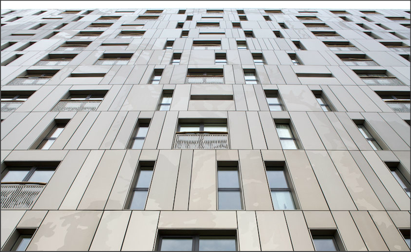
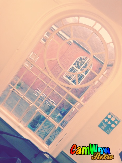
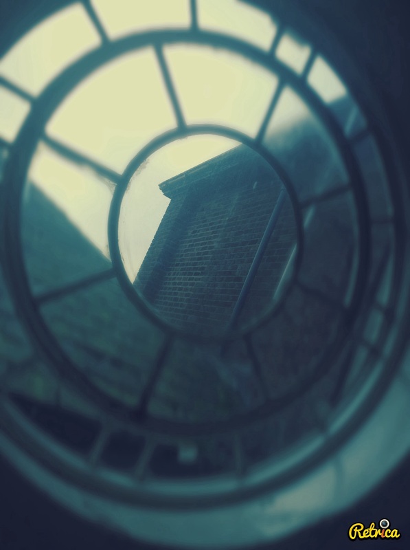
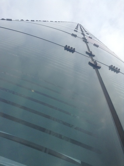
This image is good because it is taken from a worms eye view, the point of view of the camera is giving the impression that the building is bigger than it actually is. Also the picture is taken quite close to the building so you can see the detail of the building itself.
Images in the style of matt livery


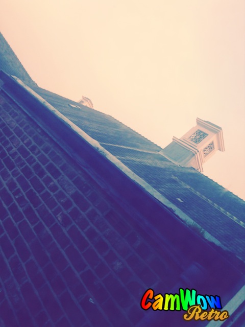
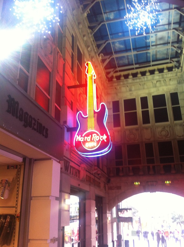
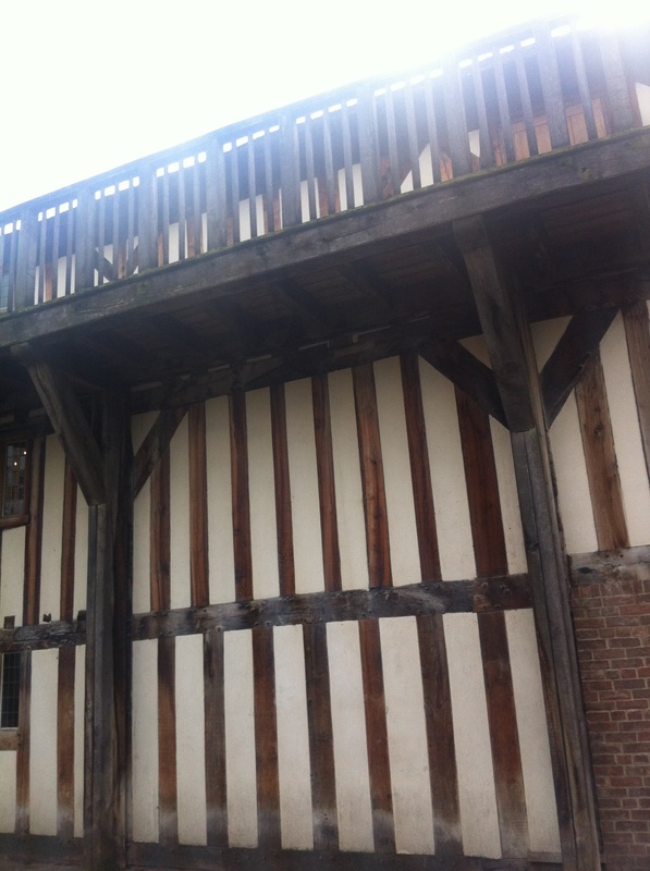
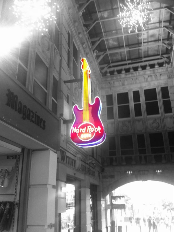
This image is similar to Matt Liveys style due to the use of lighting. In his shoot he uses a lot of lighting, majority of his shots either consists of a bright background or a bright foreground. This image contains a bright foreground which is the hard rock café sign. The angle is the slightest worms eye view/point of view,as if someones walking and looking up.
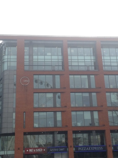
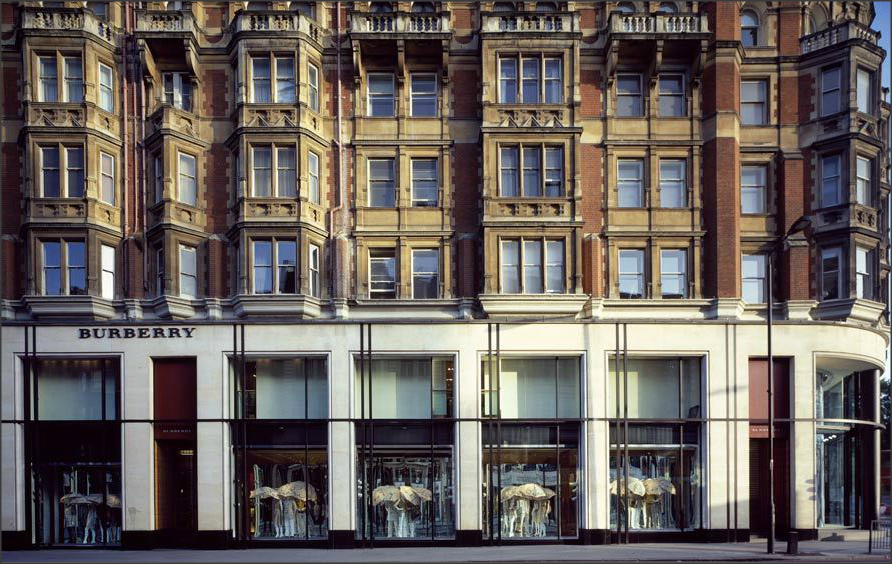
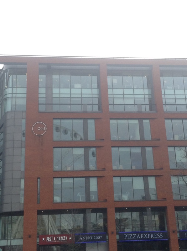
This is similar to Matt Liveys work because it is a straight forward image with the word 'one' on a power spot. Which is like his burberry image,the word 'burberry' is also on a power spot and the rest of the image is the building. Unfortunately my image isn't as good. To improve it I would need to straighten the image and only capture the building.
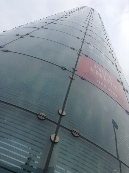
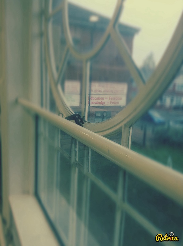
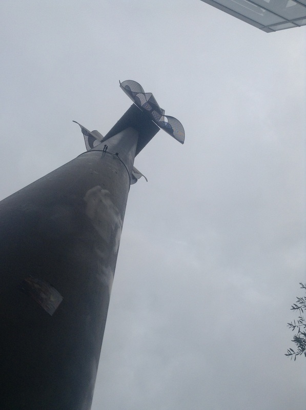
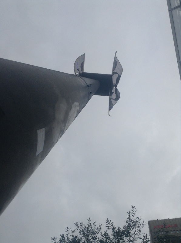
One of Matt Liveys images is taken from a really good worms eye view which gives the effect that the building is much larger than it actually is. With my image, it looks as though the building is never ending and just keeps going up&up. Also on Matt Liveys image you can see a slight reflection of the tree on the building where as on mine you can see a slight reflection of the clouds. I think both images express modern day architecture which is another similarity between them.
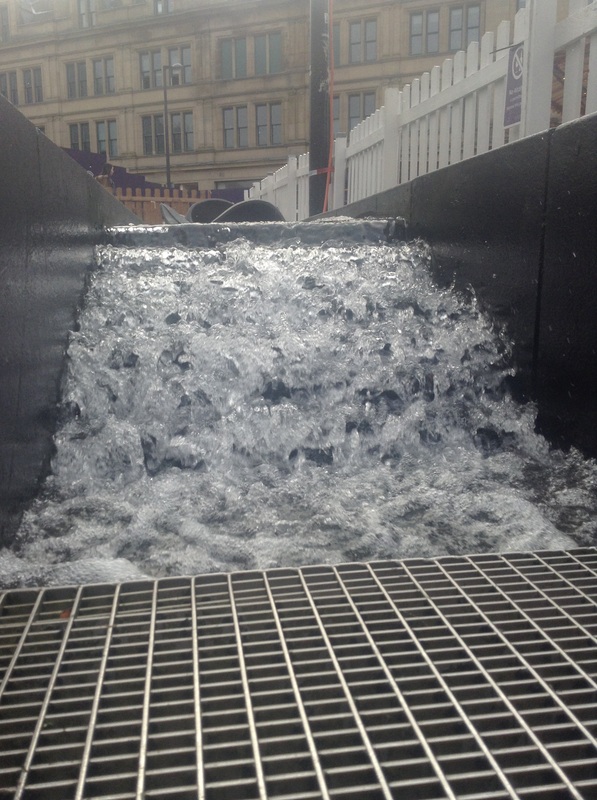
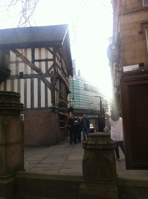
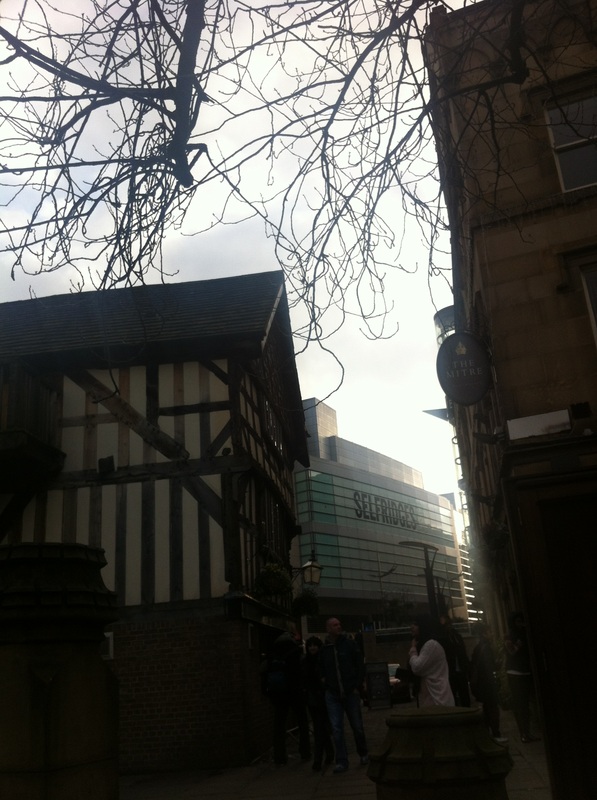
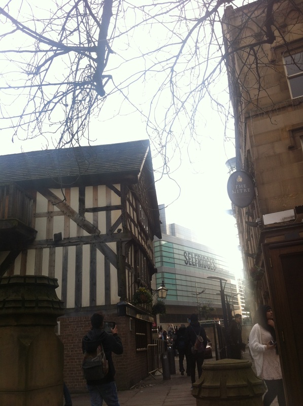
manchester shoot
During the Manchester shoot, we go to different parts of town and we are given a theme. So we could get told to base the shoot on the colour red or focus on metal objects. Depending on the task we get given I'm going to attempt to base the majority of my shots on architecture. Varying the angles the images are being taken from
and which section of the buildings I am capturing. Hoping to get the shots in a similar style as Matt Livey's.
and which section of the buildings I am capturing. Hoping to get the shots in a similar style as Matt Livey's.
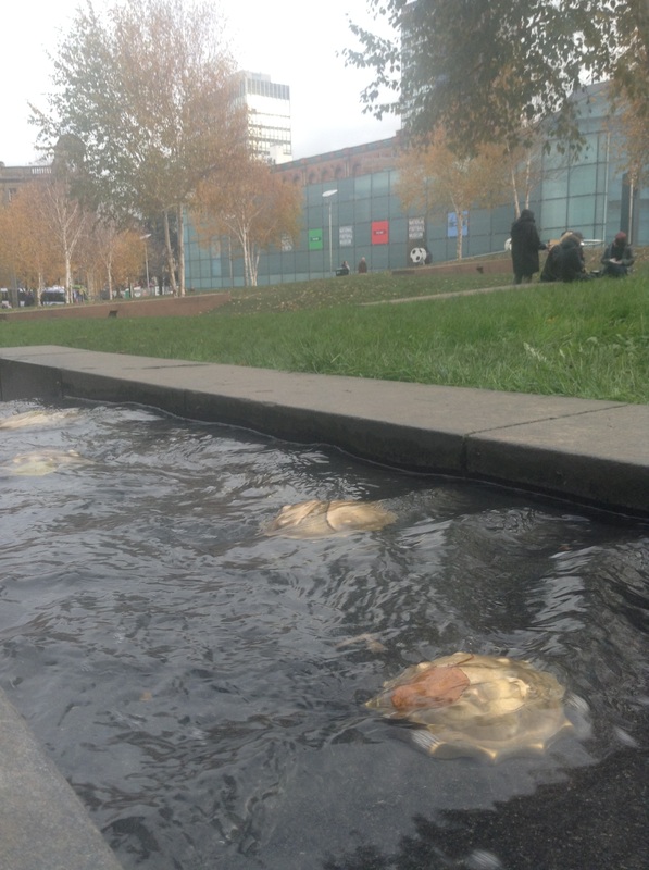
PICCADILLY gardens
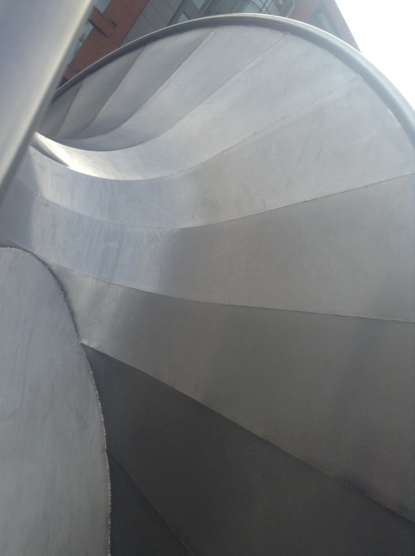
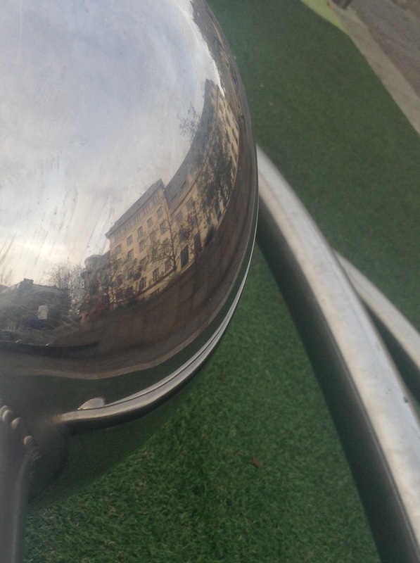
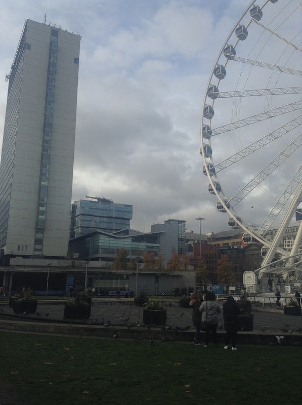
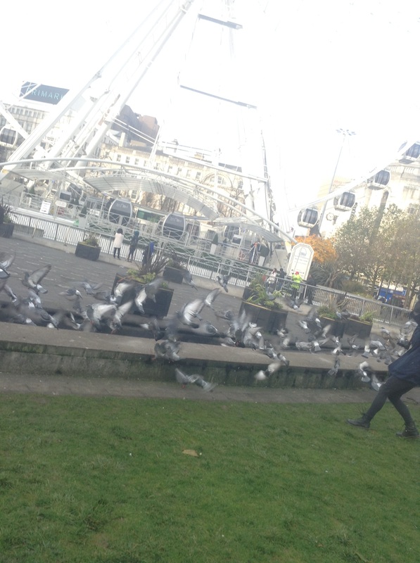
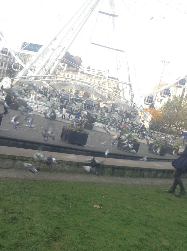
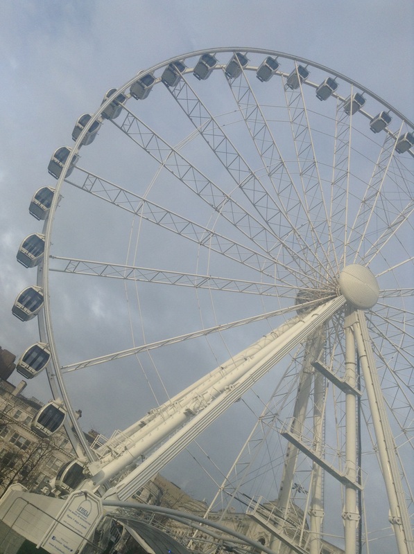
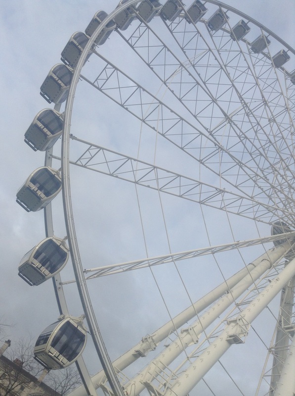
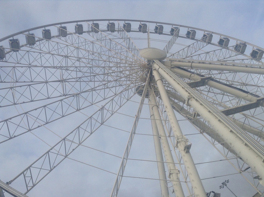
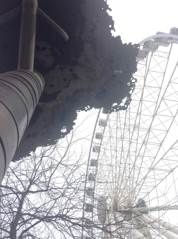
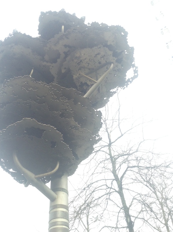
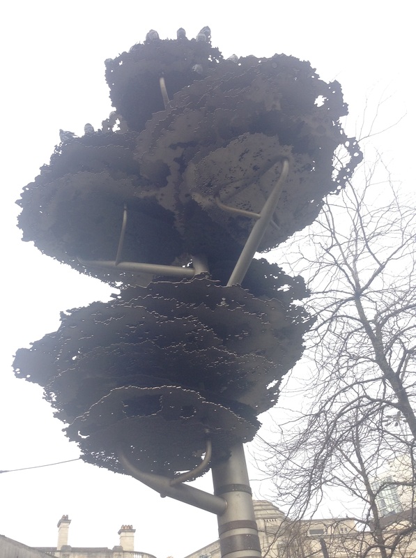

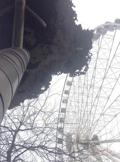
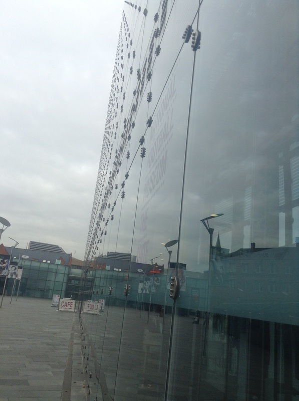
This is one of my favourite images from the Piccadilly Gardens shoot. Personally I think this shoot was my weakest. As well as capturing the metal tree structure I captured nature and the big wheel within the background. The image is taken from a slight worms eye view as well as a point of view shot. The brightness of the sky makes the metal structure look unreal which I think is a good effect.
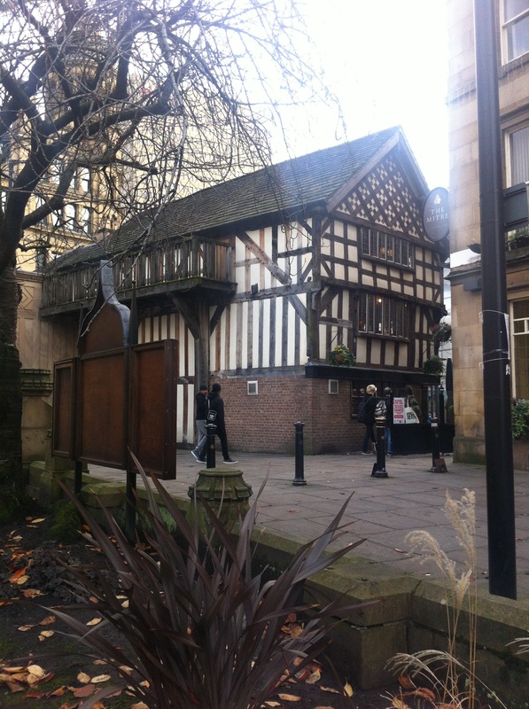
manchester/CHRISTMAS IN MANCHESTER
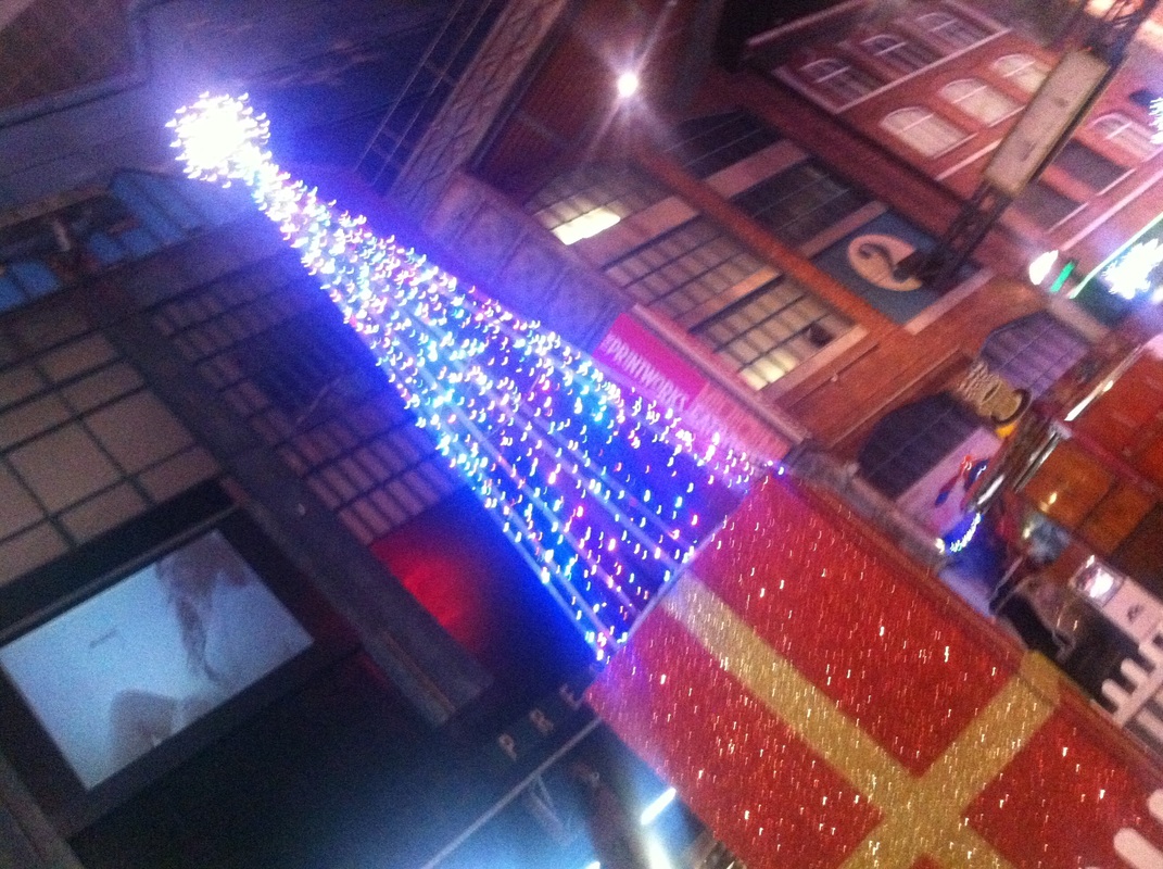


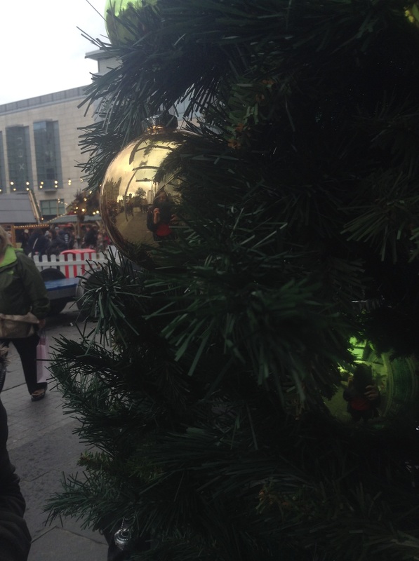
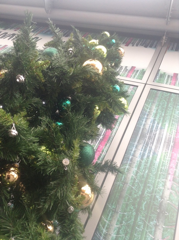
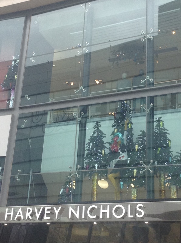
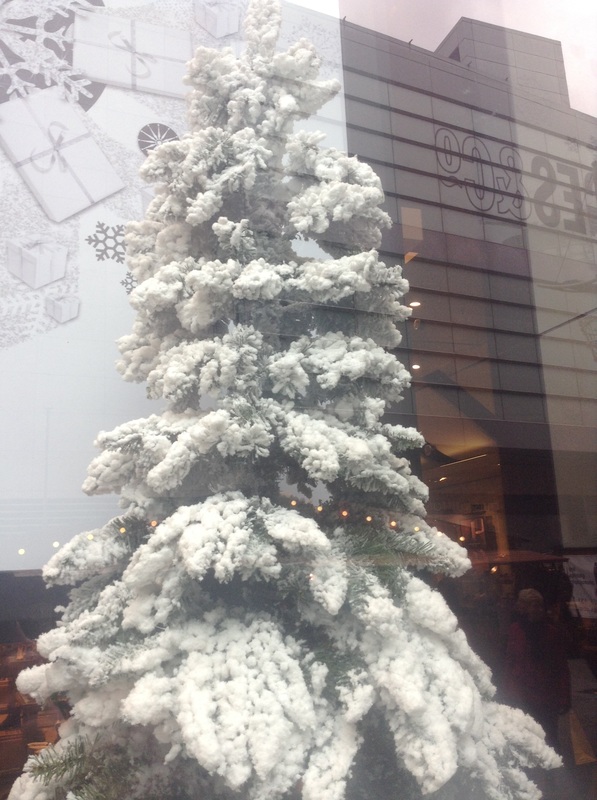
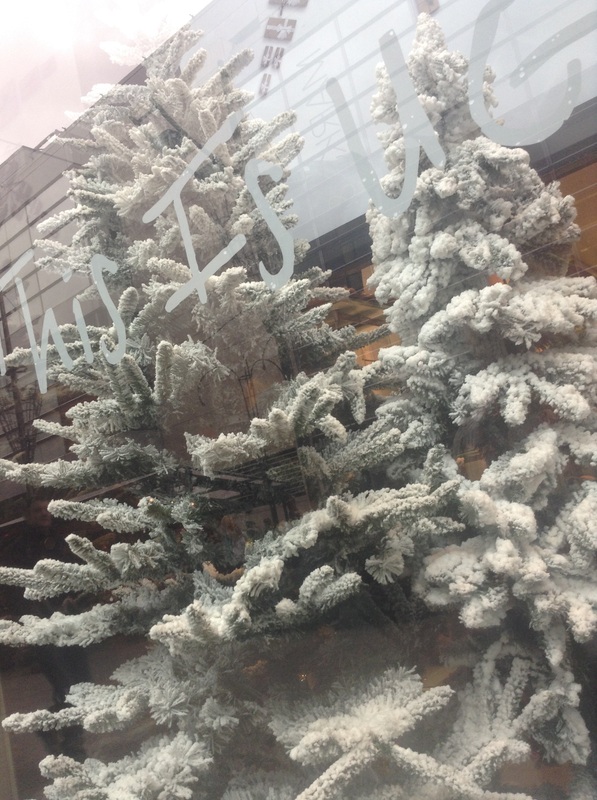
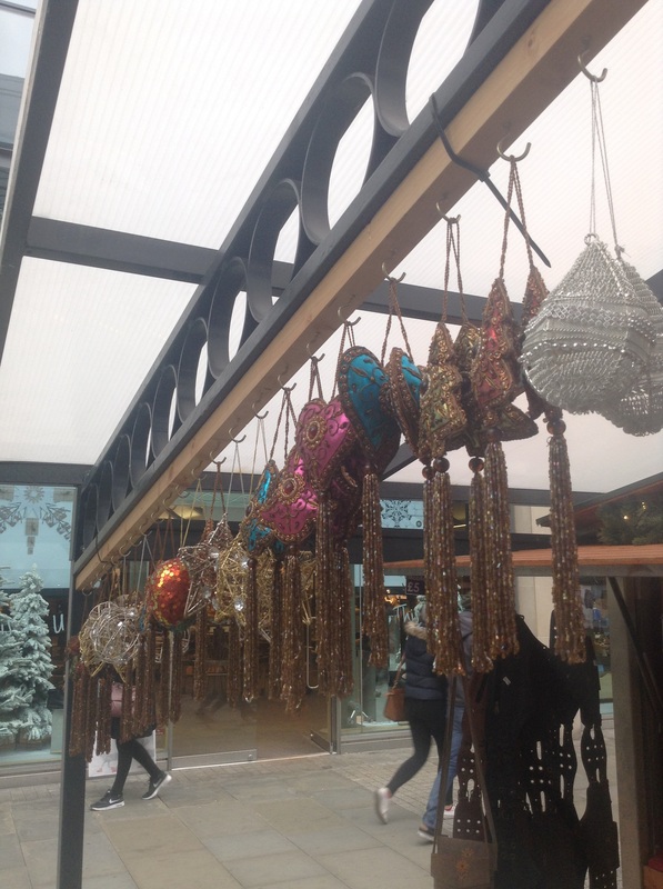

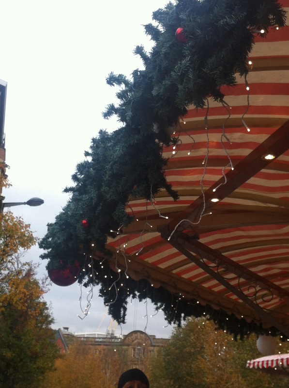
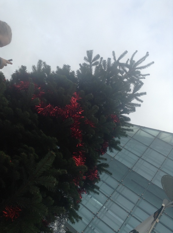
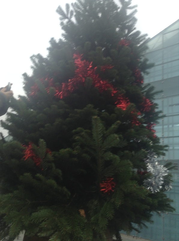
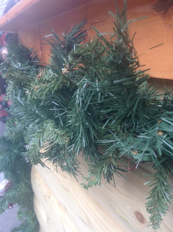
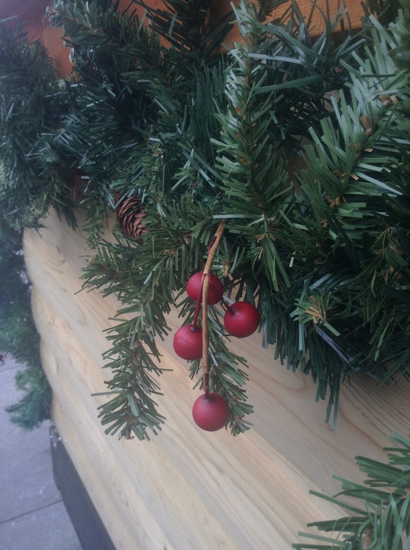
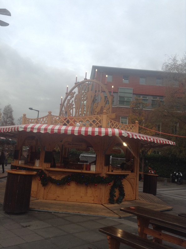
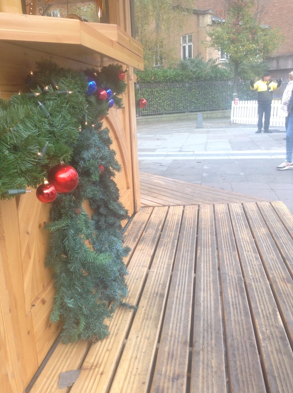

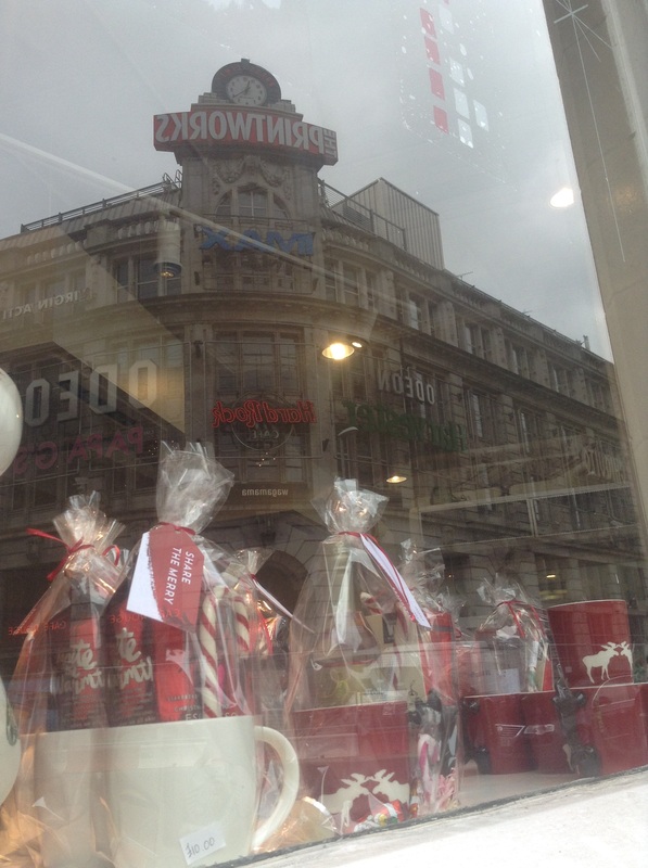

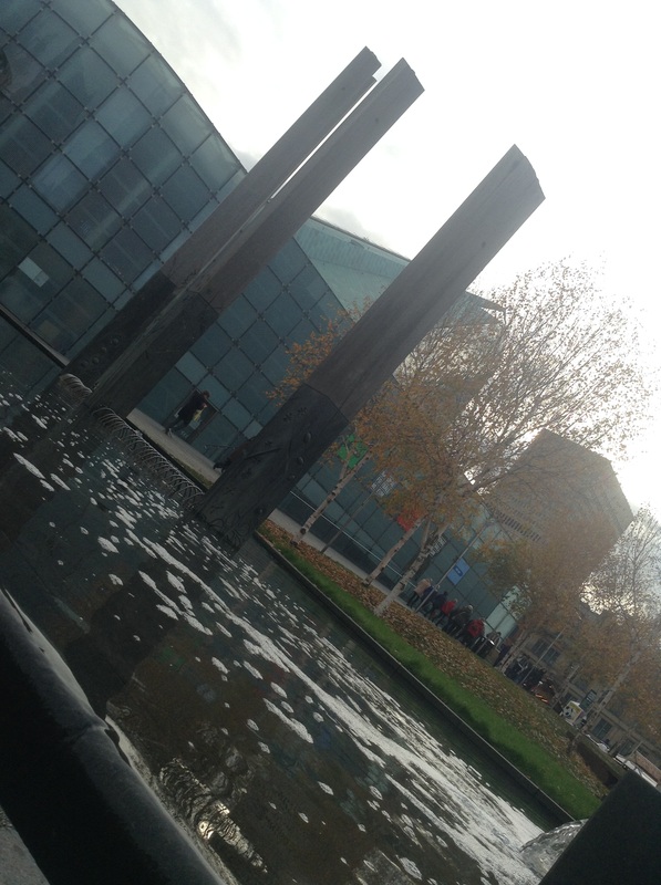

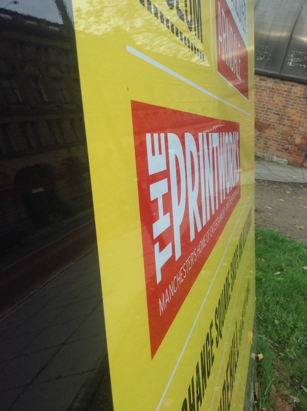
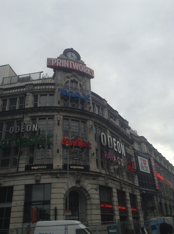

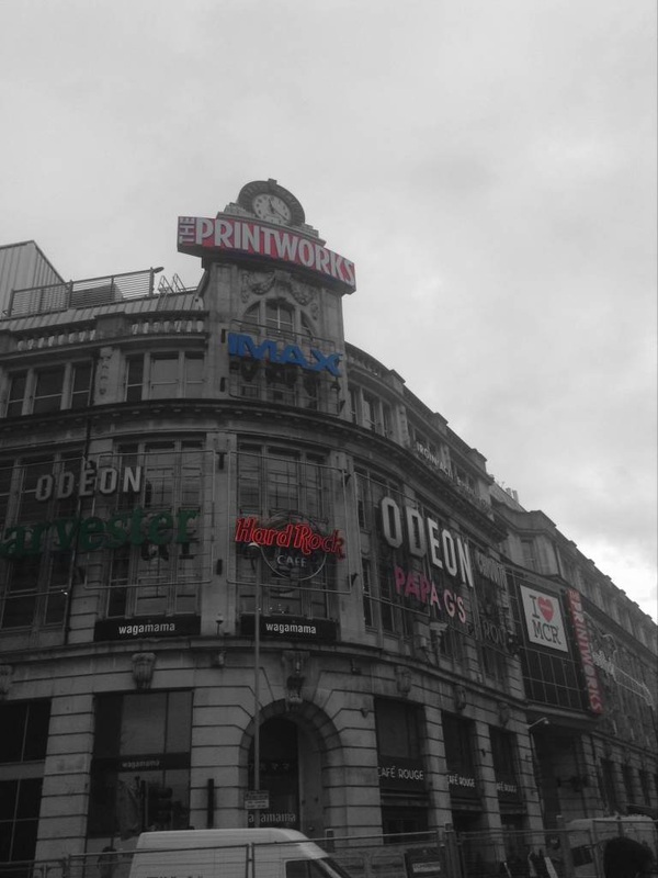
This my one of my favourites from this shoot because I've captured the Christmas cups and candy canes from the starbucks window as well as capturing the reflection of The Printworks. The printworks is one of most well known buildings within Manchester city central so as well as capturing the christmas theme I have also captured the Manchester theme.
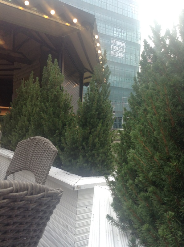
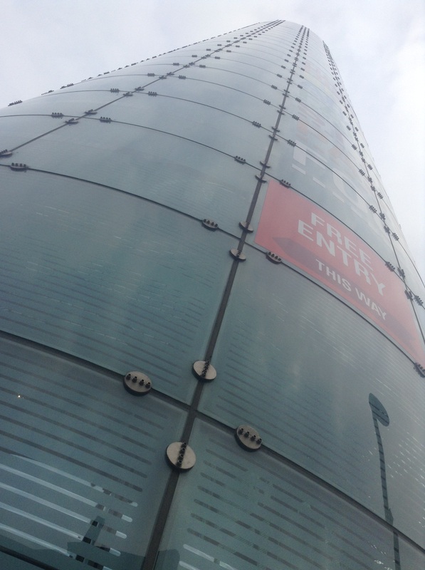
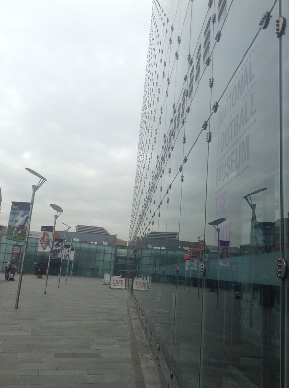
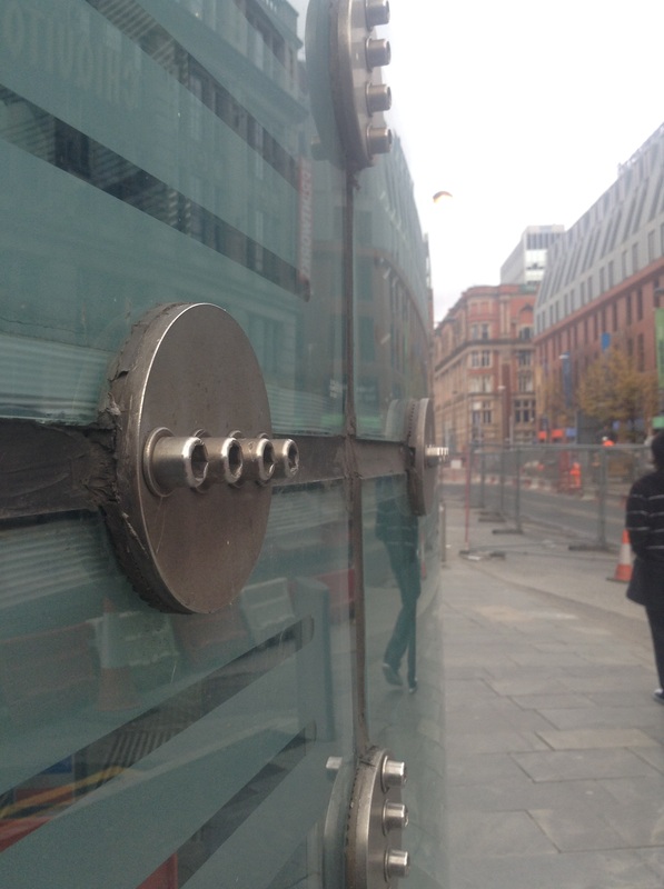
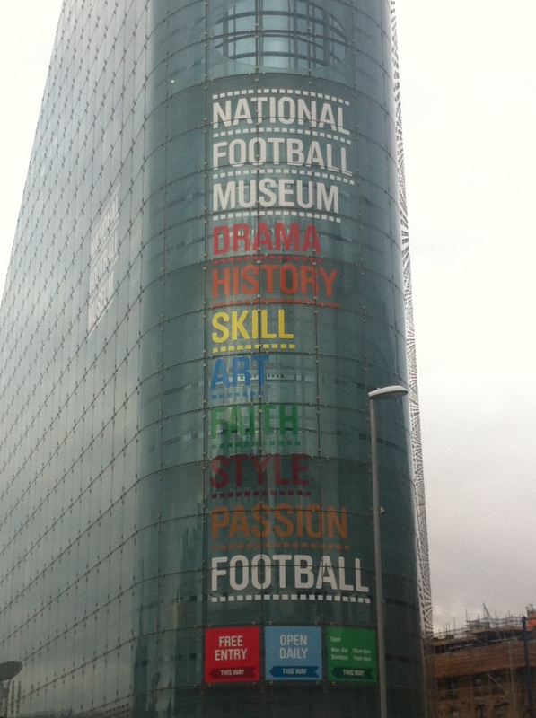
This is also one of my favourites because the image is taken from a worms eye view, giving it the effect which looks like its never ending. Also if you focus there is a slight reflection of the clouds on the glass. The building which I have captured is the football museum which is in central Manchester, linking in with the Manchester theme.
COLOUR: ORANGE
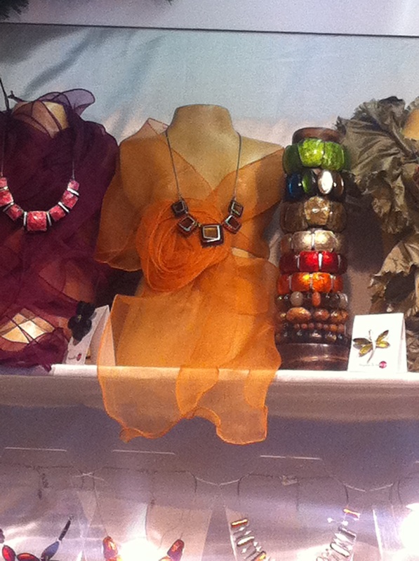


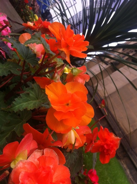
This image captures multiple colours such as orange,red,pink,green and yellow. The orange flower stands out the most because the majority is on a power spot also it is the brightest flower. The contrast with the flower fades from a really dark,deep orange to a bright,luminous orange which gives it a subtle sunset effect which is why its one of my favourites.
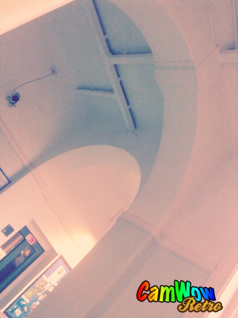
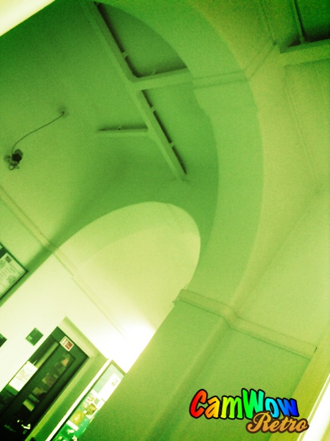
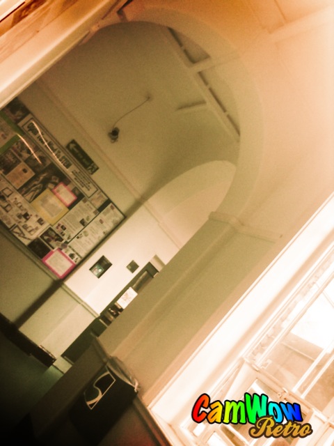
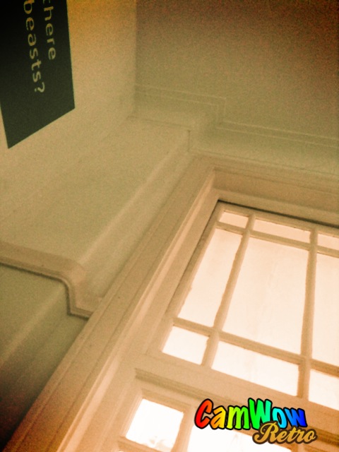
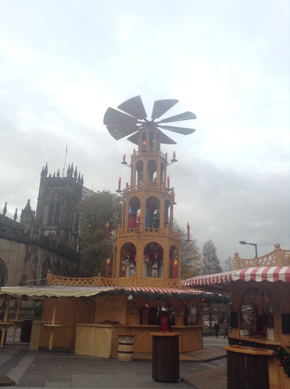
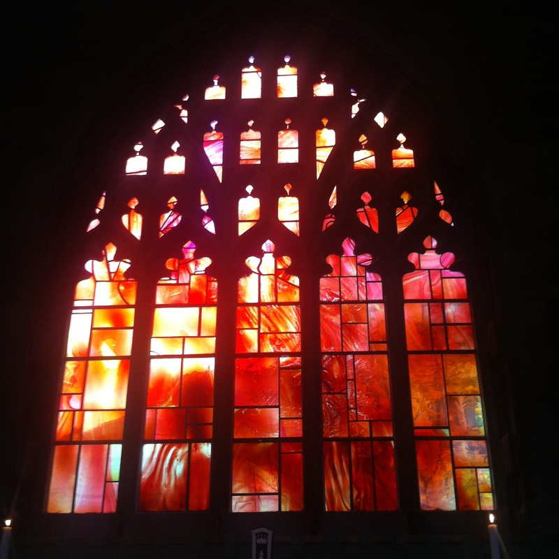
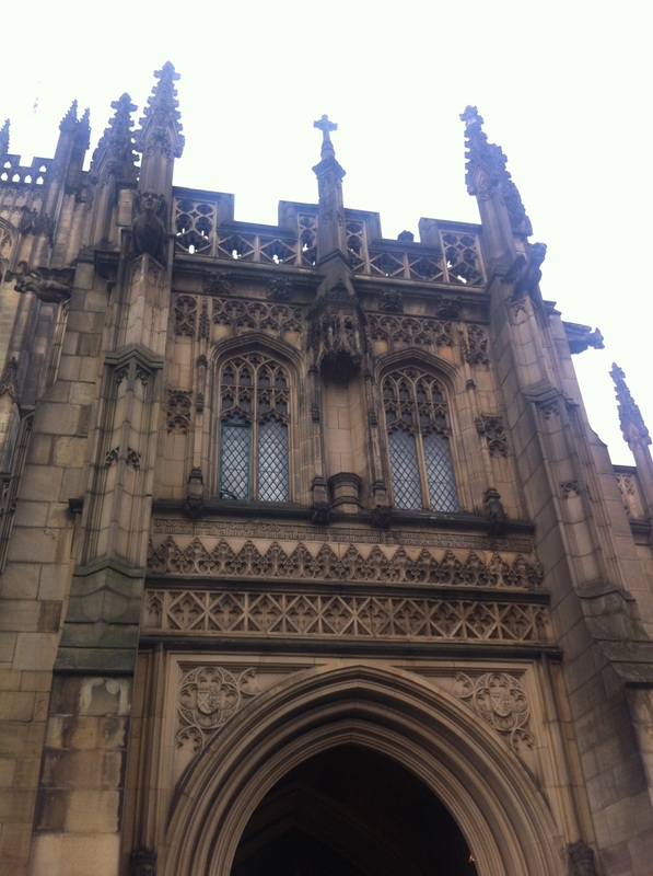
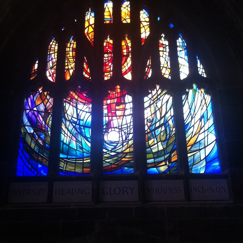
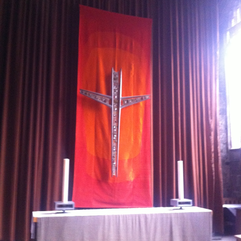
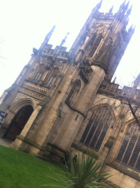
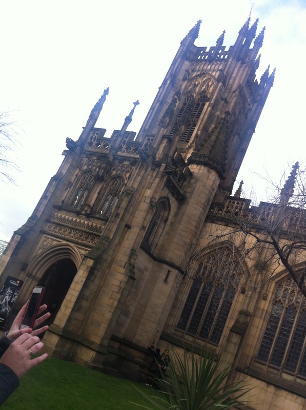
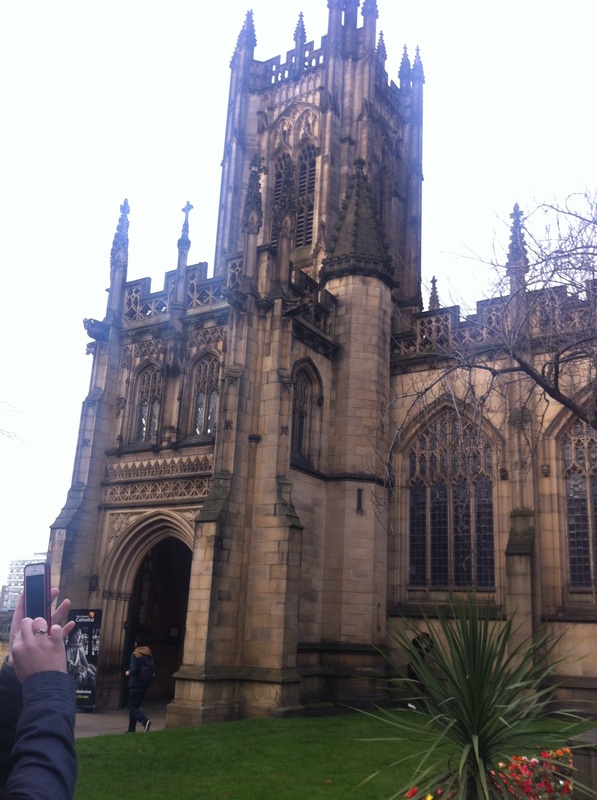
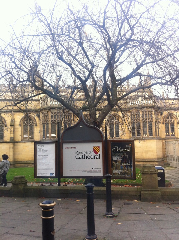
CATHEDRAL
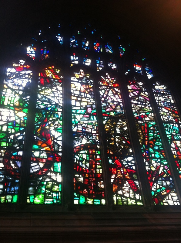
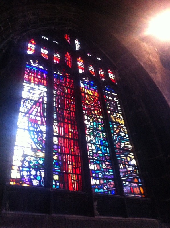
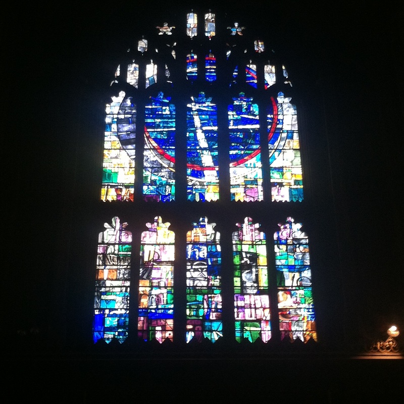
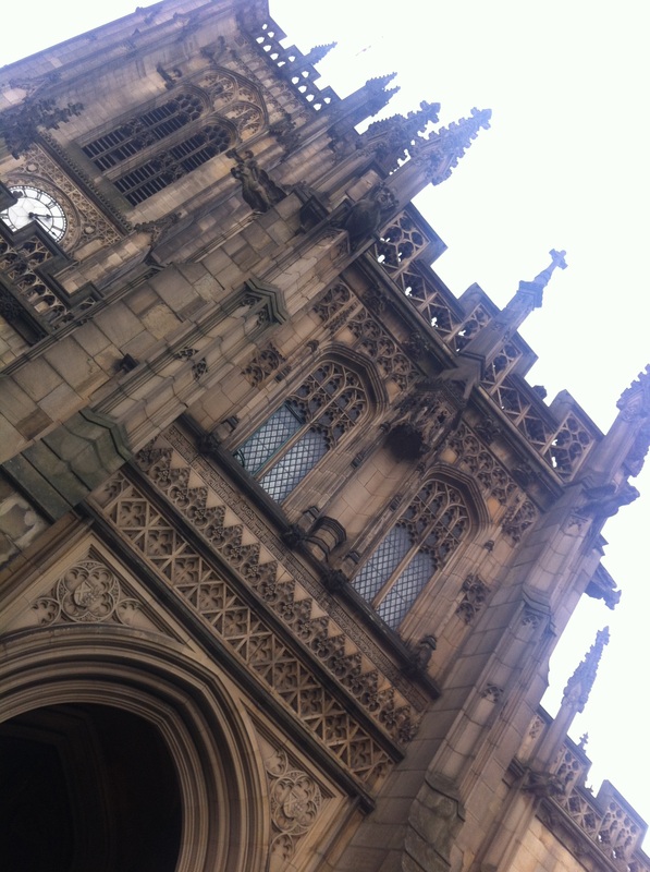
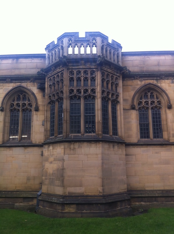
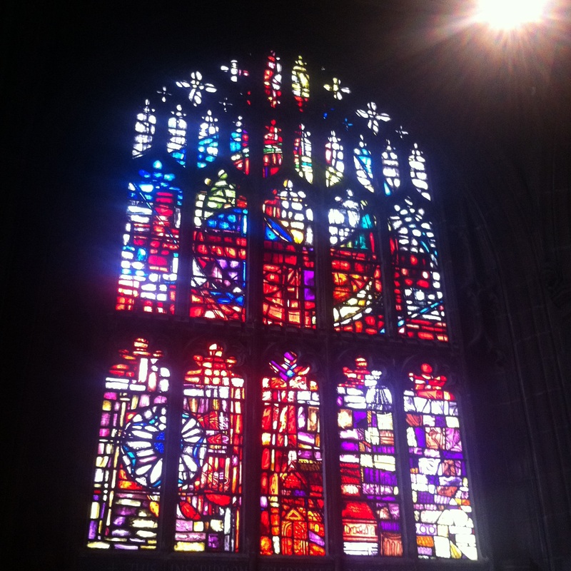
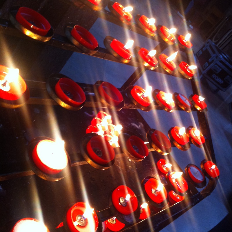
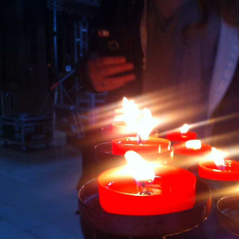
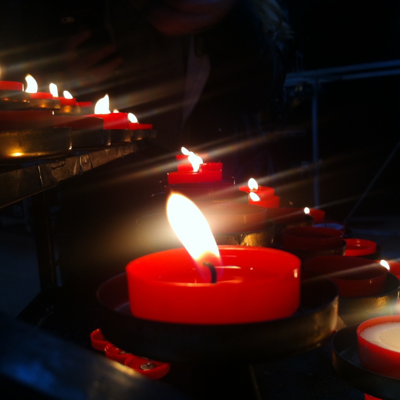
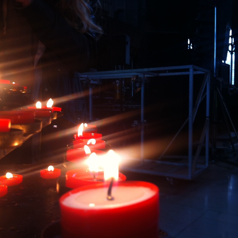
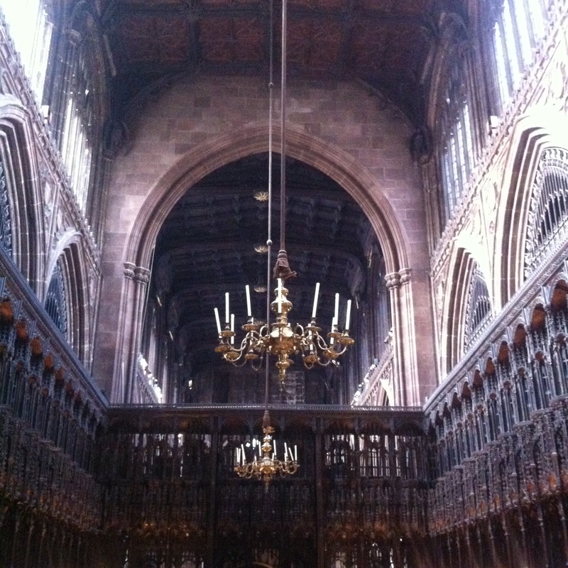
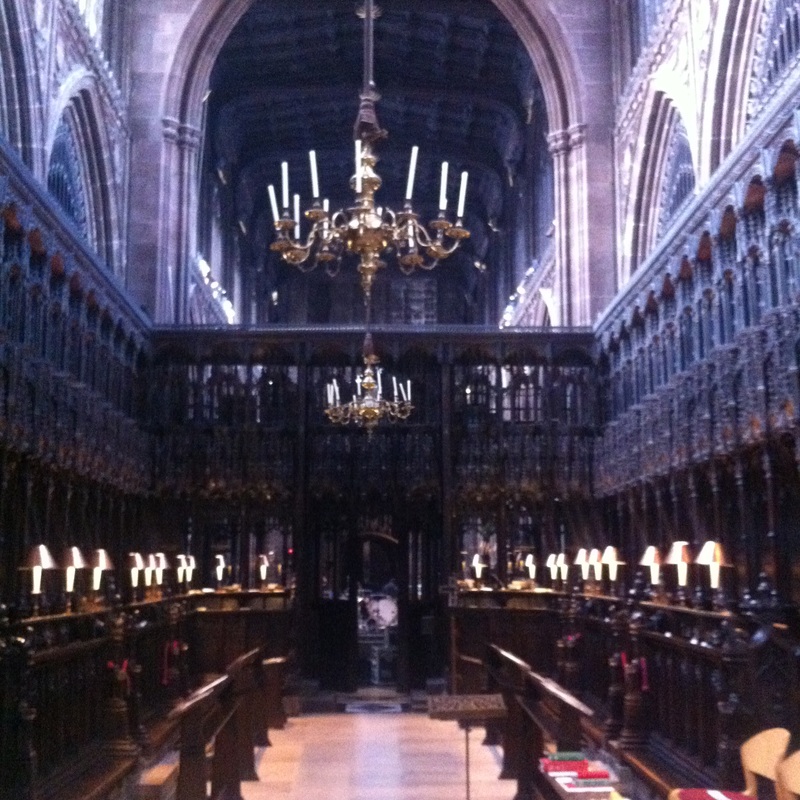
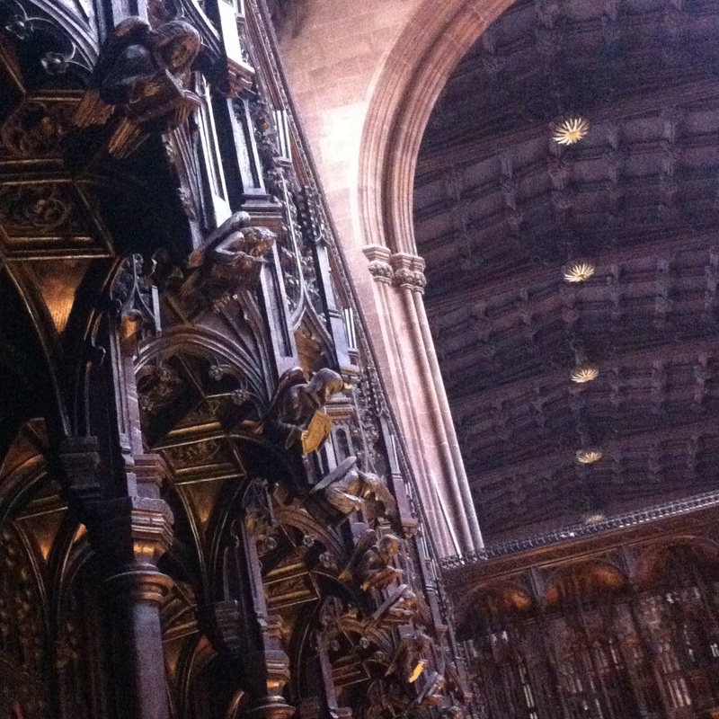
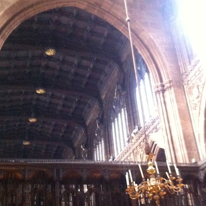
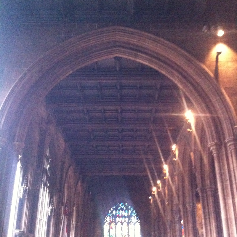
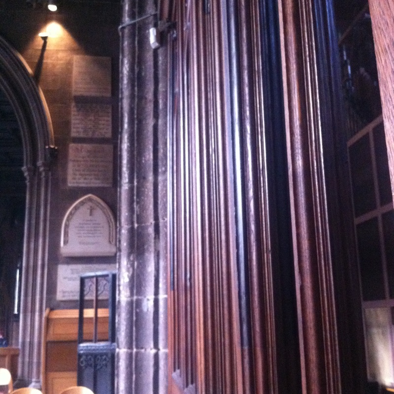
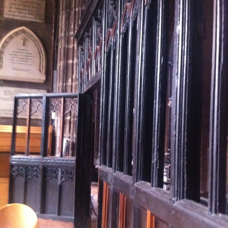
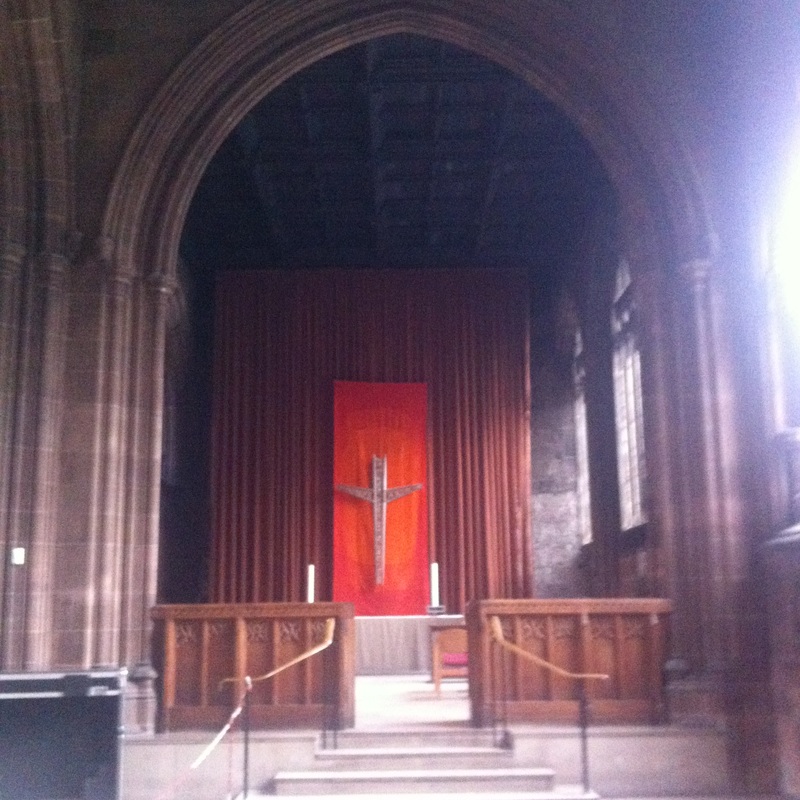

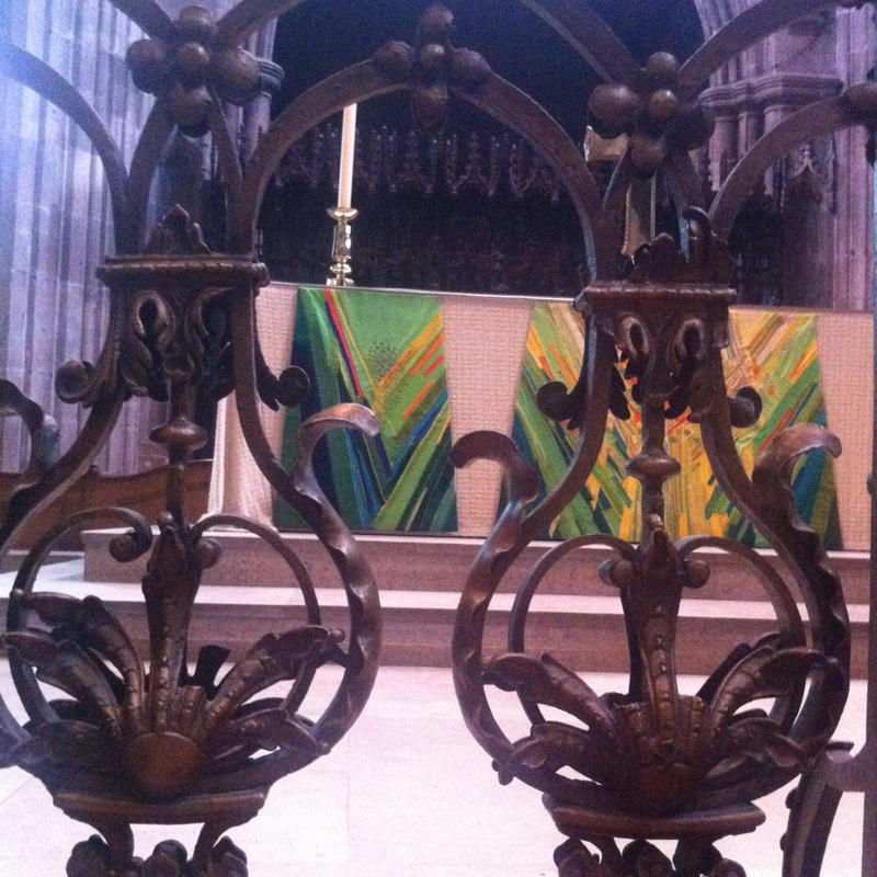
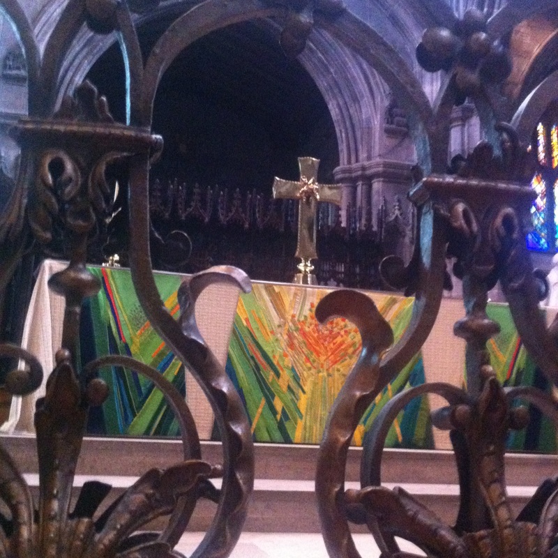

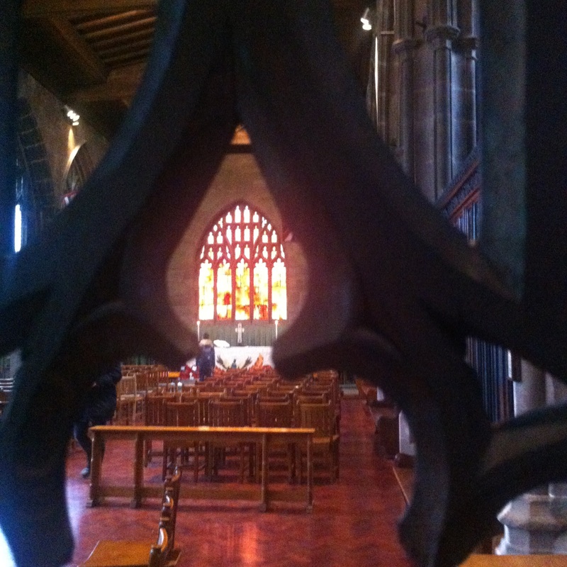
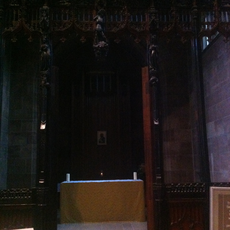
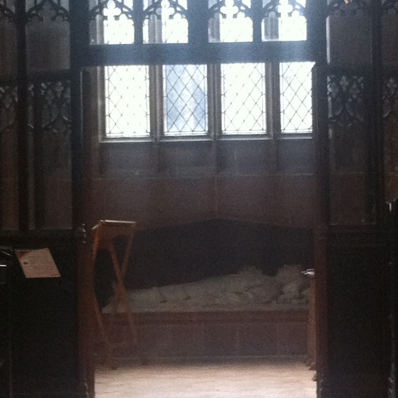
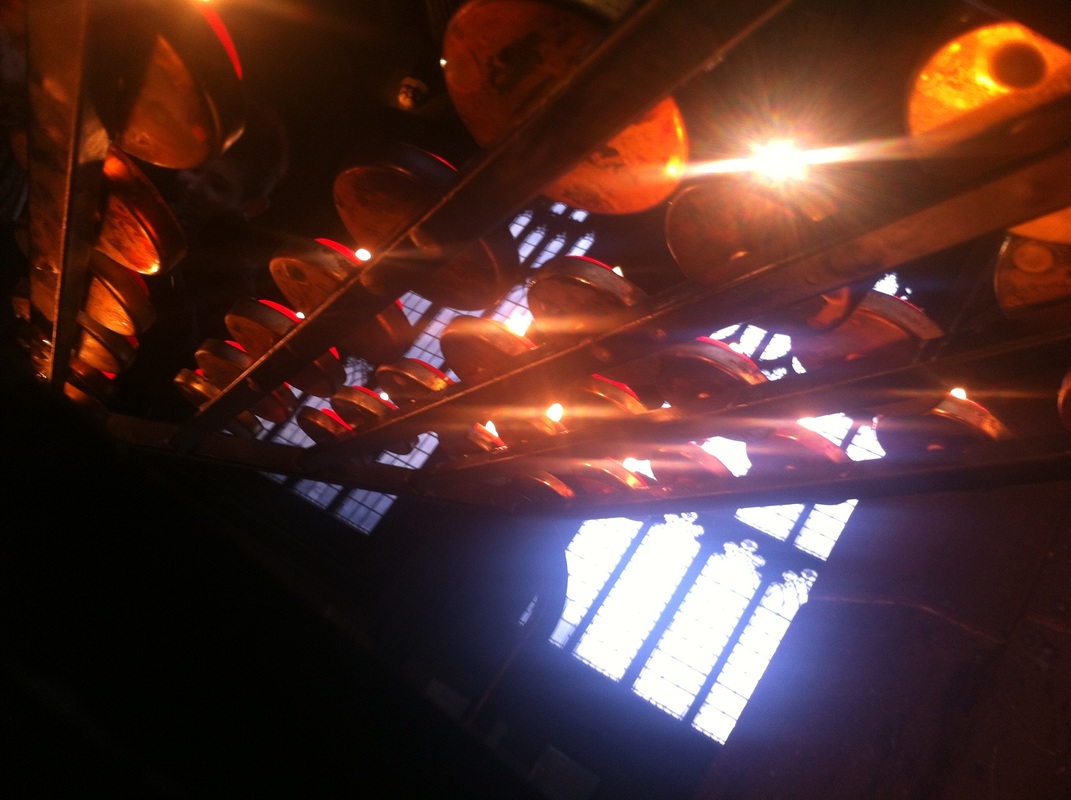
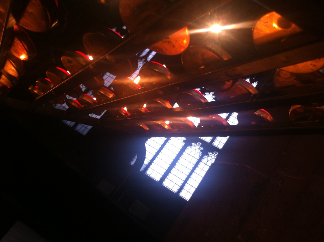
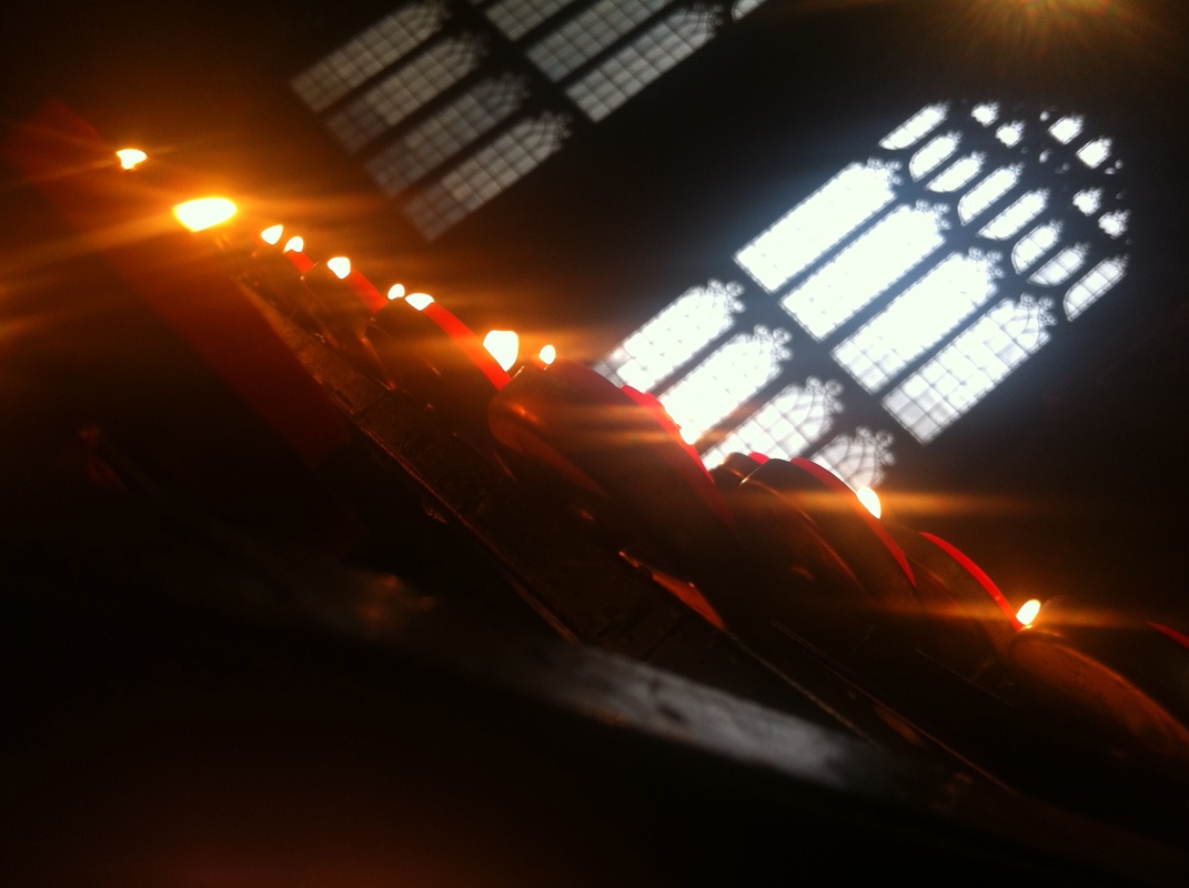
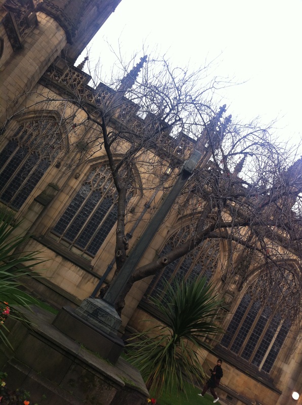
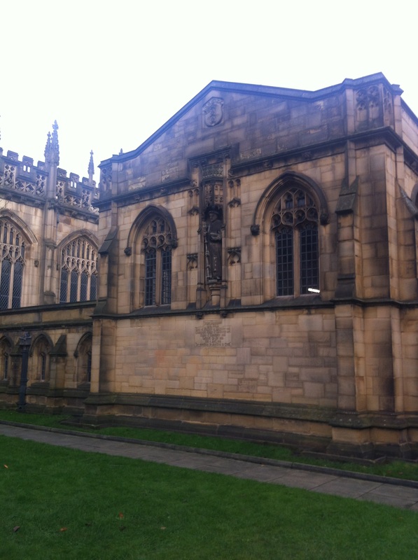
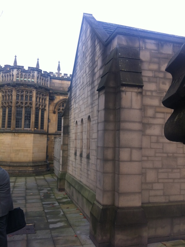
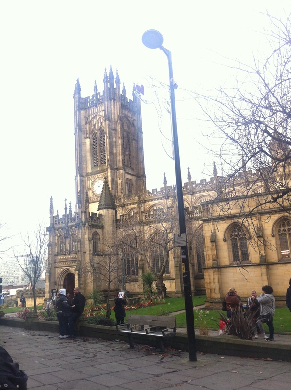

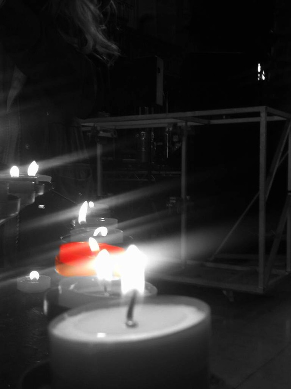
I like this image because it has captured not only the walls of the interior of the cathedral but the beautiful candle chandeliers from the ceiling. Although its not that clear you can partially see the detail and effort within the walls and arch way.
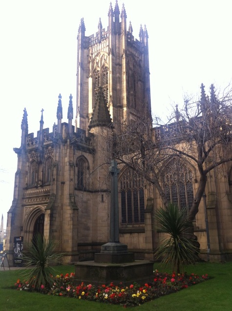
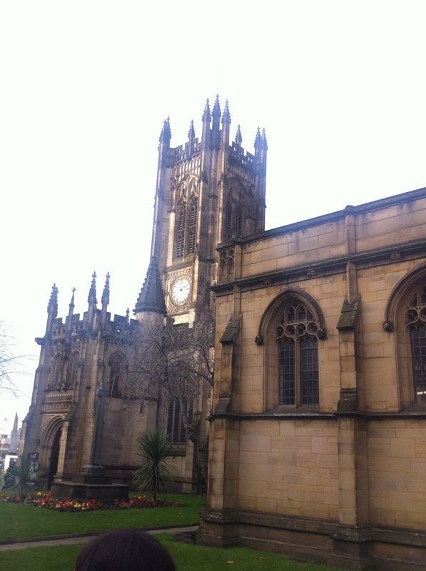
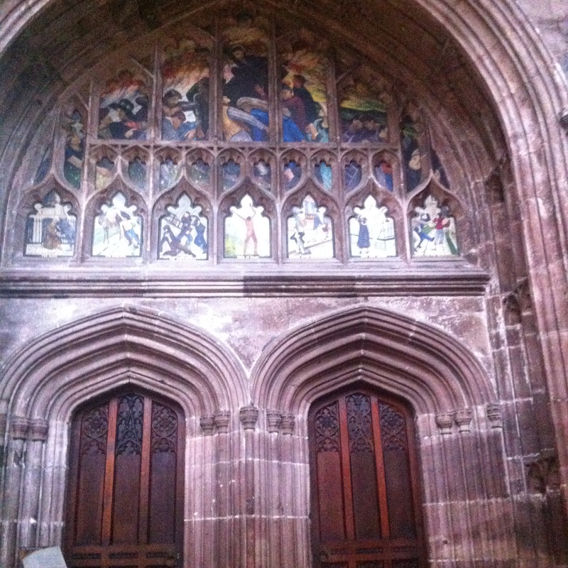
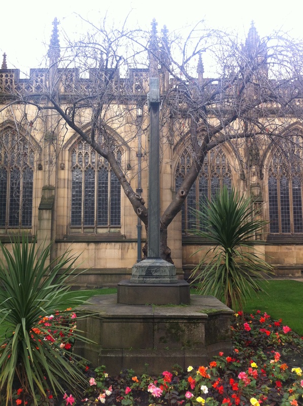
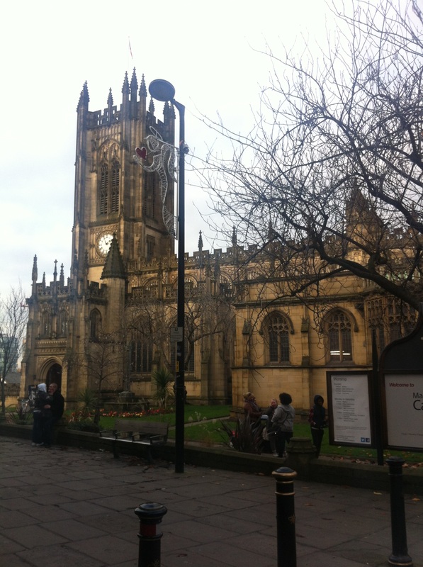
This is one of my favourite images of the exterior of the cathedral due to the roses,the cross and the cathedral itself. The sky within the background makes it look as if the cathedral is glowing. You can also see the detail on the brick work,the spires and the arched windows.
Using the apps I have reviewed I decided to edit some images I took during the Manchester shoot.

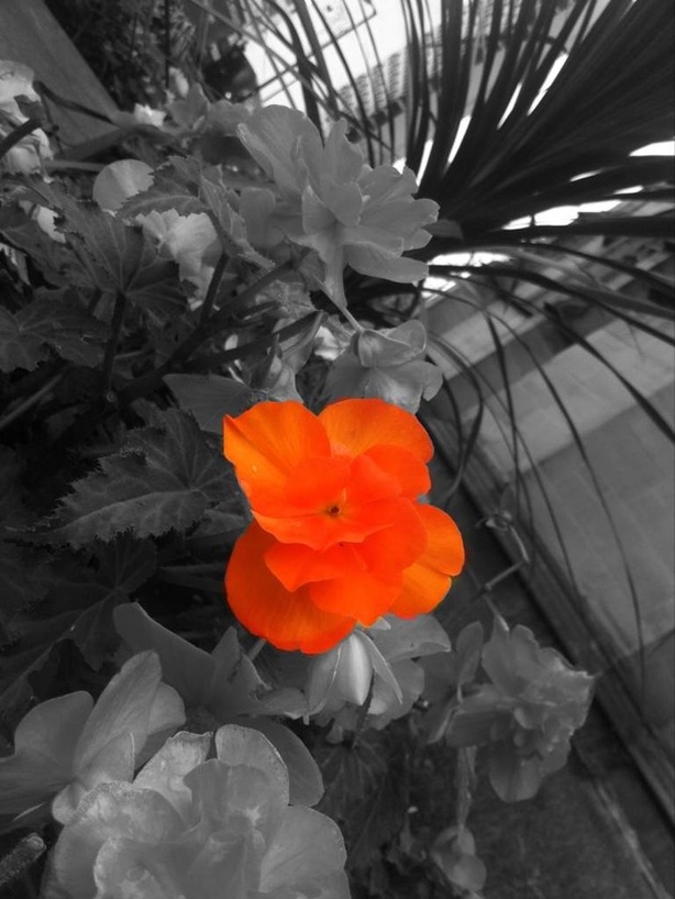
This image was taken during my 'orange' shoot, it is one of my favourites from that shoot and also my favourite from the edits. Each image has a dull grey background but this one stands out the most. The flower is so bright and fluorescent. Also there are multiple different tones of orange within the petals of the flower.

I took this image from inside the building of The Printworks. The sign is made up of vibrant colours and really stands out from the dull background. I edited all images using 'color effects'.
